Thursday, June 27, 2013

Late June Displays

This has been a busy month for me, but not too busy to hunt nail polish displays. The first two I have to share are ones I spotted at a Jewel-Osco when I was back in Illinois. It's a brand I hadn't seen before called Heaven. The caps and bottles very much look like the Mardi Gras ones from Blue Cross that Rite Aid has had this summer (which themselves looked like Island Girl ones). Unlike the Mardi Gras, these shades have names on the bottles (and no indication on labels or display that they are from Blue Cross, so maybe they just use the same suppliers). The names are all Hawaiian/beach themed, which does make me wonder about a possible Island Girl connection.

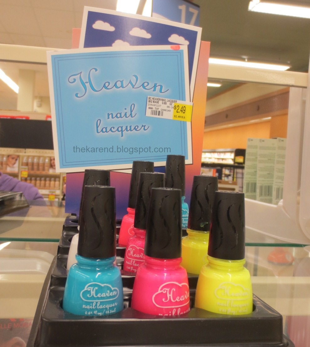
One Heaven display was filled with bright and white cremes: Honolulu Orchid (turquoise), Island Surf (hot pink), Big Wave (yellow), Island Paradise (bright coral), Tropical Breeze (white).


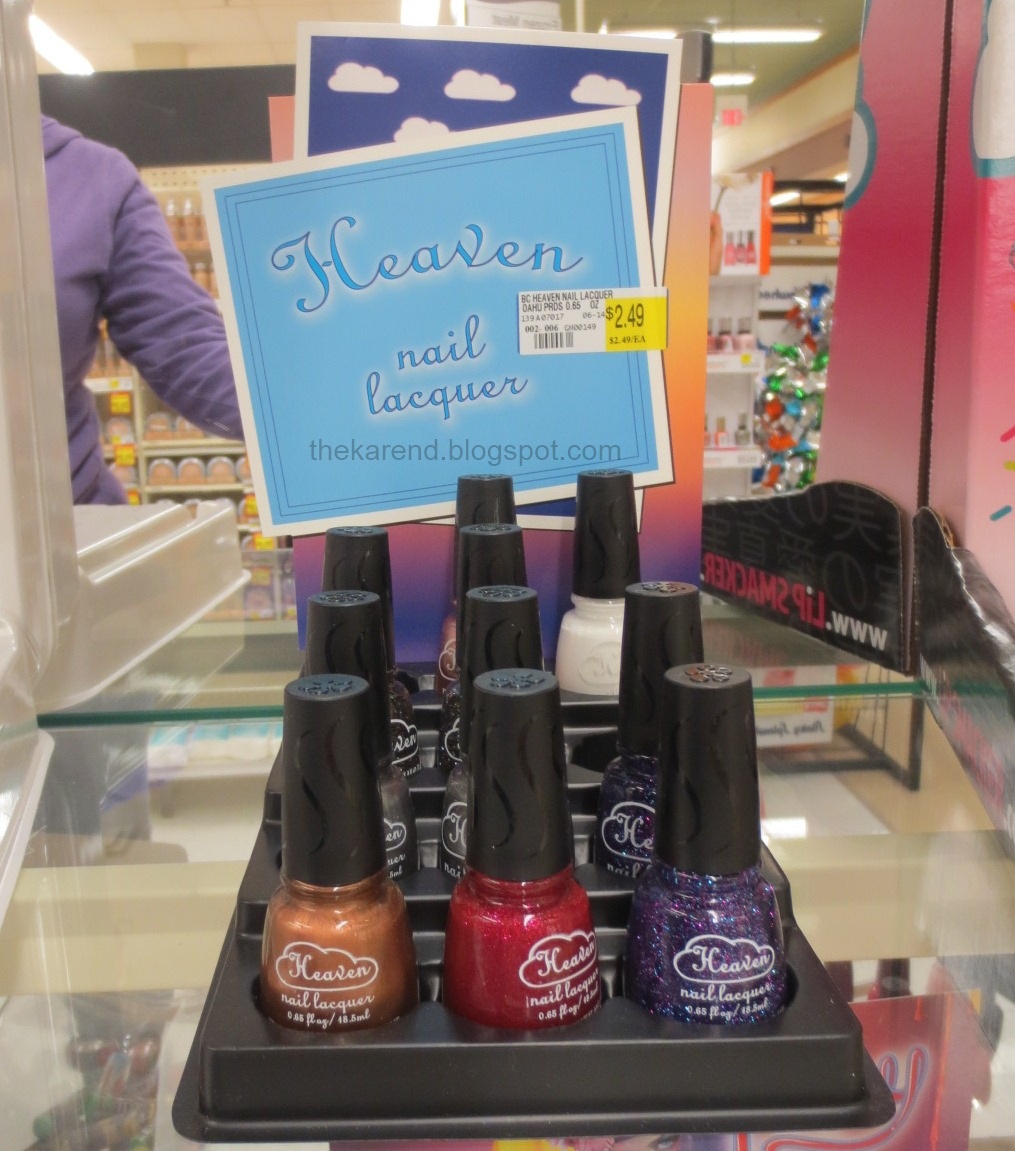
The other Heaven display had shimmers and glitters in what I think of as a holiday color palette (and one white that wandered over from the other display): Aloha Girl (gold shimmer), Waikiki Sunset (berry red microglitter), Waikiki Dream (turquoise/fuchsia glitter), Oahu Paradise (silver shimmer), and Island Lei (multi glitter).


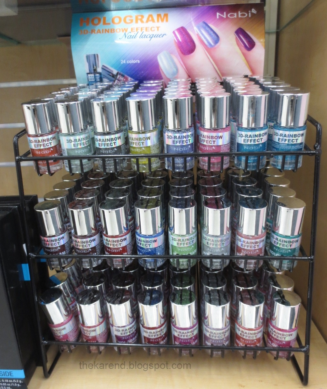
Also in Illinois, I saw one of those things that encourage me to keep stopping at drugstores even though I've just been to another one in the same chain a few miles down the road: a Walgreens had a full display of the Nabi Hologram line. I've not seen this at any Walgreens around me in Michigan, and didn't see it again at any other Walgreens I went to Illinois. There are 24 shades in the line (which I know only because I bought some off Amazon a while back—they're in my huge "to be swatched" queue) and 24 slots in the display, but when I pulled the first one out of each slot to snap a shot of the name, they weren't all different. If I'd had more time, I would have dug deeper to see what was up with that, but I had to get moving (this particular weekend was extra busy, as I split time between being with Mr. Karen and his folks and my mom an hour and a half away). Here are the colors that are showing—

Top row: Brone (I think they meant Bronze? Or maybe Brown?), Pefite Teal (yep, "pefite"; guess it was supposed to be "petite" but that doesn't make much more sense to me), Black, Gold, Sky Blue, L. Pink (not sure what the L stands for; probably Light, but this isn't a light pink), Ocean Blue, Ocean Blue (again).

Middle row: Tawny, Black Berry, Red, Navy Blue, Green, Silver, Cinnahon (I might start calling Mr. K this as a pet name), Teal.

Bottom row: Hot Pink, Rose, Purple, Winf (Wine, I suppose; typos on labels are so charming), Fushia (can't fault them for this; I have trouble spelling fuchsia, too), Lavender, Mocha, Flamingo.

The one that is not there (or was buried) is Dark Purple.


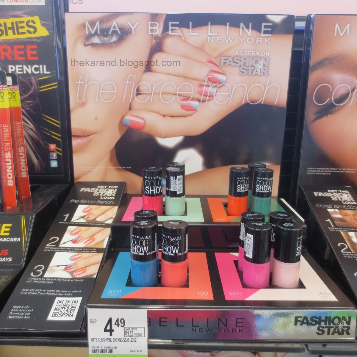
In the department of things we've seen before but not in these displays, I've got entrants from Maybelline and Sally Hansen. The Maybelline display is a tie in with the TV show Fashion Star (which I've never seen); it's called The Fierce French and has core colors from the Color Show line paired up in combinations to make the triangle nail art shown in the photos. Duos are: Shocking Seas and Coral Crush, Pink Shock (though this particular display has Pinkalicious in those slots) and Born With It, Pinkalicious and Green With Envy, and Orange Fix and Tenacious Teal. I've only seen this at Walgreens.


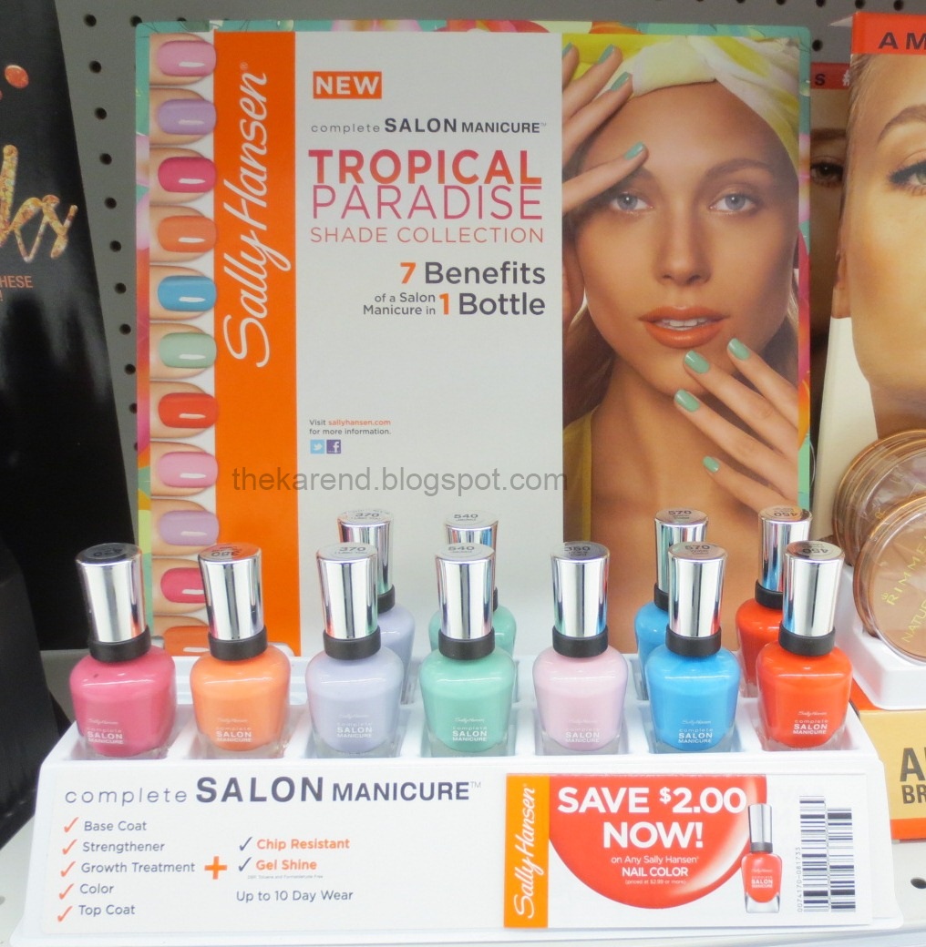
Sally Hansen has Tropical Paradise, one of the periodic displays they do with Complete Salon Manicure core colors in themed groupings. I've seen this at Meijer, Ulta, and CVS. I'm not sure what colors are supposed to be in here, as there's been a slightly different assortment each time I've come across it. This variation most resembled the assortment pictured on the display card—left to right: Rosy Outlook, Peach of Cake, I Lilac You, Jaded, Pink a Card, Water Color, Kook a Mango.


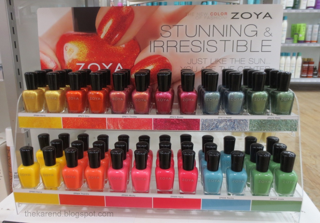
I'd seen the Zoya summer colors before; I swatched Stunning and Irresistible back in April. I hadn't seen a display of them, though, until this one showed up at my Ulta. So happy and bright!


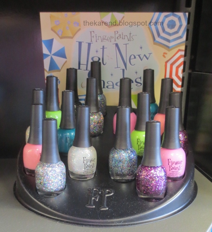
I hadn't been to Sally Beauty in a while because I try to always have a coupon when I go and due to a problem with one of my purchases getting lost in system I didn't get one for a month (I eventually did get it, but only after I sent a copy of my receipt, which apparently was from a store that's not on the same computer system as the rest or something like that). When I did go back, there were a couple new things to look at, including a Finger Paints Hot New Shades display. This had what I think are new core colors, with glitter well represented: Colorful Collage (silver holo glitter, looks a lot like last holiday's Santa's Magic), Amazing Glaze (iridescent glitter), Peacock Portrait (turquoise/multi glitter), Van Gogh's Violet (holo/magenta glitter), Hue Brighten My Day (dark green/multi glitter), Vintage Vincent (teal shimmer), Leonardo's Lime (lime creme), Paint Me Happy (peach creme), and Pink Patina (pink creme). The sign next to the display said "8 New Shades!" and there were nine there, so I'm not sure what's up with that.


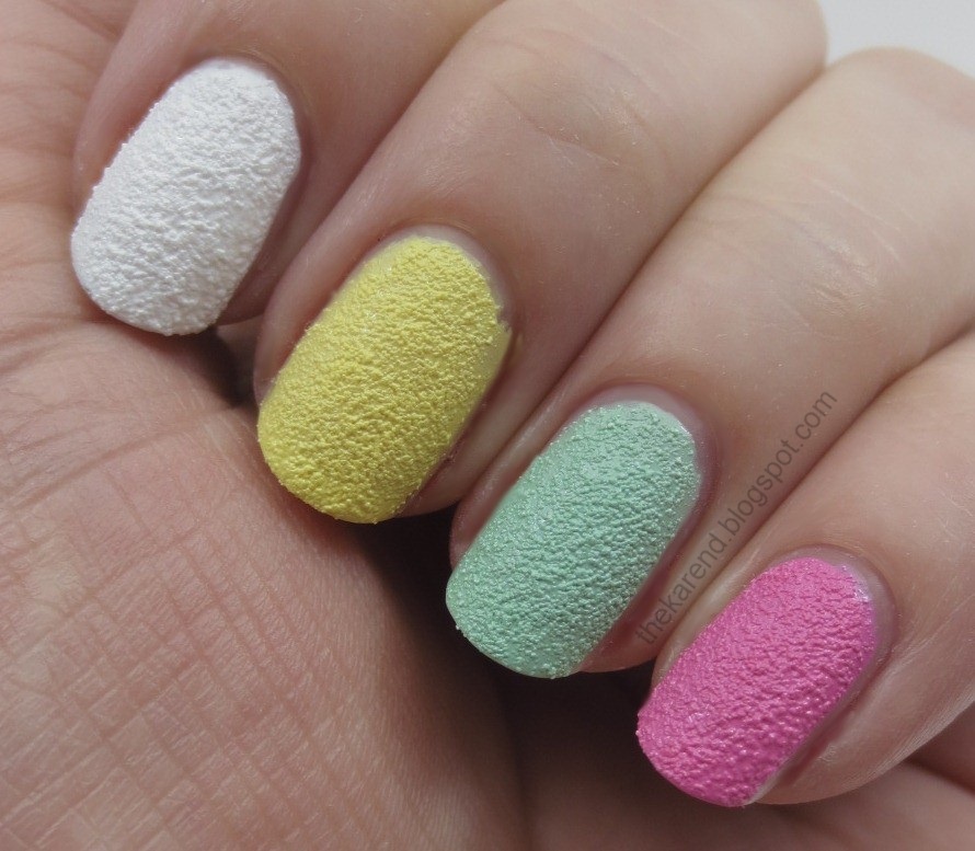
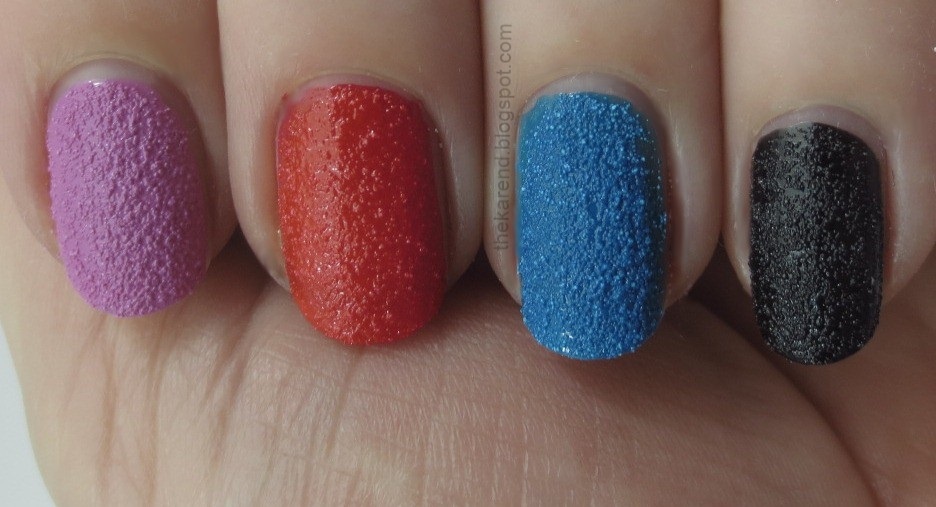
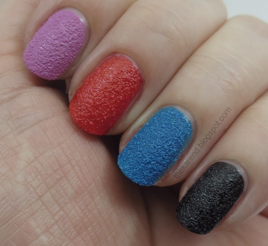
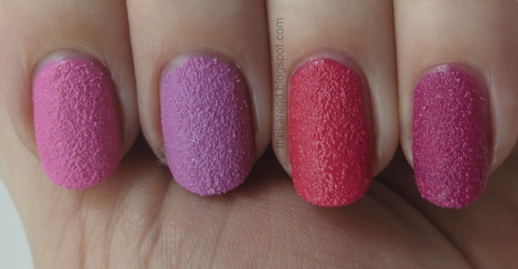
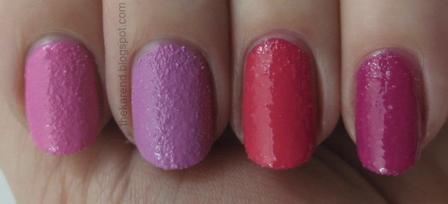
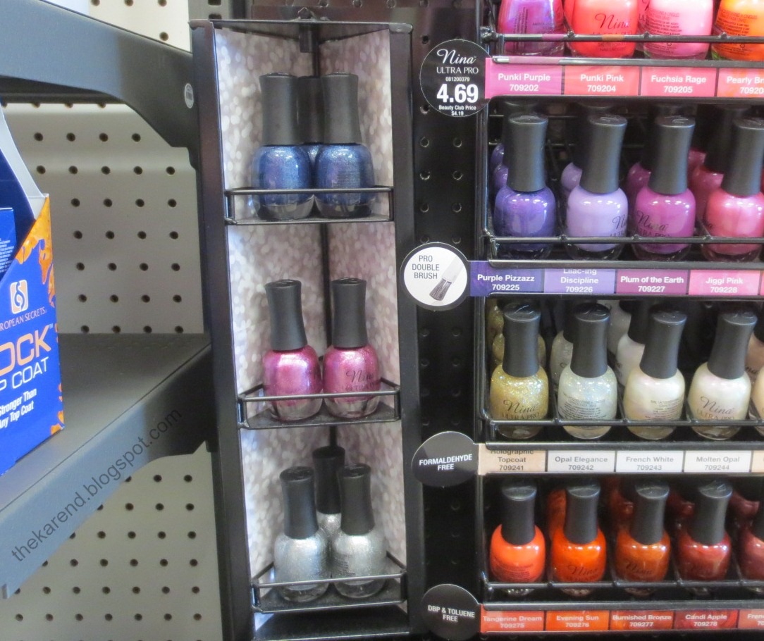
Also at Sally's, there was a little unlabelled display of three colors hooked next to the Nina Ultra Pro core display: Twinkle Twinkle (dusty blue), Star Bright (rose), and Shooting Star (silver). I suspect these might be Nina's take on the textured glitter trend, but since there was no indication of that, it's hard to tell.


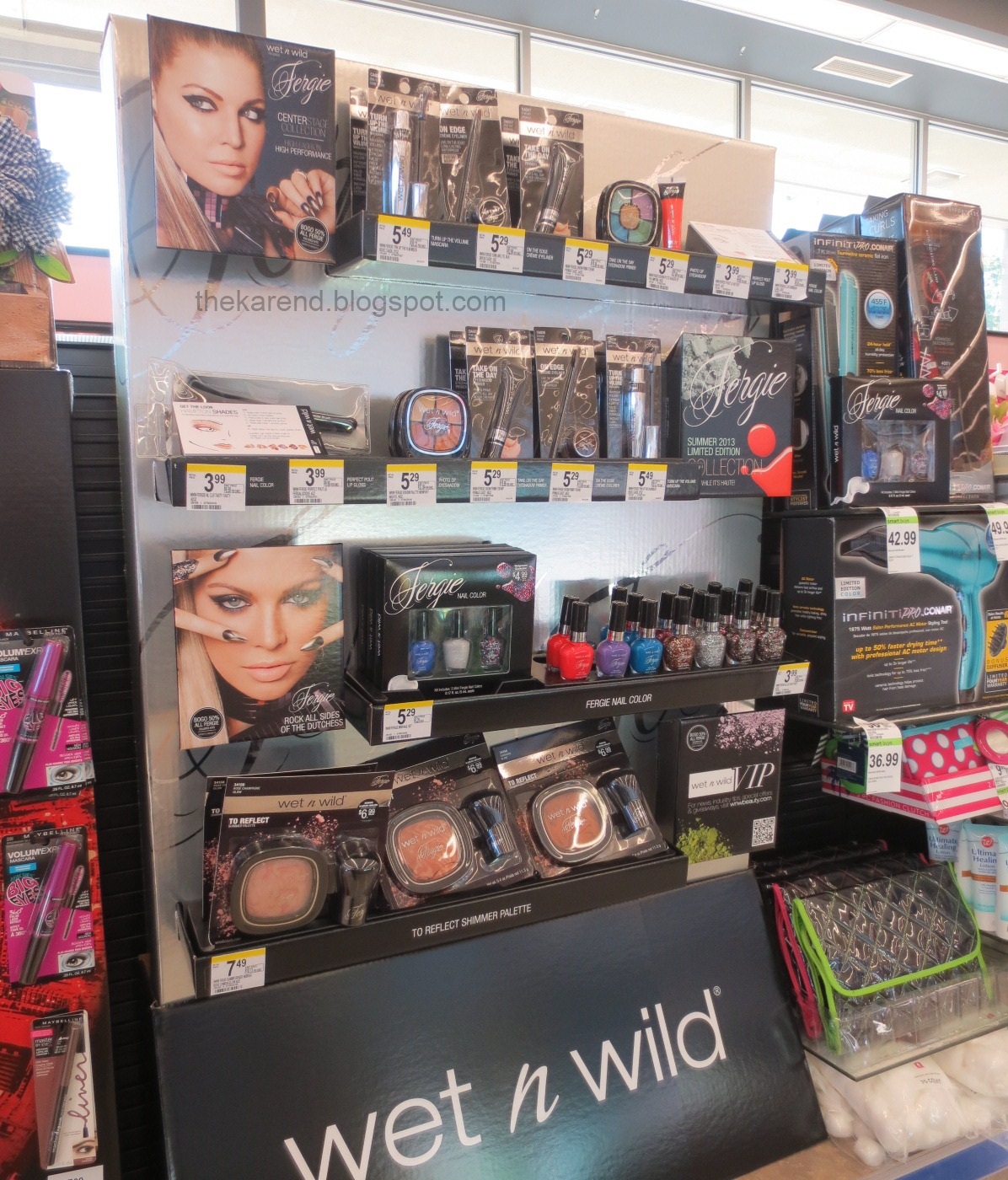
In my last display post, I shared the corner display of new Fergie colors (still don't know if these are limited edition or not). Since then, I came across a different Fergie display at another Walgreens. This one has just a subset of the new colors from the corner display, and it also has a set of three minis (also same as ones from the corner display).


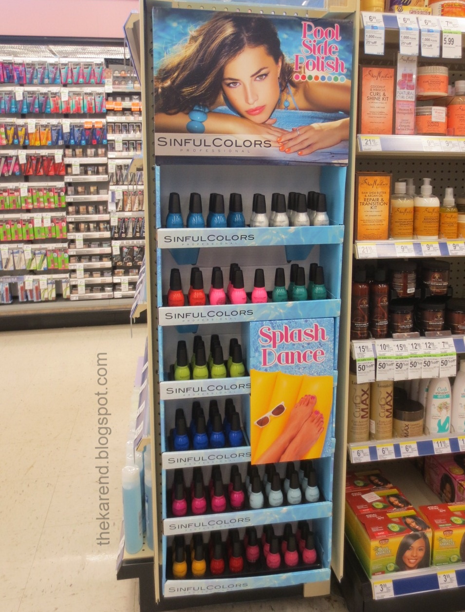
Also last display post, we saw Sinful Colors Pool Side polish in an eight-color shelf top display at Walgreens. I've since run across it in a big sidekick at other Walgreens stores, with the eight colors from the shelf top version plus some other shades that I didn't bother to document because it varied widely from store to store. I did like how this particular store grouped the colors together; that looked great compared to the jumbles I saw other places.


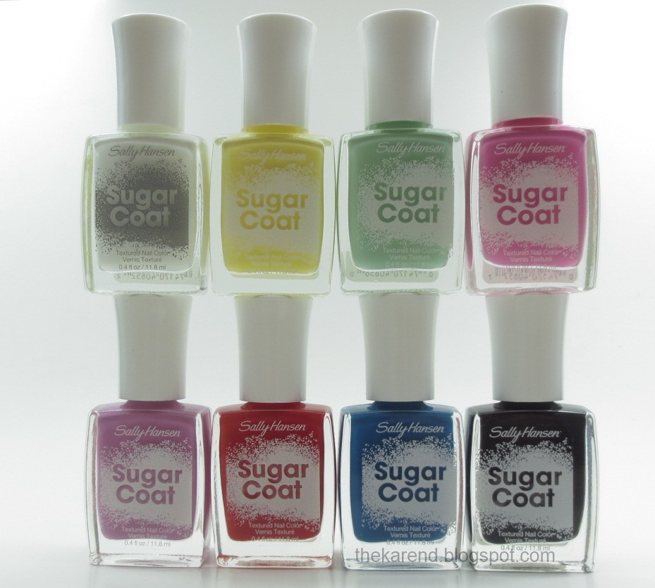
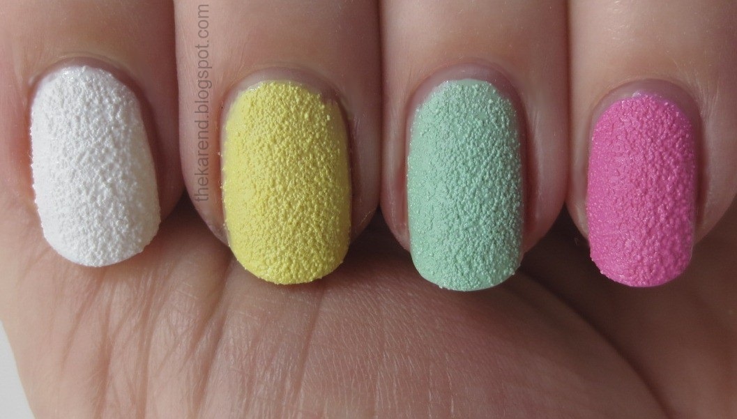
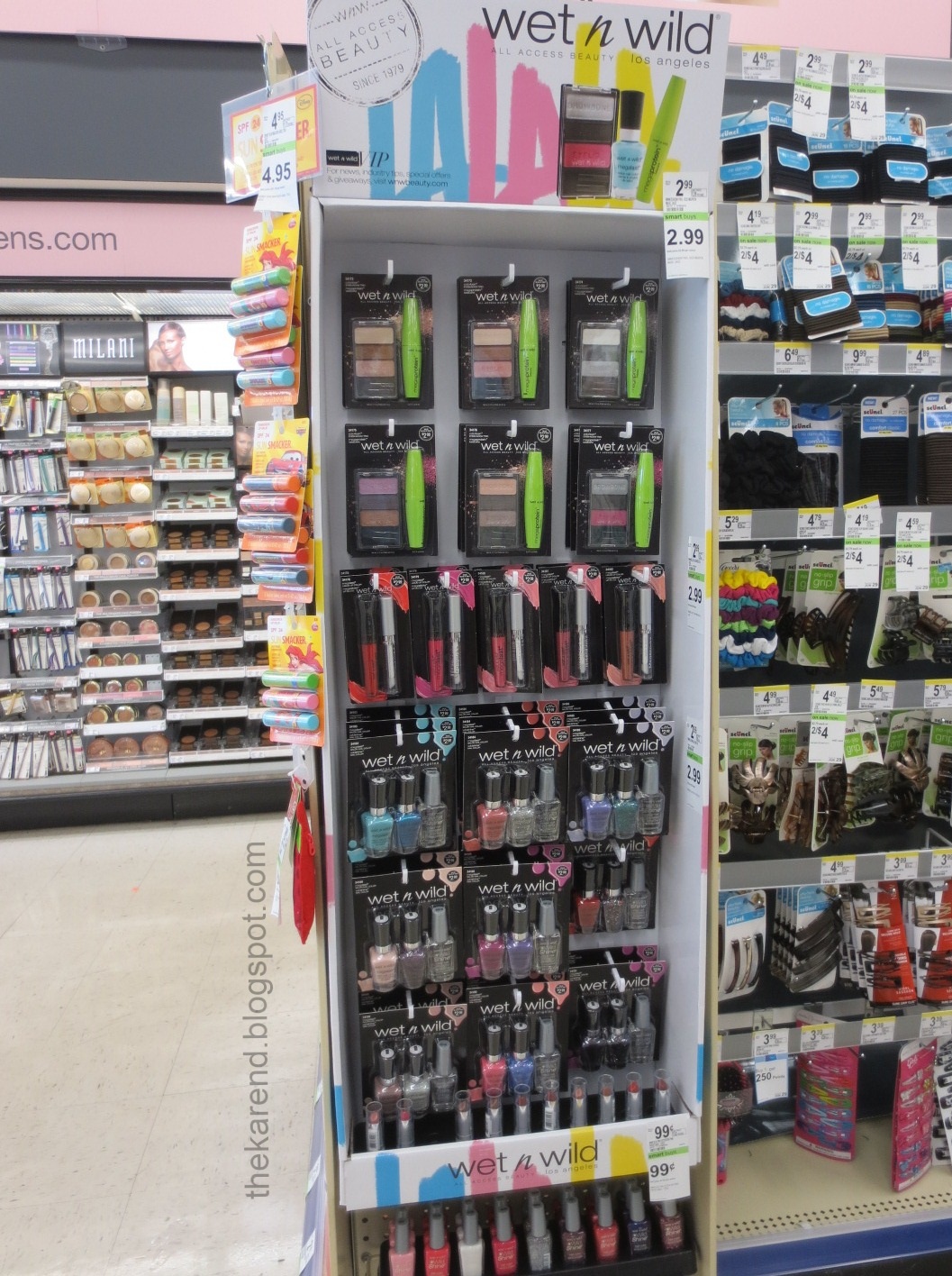
In another sidekick, I saw some trios from Wet 'n' Wild packaged on cards, with two MegaLast shades and a clear Wild Shine making up each combo. The MegaLast seemed to be one core shade paired with one I hadn't seen before, but since the whole Ice Baby bait and switch, I'm not convinced the new MegaLasts aren't just rebottled Spoiled or Fergie or some other line. Pairs are (old color listed first): I Red a Good Book with Club Cabaret (red/silver glitter), Disturbia with Mixing It Up (gold/turquoise/fuchsia glitter), On a Trip and I Saw a Comet (iridescent/turquoise glitter), Undercover and Silverati (silver glitter), I Need a Refresh-Mint and Blue Visionary (Turquoise shimmer), Sugar Coat and Sparkle and Grey (purple/silver glitter), Through the Grapevine and Plum Diary (medium purple creme), Wet Cement and White and Stormy (iridescent glitter), Candy-licious and Telescope Vision (iridescent/blue glitter).


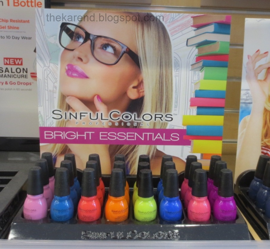
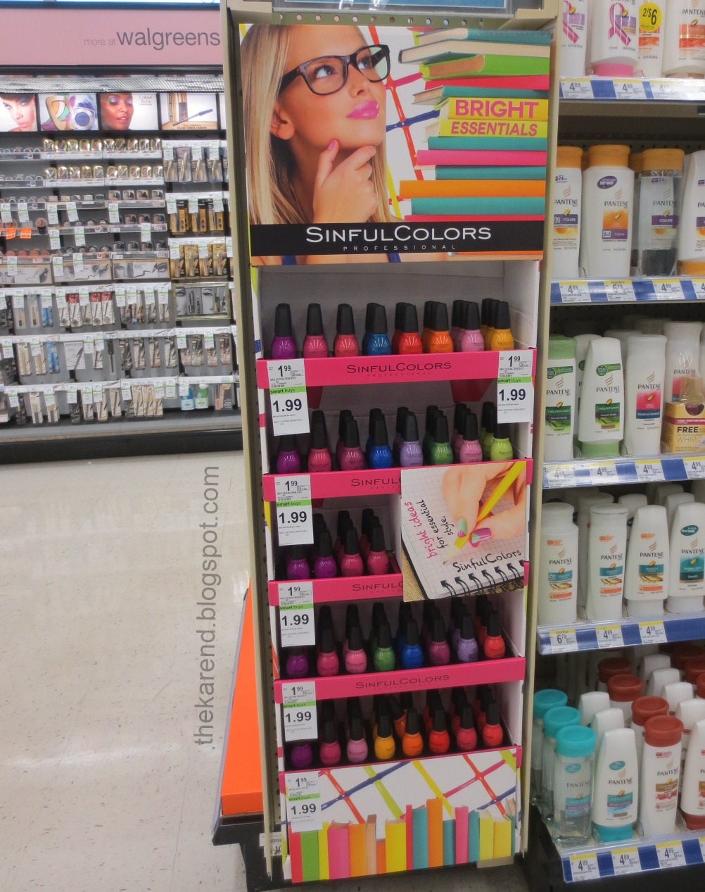
Back to Sinful, they decided they hadn't confused me enough this summer with all the new colors released with old colors and core colors and put out another display. This one is called Bright Essentials, and like most Sinful Colors, I saw it at Walgreens. Shades are: Over It, Burning Bright (new), Eva So Bright (new), Clementine, High Strung (new), Endless Blue, Cream Pink, Dream On.


There's a sidekick version of Bright Essentials, too:


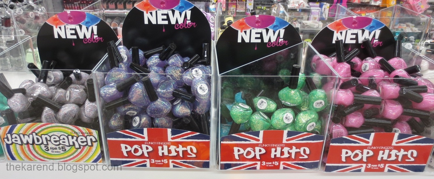
Five Below had some new Funky Fingers colors. Jawbreaker is multi colored glitter in a white base. The Pop Hits collection has four sheer toppers: Up All Night (lilac with iridescent glitter), Taken (turquoise with mylar flakies), Another World (green with iridescent glitter), and Beautiful (pink with mylar flakies).


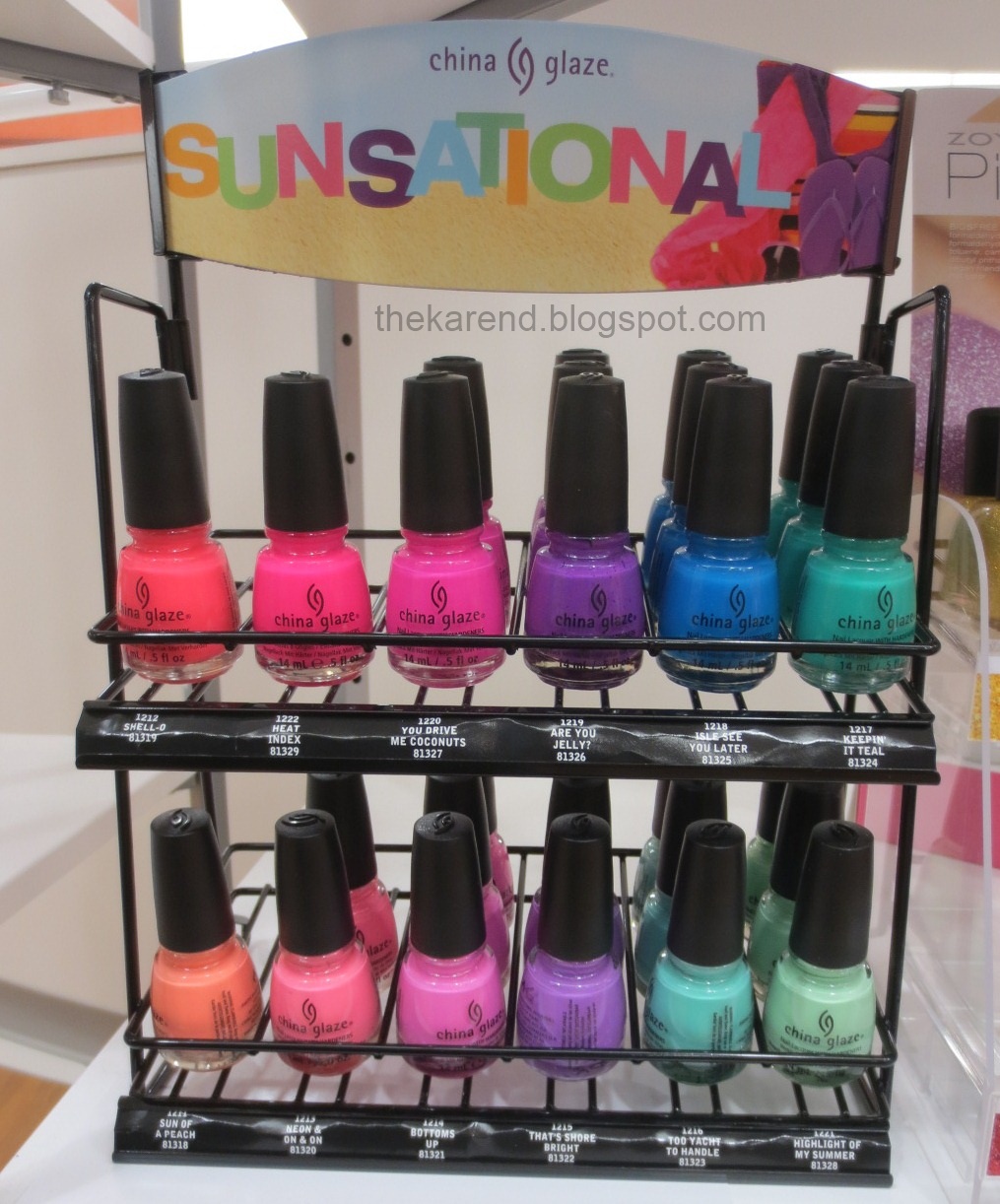
Next door at Ulta, they had China Glaze Sunsational. There are twelve colors here. Starting at the top left: Shell-O, Heat Index, You Drive Me Coconuts, Are You Jelly, Isle See You Later, Keepin' It Teal, Sun of a Peach, Neon & On & On, Bottoms Up, That's Shore Bright, Too Yacht to Handle, and Highlight of My Summer. I am trying to not buy any of these even though they look so fun and bright, because if I buy a couple, I'll want them all to complete the set.


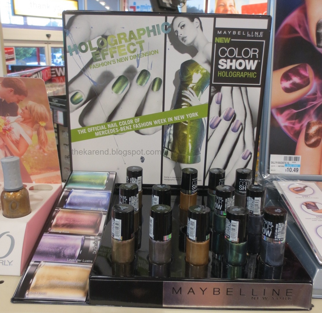
Maybelline has two new Color Show collections out, which I seen at both Walgreens and CVS. First up, the misleadingly named Holographic shades. These are not holos; they're just plain shimmers as far as I can see, possibly duochrome but not really showing that in the bottles. Five shades: Alluring Rose, Lavender Lustre, Bold Gold, Mystic Green, and Blue Blaze.


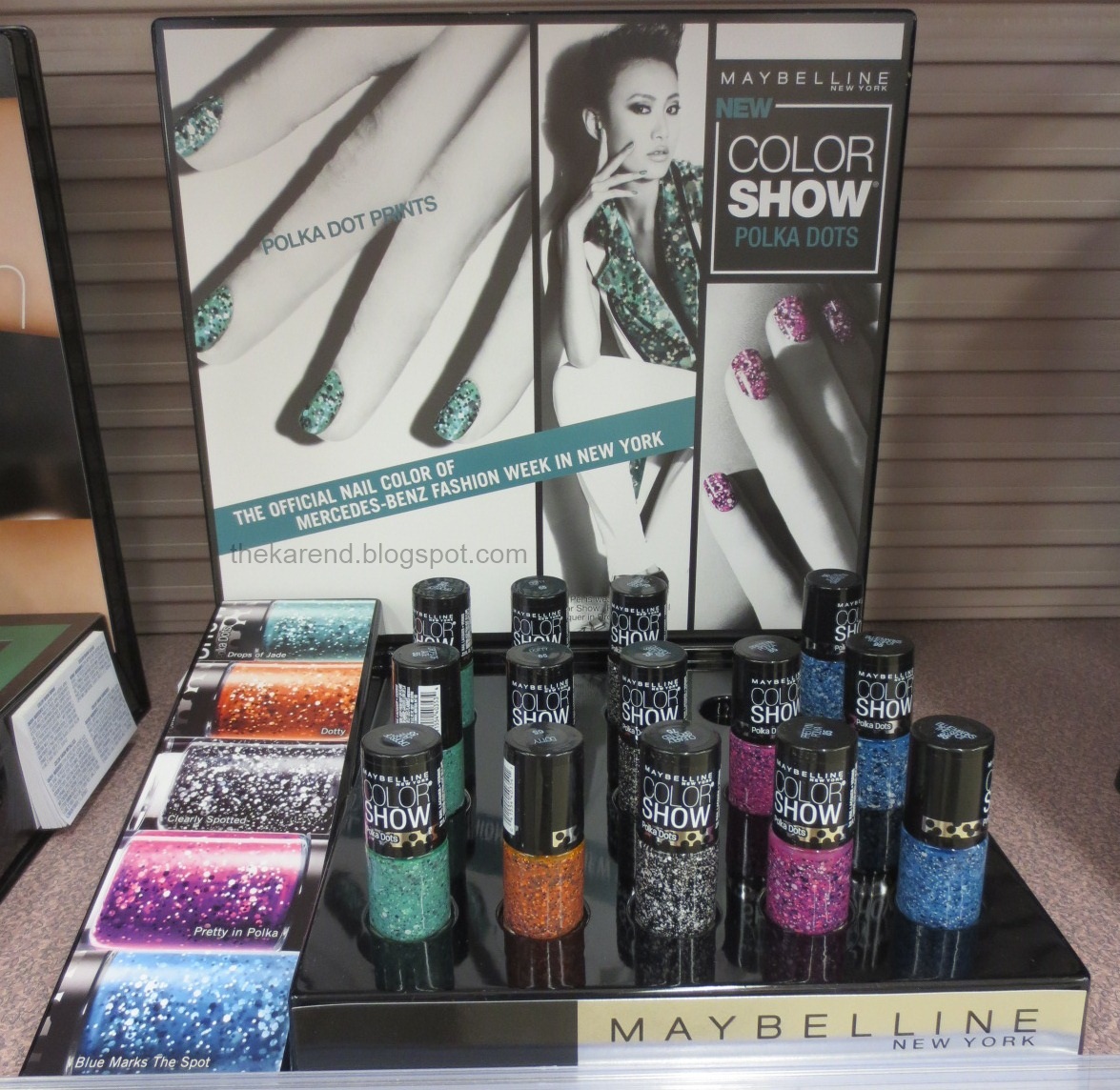
Perhaps Maybelline knew I'd be perturbed about their non-holo Holographics and sought to distract me with their other new offering: Polka Dots. These are black and white glitters in various colored bases. Shades are: Drops of Jade, Dotty, Clearly Spotted, Pretty in Polka, and Blue Marks the Spot.


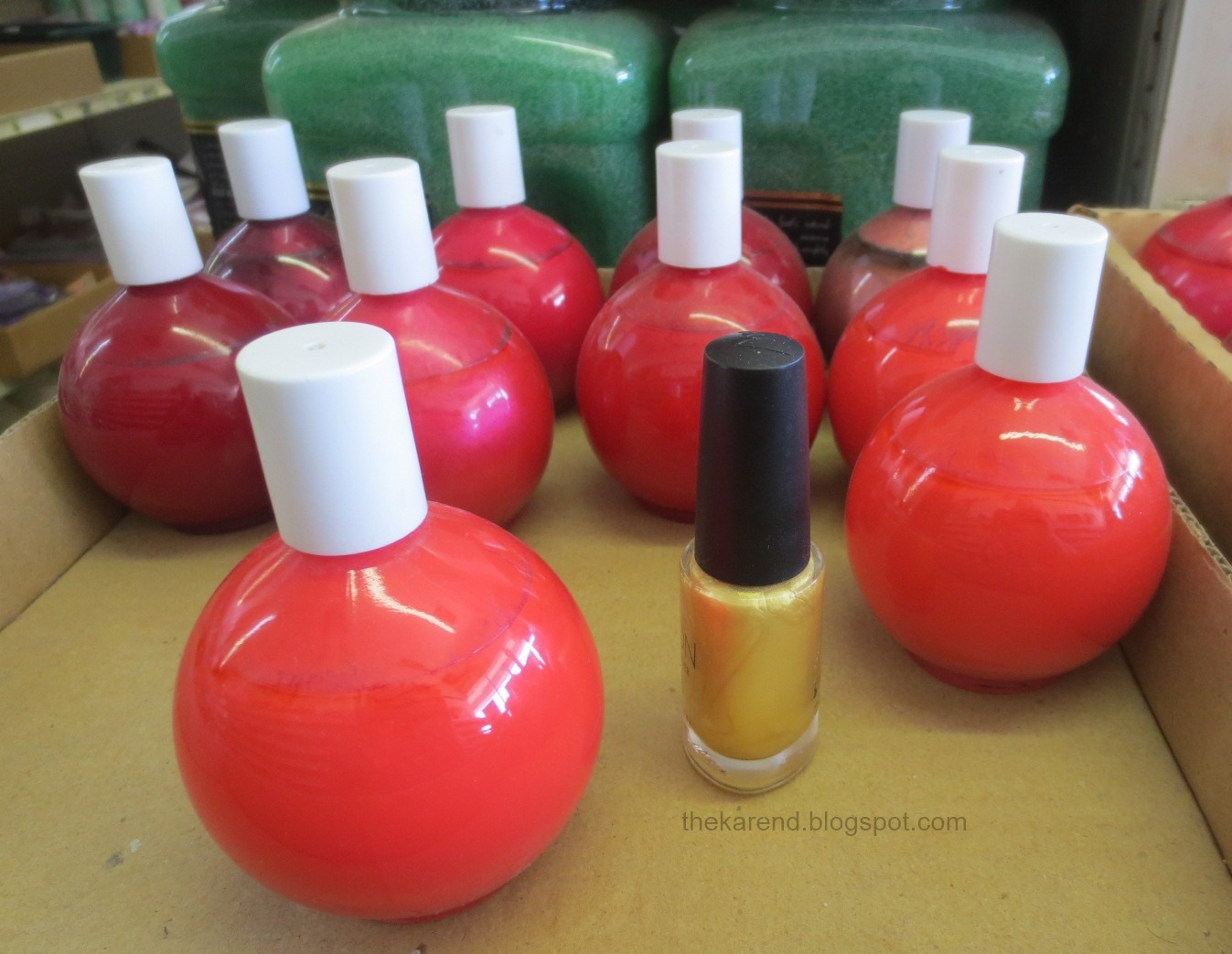
I'll finish up today with some giant unbranded bottles of polish I saw at a random nail supply store in my travels this month. I put a regular 15ml bottle next to them for comparison.


And now I'm off again, this time for long weekend of fun with some ladies who love polish as much as I do. Depending on how much fun and how little sleep I get while I'm away, it may take me a while to resurface here but it'll be sometime next week for sure.


Wednesday, June 26, 2013

Sally Hansen Fuzzy Coat

At the same time as the first batch of Sally Hansen Sugar Coat textured polishes showed up in stores by me, the brand's Fuzzy Coat collection also appeared. This has eight different color combinations of matte bar glitter, and I went ahead and bought them all even though my relationship with bar glitter tends to be difficult.

Left to right below: Fuzzy Fantasy, Wool Lite, Peach Fuzz, All Yarned Up.


Last four: Fuzz-Sea, Wool Knot, Tight Knit, Tweedy.


The display said these had a "unique textured fabric effect", and the photos showed nails so piled with bar glitter that I got a little itchy just looking at them. Thus when it came time to swatch these, I chose to layer them over cremes because that's how I expect I will wear them—as a topping, not as the main dish.

I started slow, with one coat of the fuzzies over Sally Hansen Complete Salon Manicure in Malt. Left to right: Fuzzy Fantasy (pink and white), Peach Fuzz (pastel yellow and light orange), All Yarned Up (pastel yellow, light orange, and light blue), and Fuzzy Fantasy (white and lime).


I then ramped up to more coats. I'm not sure how many, though, as these need to be applied with a sort of "dab and spread" technique to get the bars to distribute across the nail and I lost track. Three? Four, maybe?


One thing about these that surprised me is they only look bumpy; they feel fairly smooth even without topcoat, probably because there's a high ratio of clear base to bar glitter.


Here's the second quartet, also over Sally Hansen Malt but with maybe one less dabbing coat than the previous set at their peak: Fuzz-Sea (yellow and turquoise), Wool Knot (white and sky blue), Tight Knit (white and royal blue), and Tweedy (white and black).


Because I still had the Revlon Haute Tropics colors close at hand, I played around using some of them as base colors for these Fuzzy Coat polishes. Mai Tai Ask seemed to go well with All Yarned Up and Peach Fuzz, so I used them all together (Peach Fuzz is the accent nail):


My pinky finger up there in particular shows the struggles I had to get those darn bars to scatter nicely.

I thought Hello Bali would make a nice base for Tweedy and Tight Knit. As it turned out, it wasn't so great, though Tight Knit did look better on the plummy purple than Tweedy did. In Tweedy's case, the black bars blended into the base color too much, leaving me with crazy white dashes on my nails.


In some sale Sephora had, I picked up Nails Inc. Brighton from the Feathers line and then sort of forgot about it until the Fuzzy Coats came along. Turns out Brighton and Fuzz-Sea are pretty much twins.


Here they are on alternating nails over a Revlon Lagoon Afternoon base. Not that it matters, but for the record it's Fuzz-Sea on my index and ring fingers and Brighton on the other two.


T at LacqLustre was much more on the ball with getting to these; last month she did a full hand swatches of all of these, plus a comparison to a different Nails Inc. Feathers color, plus a set of Skittles over different base colors; her post is here.

I'm not sorry I bought these because it's good try new things. That said, having now tried them, I don't see myself wearing them very much, at least not until my attitude toward bar glitter improves (which it quite possibly might; I wear and do all sorts of things now that previously I didn't think I'd like).


Tuesday, June 25, 2013

Revlon Haute Tropics Collection

Yep, I'm still catching up with my swatch backlog. Today I've got the Revlon Haute Tropics collection, which showed up in stores around here a couple months ago, but I did still see it at some places this past weekend, so I'm hoping these swatches aren't too late for you to find these polishes if anything catches your eye. There are eight colors here, with neutral, cool, and warm tones all represented.


Cabana Queen is a light grey shimmer. It's not a color I think of when the tropics come to mind but I guess that's where the "haute" comes in. I used three coats of this one, which left just a hint of visible nail line. (There's no topcoat on any of today's swatches.)


Secluded Beach is a pinky taupe with a very subtle shimmer. Think of it as a warm-toned version of Chanel Paradoxal and its many near dupes. This one was opaque in two coats.


Below is the best shot I could get of the shimmer, with a lamp shining directly on my nails; pretty subtle, eh?


Coast is Clear is the winner of the collection as far as I'm concerned. It's a seafoam blue green glass flecked shimmer. At three coats, it's gets within hailing distance of opaque.


Lagoon Afternoon is a deep turquoise blue creme with slight jelly tendencies. Not too jelly, as this swatch is only two coats and you can see that's more coverage than Coast is Clear at three coats.


Plunge Pool is an intense Royal Blue shimmer and another two-coater.


Hello Bali is a red violet jelly with slight creme tendencies, meaning I needed three coats to equal the opacity I got with two coats of Lagoon Afternoon. This is my second favorite in the collection; I have lots of colors like this, but can't think of any that are a crelly or nearly this shiny on their own.


Belize Please is a hot pink subtle shimmer. I used three coats of this one, though perhaps with more attentive application I could have stopped at two.


I had a hard time seeing the shimmer on my nail (and my camera did, too), but here's a shot of it in the bottle so you can see I'm not imagining it:


Mai Tai Ask is a bright orange creme. Like Belize Please, I used three coats but could probably have gotten away with two if I'd been paying closer attention.


I think there's a nice variety of colors and finishes here. The collection does lean toward cooler tones, which of course suits me fine.

Friday, June 21, 2013

Sally Hansen Sugar Coat Skittle Swatches and Comparisons

Seeing the second group of Sally Hansen Sugar Coat polishes show up at Walgreens (as shown in my recent display post) reminded me that I hadn't yet shared any swatches of the colors in the first group. Those didn't arrive in time to make it into the Texture Week I did at the end of April/beginning of May and it's just taken me a while to get back into a bumpy mood.

There are eight colors in this group, all textured cremes. Top row, left to right: Sugar Fix (white), Sweetie (light yellow), Sour Apple (mint green), Cotton Candies (cool toned pink). Bottom row: Bubble Plum (red violet), Cherry Drop (warm toned red), Razzleberry (blue), Lick-O-Rich (black).


Here's the top row on the nail in the form of Skittles swatches. Left to right: Sugar Fix (3 coats), Sweetie (3), Sour Apple (2), and Cotton Candies (2).


And here's the bottom row. Left to right: Bubble Plum (2 coats), Cherry Drop (3), Razzleberry (2), Lick-O-Rich (2).


The base in Razzleberry seemed less opaque than the others; I could see the white of the texture "rocks" showing through in spots. Here's a mid-cleanup shot showing the little rocks that were left after I took care of the blue with my brush:


Yet despite the rocks showing through, Razzleberry was the only one I had a hint of staining with; it wasn't horrible, just noticeable and took a tad more work to get off my skin.

Of course I had to do comparisons with some of the other textured cremes that have come out this summer even though I could see from the bottles there was not a big overlap in the shade ranges. No other line has a white or black bumpy creme, for instance (OPI's have glitter in them).

Left to right below: Sally Hansen Cotton Candies, Sally Hansen Bubble Plum, China Glaze Bump & Grind, Milani Spoiled in Fuchsia.


Just for fun, here's a shot of the above polishes early in the drying process, when the texture wasn't fully emerged:


At this point, my attention span was starting to run out, so I did the next set of comparisons in the form of sloppy gradients (which I didn't even let dry fully before I photographed them).

Leftmost: Sally Hansen Bubble Plum at the base, layered with Milani Spoiled in Fuchsia in the middle and Milani Purple Streak at the tip.

Next: Sally Hansen Cherry Drop, Milani Tainted in Red (hmm, looks kinda dupey), China Glaze Itty Bitty & Gritty.

Next: Sally Hansen Razzleberry, China Glaze Of Coarse, Sally Hansen Sour Apple.

Rightmost: Sally Hansen Lick-O-Rich, Milani Shady Gray, Sally Hansen Sugar Fix. (Someday I want to try this as a proper gradient, but starting with white at the base.)


I spied Color Club Pearl-spective which I'd yet to put away so quickly slapped that over the purpley nail to see how that would look. Pretty good, though for a full mani it wouldn't really make sense to use the textured polish then smooth it out with a microflakie topper.


Milani Tainted in Red and Sally Hansen Cherry Drop were so close in the gradient that I had to see them side by side. Left is the Milani, right is the Sally Hansen. They're both orange-y reds and are nearly indistinguishable; the Sally Hansen is possibly just a touch brighter, or that could just be how the light happened to be hitting it. In any case, I can't think of a compelling reason to have both of these unless you're a completist and want all the Milani textures and all the Sally Hansen ones.


Finally, before I packed these textures away for now, I wanted to expand on the pink to purple gradient and see what kind of ombre line up I could come up with in that color family. I didn't settle on a good thumb color, but was pretty pleased with this quartet for my other fingers—China Glaze Unrefined, Sally Hansen Bubble Plum, Milani Spoiled in Fuchsia, and Milani Purple Streak.


I'm still not completely sure I like texture on my nails but must admit it is interesting to look at. A few weeks back I did a quick mani with Zoya Stevie and wore it for a weekend just to build up my tolerance for having bumpy nails. At this rate, I should be perfectly comfortable with it about the time the trend is over. I admit I am intrigued by some of the swatches I've been seing of European brands who've jumped on the texture bandwagon. I've been so busy I haven't been doing hardly any swapping lately, but I might have to try and find a swap for some of the Isadora Sugar Crush and/or Barry M Textured and/or Kiko Sugar Mat ones—I'd love to see how they compare to the U.S. brands' take on the texture trend.