First up I have sunny yellow: Wet 'n' Wild A Venice Day and Julie G Canary Islands (from this summer's Cruise Collection, which I used as base colors when I swatched the Sally Hansen Color Frenzy Glitters). In the bottle, they look pretty darn similar.

On the nail, there are some differences. Left to right below: Wet 'n' Wild alone at 3 coats, Wet 'n' Wild one coat over white, Julie G one coat over white, Julie G 3 coats alone. The Julie G is a more traditional creme formula while the Wet 'n' Wild leans toward the jelly side of the spectrum. The Wet 'n' Wild looks fairly mellow on its own but pops bright over white, while the Julie G is a softer, creamier shade.

My next pair is soft coral-y oranges: Wet 'n' Wild Love Me Some Mussels and Essie Serial Shopper (from this summer's Too Taboo collection, which I never got around to swatching by itself and probably won't at this point).

I'd apparently decided by this point that I wasn't going to wear the Wet 'n' Wild colors on their own, as used a white base on all my fingers for this comparison. Left to right (over white, as I said): Wet 'n' Wild, Essie, Wet 'n' Wild, Essie. The Essie is brighter, which sort of surprised me since it didn't show that in the bottle sitting next to the Wet 'n' Wild.

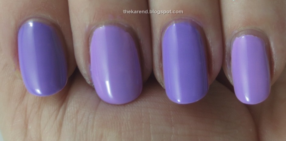
Lastly, I have lilacs: Wet 'n' Wild Trippin' on the Boardwalk and Essie Sittin' Pretty (also from Too Taboo).

Left to right below (over white base): Wet 'n' Wild, Essie, Wet 'n' Wild, Essie. As with the oranges, the Essie is brighter. The Wet 'n' Wild looks a touch more blue than the Essie as well.
The natural question when I do comparisons is which ones could I give up now that I've seen them side by side. In the case, the answer is "none of them" because there are no dupes here. Someday that answer is going to have to change, but today is not that day.
Reminder: If you haven't already, please vote in the Mont Bleu crystal file design poll, which closes on Friday. Elegance has a one vote lead over Double Rainbow as I type this, so the outcome is by no means decided.

Thanks for the comparisons; they all look like great summer shades!
ReplyDeletethey might not be total dupes but no need for both. thanks for the comparison.
ReplyDeleteNice comparison. Each of the 3 sets of colours look different in their own way. Enough to merit having both lol :-)
ReplyDeleteI love when you do comparisons. Seriously irks me when bloggers label colors as dupes that obviously aren't.
ReplyDelete