Showing posts with label c: red violet. Show all posts

Monday, June 13, 2022

Sally Hansen Miracle Gel Cruella Pairings

Today I have some swatches I did a while back with my selections from the Sally Hansen Miracle Gel Cruella collection. Of course I got all three of the glitters and also got three shades I felt coordinated with them (and that weren't core colors with a new cap screwed on). Left to right: Fame & Fortune, No to Conformity, Iconic Darling, The DeVil is in the Details, Luck & Glory, Pretty in Punk.
 
Sally Hansen Cruella Miracle Gel nail polish
Here's Fame & Fortune, a warm purple almost metallic shimmer, with No to Conformity, a topper with blue, purple, and rose pink glitter ... mostly hexes, including some very small ones, but also some irregular shards (I guess that's the non-conforming part). I used two coats of Fame & Fortune and one of No to Conformity, plus clear top coat.
 
Sally Hansen Cruella Miracle Gel nail polish Fame Fortune No to Conformity
 
Sally Hansen Cruella Miracle Gel nail polish Fame Fortune No to Conformity A closer look at No to Conformity:
 
Sally Hansen Cruella Miracle Gel nail polish No to Conformity
I did like Fame & Fortune on its own quite a bit, so here's a peek at that:
 
Sally Hansen Cruella Miracle Gel nail polish Fame Fortune
Up next, Iconic Darling, a frosty light grey, with The DeVil is in the Details, a black and white glitter topper. Iconic Darling took three coats before I felt it looked decent. The DeVil is in the Details was fine at one, with no issues getting glitter out of the bottle and onto the nail.
 
Sally Hansen Cruella Miracle Gel nail polish Iconic Darling and The DeVil is in the Details
 
Sally Hansen Cruella Miracle Gel nail polish Iconic Darling and The DeVil is in the Details
 
Sally Hansen Cruella Miracle Gel nail polish The DeVil is in the Details
Finally, Luck & Glory, a blue shimmer that leans just a touch periwinkle, and Pretty in Punk, a topper with pink, red, purple, and sky blue matte hex glitter. I did two coats of Luck & Glory and two of Pretty in Punk because I just wanted more of that glitter.
 
Sally Hansen Cruella Miracle Gel nail polish Luck Glory Pretty in Punk
 
Sally Hansen Cruella Miracle Gel nail polish Luck Glory Pretty in Punk
 
Sally Hansen Cruella Miracle Gel nail polish Pretty in Punk
My least favorite of these is Iconic Darling; it was a bit too brushstrokey for me. My favorite is No to Conformity, which has already made it into my pedicure rotation as it goes with many of the colors I wear on my toes and is a fun way to freshen up my look between color changes.

Monday, December 6, 2021

Fresh Paint Purple & Pink

When I was in Michigan this past summer, I bought the only two Fresh Paint colors I came across that I didn't already have, despite both of them being undoubtedly close to things I already had. I blame nostalgia, since I miss being able to pop into a Five Below whenever I felt the urge. First there's this creme, Pretty in Purple, which does lean purple though one could argue the case for it being pink. Maybe it should have been called Pretty in Orchid? I used two coats for my swatch and that was plenty for full coverage.
 
Fresh Paint Pretty in Purple nail polish, a purpley-pink creme
 
Fresh Paint Pretty in Purple nail polish, a purpley-pink creme
The other Fresh Paint I got was a sheer-ish pink with pink and blue shimmer, Lookin' Like a Snack.
 
Fresh Paint Lookin' Like a Snack, a pink shimmer nail polish
This one said "topper" to me, so I layered it over Pretty in Purple. Top to bottom: Pretty in Purple alone, plus 1 coat of Lookin' Like a Snack, plus 2 coats, plus three coats.
 
Fresh Paint Pretty in Purple nail polish topped with Lookin' Like a Snack
 
Fresh Paint Pretty in Purple nail polish topped with Lookin' Like a Snack
My swatching notebook says I also layered Lookin' Like a Snack over some blue and purple cremes, but somehow I don't have any photos to prove it, so unless I get motivated to re-do them, you'll just have to take my word for it that layered over a darker purple base, Lookin' Like a Snack shows a duochrome-y shift. I don't know that I needed to add either of these to my collection, but they're decent polishes and it's not their fault I already have so many similar ones in my stash.

Friday, October 23, 2020

Polished for Days Birch and Woodnote

Today I've got two flakies from Polished for Days that feel perfect for autumn (which we are currently having where I live maybe half the time, with the other days being winter, complete with snow): Birch and Woodnote.
 
Polished for Days Birch and Woodnote
Birch has a grey base that's been filled up with orange/green shifty flakes and tiny sparkling holo flakes.
 
Polished for Days Birch
Birch can absolutely be worn on its own, but you know me ... if I can layer, I'm gonna layer. So I did three coats of Birch on my index finger and on the other digits did one coat of Birch over Sally Hansen Complete Salon Manicure Jungle Green, a deep slightly greyed teal creme. The layered nails also got topcoat, though it didn't make a huge difference as Birch is fairly shiny and well behaved.
 
Polished for Days Birch
 
Polished for Days Birch
 
Polished for Days Birch
It was dark out when I swatched Birch, so I don't know how it looks in the sun. I do know it looks fabulous in a different way under the warm direct light of my desk lamp. The larger shifty flakes yield center stage to the tiny holo ones but don't disappear entirely, still hanging around to add interest.
 
Polished for Days Birch
 
Polished for Days Birch
Woodnote has a reddish violet base seasoned heavily with gold/orange/green shifty flakes plus a dash of silvery holo flakes added as well. This is less densely packed than Birch, but no less pretty.
 
Polished for Days Woodnote
I took the same approach with Woodnote as I did with Birch: my index finger is three coats of Woodnote alone and the other fingers are one coat of Woodnote over Essie Mrs. Always-Right, a browned rose creme.
 
Polished for Days Woodnote
 
Polished for Days Woodnote
 
Polished for Days Woodnote
The shift in this is quite noticeable even in indirect light; it goes from gold/orange to almost completely green with just a slight change in angle.
 
Polished for Days Woodnote
Under the desk lamp, Woodnote went golden.
 
Polished for Days Woodnote
Both of these beauties were still available on the Polished for Days site last I checked a couple days ago. Birch is from last year's Woodland Holiday collection, while Woodnote is from the more recent Enchanted Woods collection.

Friday, June 5, 2020

Essie Expressie Comparisons

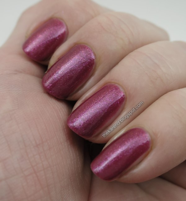
As I mentioned in Monday's post, most of the Essie Expressie line is made up of cremes, which I bought several of because of course I did. There are a few shimmers in the line as well, and I'm kicking off today's post with the one I bought: Mic Drop-It-Low, a purple-leaning deep pink, or as Essie describes it on their website, a "shimmering magenta pink". My swatch is two coats. I was happy to see that the shimmer shows on the nail even in the indirect light of my lightbox.



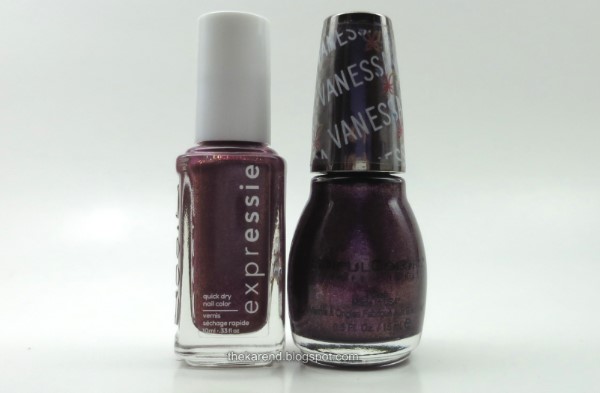
For comparison purposes, I grabbed the closest polish I could easily find (yes, my stash is still in transition to a more organized state), SinfulColors Frozen Rose from the Vanessa Hudgens winter 2018 collection.


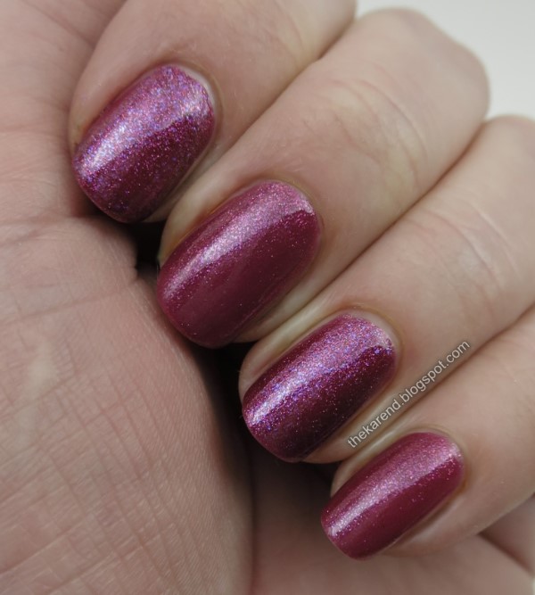
Top to bottom, below (2 coats each): Sinful, Essie, Sinful, Essie. The base colors of these are very close to each other, with the Sinful being perhaps a touch more purple. Frozen Rose has more visible shimmer and its shimmer is more varied, showing both pink and purple particles. The shimmer in Mic Drop-It-Hot is about as dense as the Sinful but it doesn't show on the nail as much (not even in direct light, the photos of which I'm not posting as they don't show anything different than these lightbox ones do).


I also did comparisons for four of the cremes I bought (two of which I used in Monday's nail art): Precious Cargo-go, Taxi Topping, Don't Hate Curate, and Saffr-on the Move.


Before I get to the comparisons, here are these four as Skittles; I'll have to remember this combination come autumn. Top to bottom: Saffr-on the Move, Don't Hate Curate, Taxi Topping, and Precious Cargo-go. All were two coats.


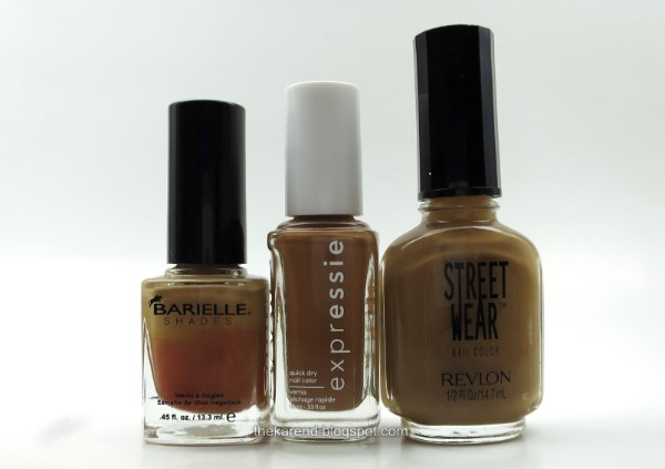
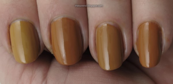
Kicking off the creme comparisons with Saffr-on the Move. Bottles, left to right: Barielle Aura Angora (now suffering from a case of Ugly Bottle Syndrome, aka UBS), Essie Saffr-on the Move, and Revlon Street Wear Burnt.


On the nail, left to right (all two coats): Aura Angora, Saffr-on the Move, Burnt, Saffr-on the Move. No dupes here, though Burnt comes closer, being a touch lighter and less orange than Saffr-on the Move. Aura Angora is rather more yellow than Saffr-on the Move.


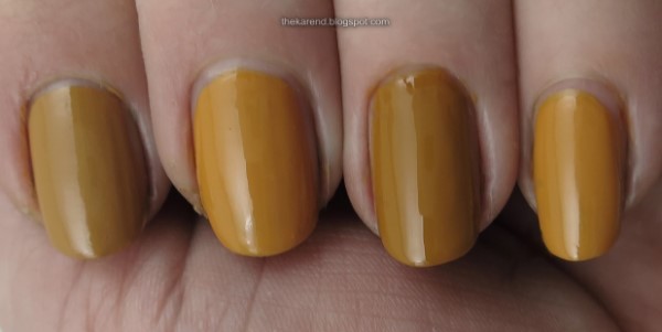
I held over Aura Angora for the next comparison. Left to right: Barielle Aura Angora, Essie Don't Hate Curate, Nails Inc. Hampstead Gardens.


On the nail, left to right: Aura Angora, Don't Hate Curate, Hampstead Gardens, Don't Hate Curate. Again, two coats of each. No matches here. Aura Angora and Hampstead Gardens are both darker than Don't Hate Curate. Aura Angora and Hampstead Gardens are closer to each other than either is to Don't Hate, though Aura looks a bit more muted.


I could only easily find one decent comparison possibility for Taxi Hopping: L'Oreal The Perfect Trench.
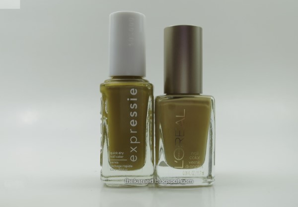


And, nope, not a match. Left to right: L'Oreal, Essie, L'Oreal, Essie (all two coats). The Perfect Trench is ligher and more muted on the nail in comparison to Taxi Hopping; I thought they looked closer than that in the bottles.
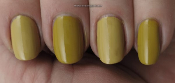


And finally, the greens: OPI Uh-Oh Roll Down the Window, Essie Precious Cargo-go, Zoya Dree.
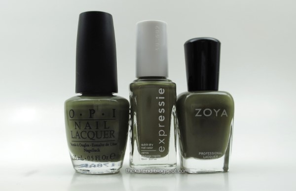


On the nail, left to right (2 coats each): OPI, Essie, Zoya, Essie. The OPI and Zoya are both darker than the Essie and pretty much a dupe of each other.


That I didn't find any dupes for the Essies in the course of swatching for this post makes me feel better about buying more cremes. Now granted, I didn't do an exhaustive search of my stash (see previous note about reorganizing), so I can't be sure I don't have dupes out there somewhere but at least they didn't pop out at me right away.

Tuesday, February 25, 2020

Alter Ego Pretty Hair and Fire Light

I seem to lack the mojo to swatch whole collections lately (though I still have the mojo to buy some, so that part's still working), so today I have two pretty polishes I picked up from Alter Ego last year at Indie Expo Canada.

Pretty Hair was an IEC 2019 exclusive; it's a pink-leaning magenta with lots of silver holo scattered shimmer. It was opaque in two coats. I didn't use any top coat; it was plenty shiny on its own.


Here's a look in direct light:


Fire Light is a topper with flakes of purple, blue green, and magenta in a clear base. Some of the flakies seem to be a bit shifty ... I saw glints of gold at some angles, too. Unlike Pretty Hair, this one seems to be available even now on the Alter Ego website (along with some other flakie toppers that I did not buy but now think I should have).


I put two coats of Fire Light on top of Pretty Hair (no top coat needed with this one, either).


I like these together. I also think Fire Light will look splendid over a lot of my purple and blue and green polishes.