Showing posts with label f: neon. Show all posts

Wednesday, June 17, 2020

Wheel X12: More Green Cremes Including Some Neons

Still working through my green cremes. Today's group has a bunch of neons and near-neons that for which I painted half the tip white to see how much of a difference that would make.


1. Girly Bits Hooperchondriac (2 coats over 1/2 white base)
2. Studio M Field Day (2) [no half white base for this; it was thick and opaque even after I added thinner, yet for all that it dried the most matte as I'd expect from a true neon]
3. Luxe Pop Electrix Electric Kale (2 over half white base)
4. Spoiled Permission to Proceed (2 over half white base)
5. Essie Shake Your $$ Maker (2 over half white base)
6. Sephora X Head Case (3 over half white base)
7. Sephora Formula X Radioactive (3 over half white base)
8. Sally Hansen Xtreme Wear Tan Lime (3 over half white base)
9. Sally Hansen I Heart Nail Art Neon Hot Wasabi (3 over half white base)
10. Wet 'n' Wild Megalast Contact High (2 over half white base)
11. Finger Paints Silkscreen Green (3 over half white base)
12. Sally Hansen Insta Dri Granny Smith Apple (2)
13. Sally Hansen Insta Dri Green Apple (2) [shade number 667]
14. Sally Hansen Insta Dri Green Apple (2) [shade number 632]
15. Sally Hansen Insta Dri I-rush Luck (2)
16. Wet 'n' Wild Wild Shine Frank is Mine (3 over half white base) [so yes, this one fooled me into thinking it was darker than it was]
17. CND Green Scene (2)
18. Catrice I'm Not a Greenager (2)
19. Studio M On the Field (2)
20. L'Oreal Hyde Park (3)


Bottles 1 through 5:


6 through 10:


11 through 15:


16 through 20:


Thursday, July 31, 2014

L'Oreal Limited Edition Neons with Comparisons

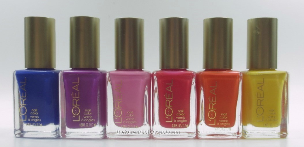
For Summer 2014, L'Oreal released the textured Miss Denim collection plus a six-color Neons group, which is what I have today. Left to right: Fluo Azur, Flashing Lilac, Acid Watermelon, Punchy Lychee, Energetic Tangerine, and Banana Pop.


These are all cremes, and since I have a low tolerance for cremes at the moment, I did not do full hand swatches of these. I Skittled the four warmest and brightest shades together. Top to bottom: Acid Watermelon (pink), Punchy Lychee (red orange), Energetic Tangerine (orange), and Banana Pop (yellow). All were three coats except, surprisingly, Banana Pop, which was two.


I'd call Punchy Lychee a neon, and could see extending that desgination to Energetic Tangerine as well. Both dry to a satin finish, which is characteristic of polishes which contain neon pigments, and both show the slightest hint of visible nail line, which leads me to believe they'd pop over a white base. Acid Watermelon and Banana Pop are bright, yes, but I wouldn't call them neons.

I tried a white base under the last two colors, Fluo Azur (blue) and Flashing Lilac (purple). Fluo Azur was two coats and dried satin, so I'll allow it into the neon club. Flashing Lilac was three coats, and wasn't quite as satin when dry as Fluo Azur so it's on probationary status as far a neon qualification.


I am currently awash in summer cremes, so of course I did some comparisons. First up, I have a perfect illustration of cool versus warm pink with L'Oreal Acid Watermelon and Maybelline Pink Punch (from this summer's LE Bleached Neons).


Alternating below, starting with L'Oreal on the left. The Maybelline looks practically orange when sitting beside the cool-toned L'Oreal.


Next up, L'Oreal Punchy Lychee versus Julie G Miami Beach (from this summer's Cruise collection). Top to bottom: Miami Beach 1 coat over white, Punchy Lychee 2 coats over white, Punchy Lychee three coats alone, Miami Beach two coats alone. These are a bit closer than the pinks I compared above, but in no way are they dupes. Miami Beach leans more pink and is a true opaque creme; the white base makes pretty much no difference. Punchy Lychee is more red, and the white base makes a definite difference.


Top to bottom: Miami Beach one coat over white, Punchy Lychee two coats over white, Punchy Lychee three coats alone, Miami Beach two coats alone. These are a bit closer than the pinks I compared above, but in no way are they dupes. Miami Beach leans more pink and is a true opaque creme; the white base makes pretty much no difference. Punchy Lychee is more red, and the white base makes a definite difference.


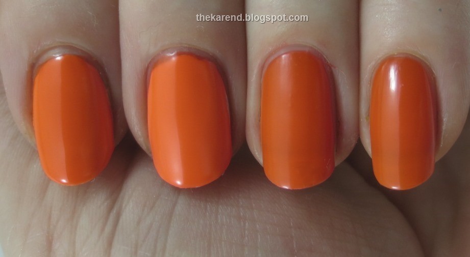
L'Oreal Energetic Tangerine got matched up with OPI Juice Bar in a battle of the oranges.


Left to right: Juice Bar two coats over white, Energetic Tangerine ditto, Energetic Tangerine three coats alone, Juice Bar ditto. These are pretty darn close. The L'Oreal is a smidge brighter over white and a smidge less shiny, but I don't see that one would need both.


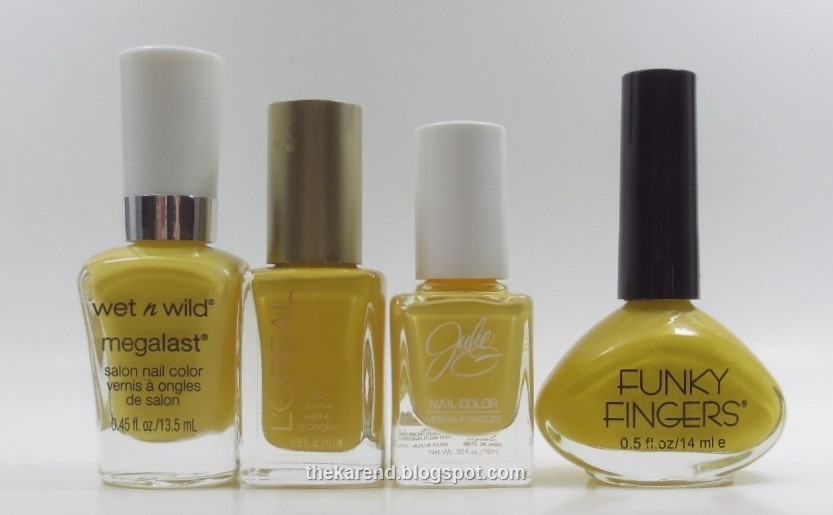
I pulled a full complement of yellows to compare: Wet 'n' Wild A Venice Day, L'Oreal Banana Pop, Julie G Canary Islands, and Funky Fingers Alex's Lemonade.


Top to bottom: Wet 'n' Wild two coats over white, L'Oreal three coats alone, Julie G three coats alone (almost two), Funky Fingers two coats alone (this one is lemon scented when dry). I put the Wet 'n' Wild over white because I had previous experience with it and knew it to be more neon-esque than these others. The Wet 'n' Wild is the brightest of these and the L'Oreal the deepest. The Julie G leans ever so slightly pastel, and the Funky Fingers comes the closest to what I think of as a pure yellow.


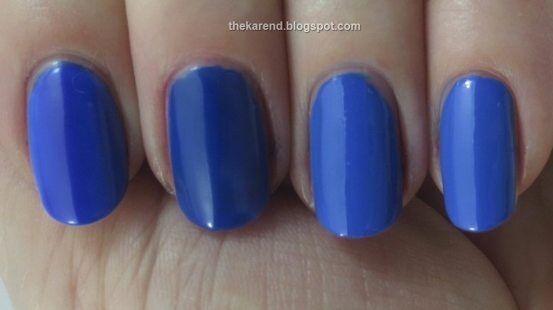
For the blues, I grabbed Sally Hansen Xtreme Wear Pacific Blue—the old creme version, which was recently replaced by a shimmer (see Nouveau Cheap for the story)—and NYC Ocean Blue (from this summer's City Samba display).


Left to right: L'Oreal two coats over white, L'Oreal three coats alone, NYC two coats, Sally Hansen two coats. The L'Oreal shows its neon-ness here, popping over the white and drying less shiny than the two true cremes. Alone, it's darker than the other two blues; over white, it's still a tad darker. They NYC looks to have a touch less white in it than the old Pacific Blue, but it's close enough that it would make a fine substitute if you didn't stock up on Pacific Blue when the panic hit the nail-o-sphere.


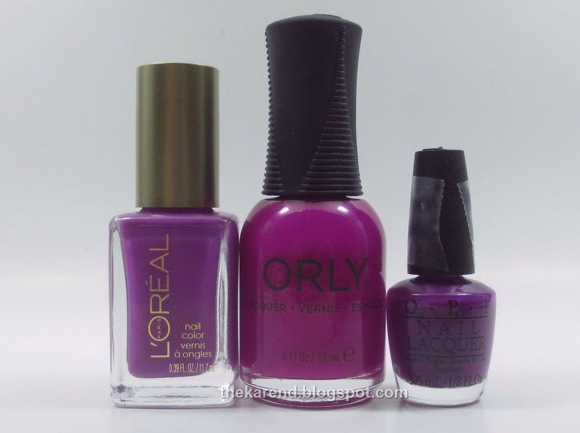
In the purple category, I reached for Orly Purple Crush and OPI Push and Pur-pull (yes, that's cello tape you see on the handle; since the minis don't have names printed on them, I cut the names off the box and tape them on).


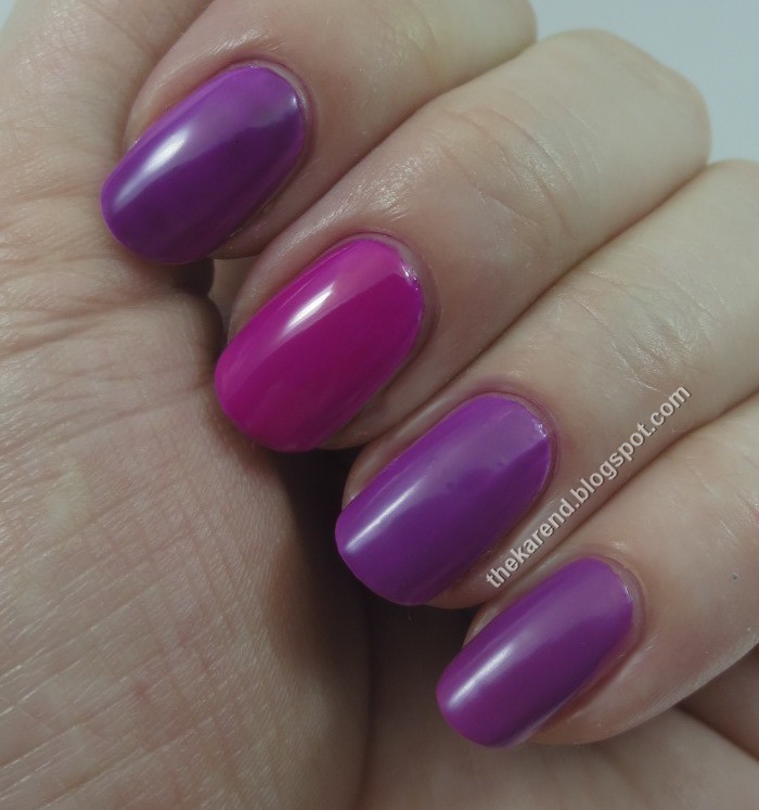
Top to bottom: OPI three coats over white, Orly three coats over white, L'Oreal three coats over white, L'Oreal three coats alone.


Obviously the Orly is the odd polish out here, being much closer to pink than purple. The OPI is close to the L'Oreal; since having the Orly in between makes it hard to see that, I did a contortion to get them side by side below. I was surprised that the white base didn't make more of a difference to the L'Oreal.


So I'd score L'Oreal a three and a half out of six as far as the neon-ness of their Neons. There aren't any bad colors here, but there aren't any groundbreakers either.

Monday, June 2, 2014

Girly Bits Customs and Coming Attractions

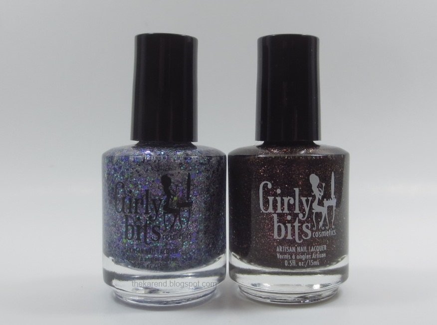
On Friday in my textured polishes post to wrap up the week, I shared a Girly Bits polish from the collection that just opened for pre-order. Today I have another two colors from that collection, but first, I want to share the two custom mixes I did during the polish making workshop, Party at Pam's and Unexpected Brown.


Party at Pam's is my glitterbomb. Near as I can recall and piece together from my photos, I put these glitters in it: purple 1mm, light purple hex .375mm, purple holo .375 and .2mm, teal holo .375mm, lime holo .8 and .2mm, silver less than .1mm. As for the proportions, I wanted the purple to dominate, so I used more of those glitters. The lime was my accent color, so I used the least of that.


Party at Pam's has a clear base and I meant it to be a layering polish, but I did swatch it on its own just to see what that would look like. This is three coats of Party at Pam's on its own, with no topcoat so i could see how bumpy it would be (answer: somewhat). The accent nail is Party at Pam's in a jelly sandwich with L'Oreal Berry Nice (two thick coats of the L'Oreal, one of Party, one more of the L'Oreal). I loved how it looked in the sandwich, I must say.


Here's how Party at Pam's looks over L'Oreal Royalty Reinvented (accent nail) and Sinful Colors Mesmerize (with topcoat this time).


Same combination outside in the sun:


And outside in the shade:


I also tried Party at Pam's over green; here it is on top of China Glaze Def Defying (accent nail) and Nuance Prickly Pear, again with topcoat, again in the shade:


Overall, I'm pretty happy with Party at Pam's but I think I may have overdone it with the eensy weensy silver holo glitter, as in some lighting conditions, all that silver distracts from the colored glitter.

Whereas Party at Pam's is pretty close to what I imagined beforehand that I'd want to make if I had access to a fully stocked polish making studio, my second creation was inspired by things I saw that day, namely a packet of pretty bronze glitter on the table and the other ladies working with colored bases. I'd gone multi-colored with my first creation, so I wanted to keep this one more monochromatic—yet it still ended up having a touch of purple in it, because I do love my purple. Here's Unexpected Brown, so named because brown was not at all what I thought I'd end up making before our workshop started.


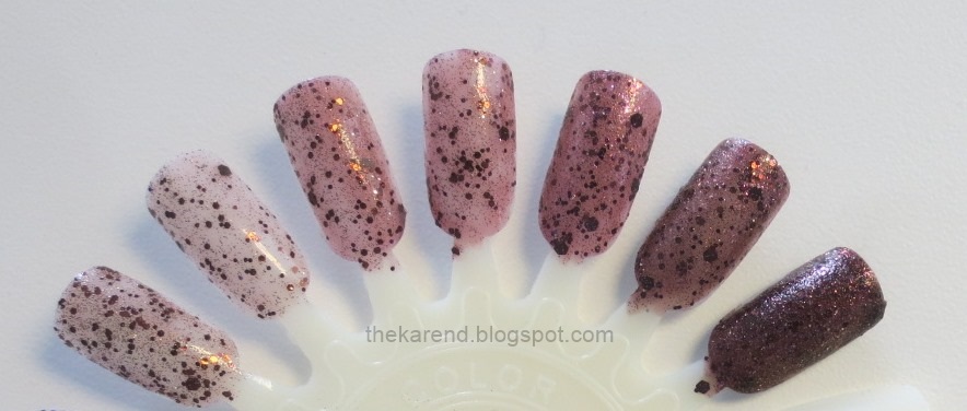
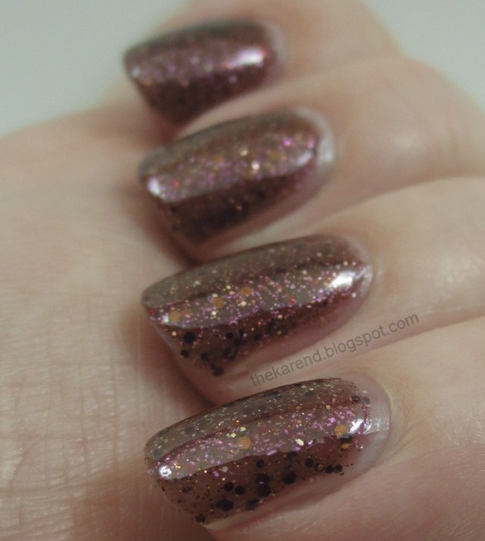
To the original bronze .625mm glitter that caught my eye, I added .1mm glitter in dark brown and gold, .2mm in gold, 1.5mm in brown, .375mm in maroon, and some violet shimmer pigment. I also tinted the base with green and red (to make brown) and black (to darken the brown). This wheel shows the progression from left to right as I started with a very light tinted base and went darker, then tweaked to go less red and more brown. Last tip on the right was a test to see if I could build this to opaque in reasonable number of coats.


Here's Unexpected Brown at three coats plus topcoat; it's definitely jelly-esque as the glitter does show nicely, but it's also opaque enough that I consider three coats full coverage.


In low light (and sunlight, though I didn't get any decent photos of that), Unexpected Brown gets a sort of polka dot look to it, as the larger dark glitters pop from the lighter base color.


As I was swatching, Unexpected Brown was reminding me of some other polish but I couldn't think of which one exactly; finally I decided it was Oopsie Daisies Ganache (scroll down in that post); it's the same brown jelly base with brown glitter idea, though Ganache has a different glitter mix and no violet pigment.

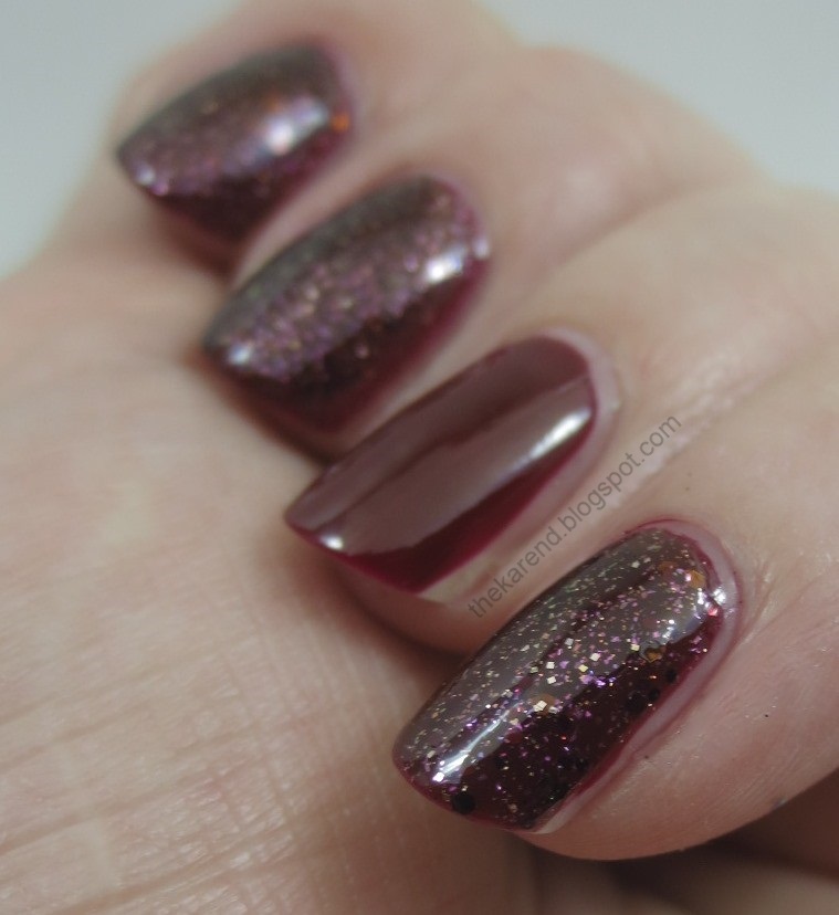
Unexpected Brown is sheer enough that it can be layered, too; I tried it over Revlon Top Speed Seduction (left unlayered on my accent nail). The darker glitters blend into the base color, leaving the lighter glitters and the purple pigment to take center stage.


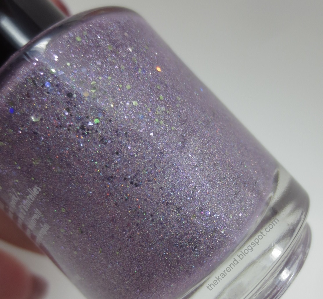
Enough about me and my creations, let's look at some polishes created by someone who really knows what she's doing. First up is Girly Bits The Power of Love, from the 80s Girl Bands collection that opened for preorder at noon today. (Since the first song that pops in my head when I hear "The Power of Love" and 80s is Huey Lewis and the News, who were not girls, I had to read the lyrics quoted on the website to figure out this is referencing Jennifer Rush.) This was one of the many bottles I bought after the workshop. It's a warm lilac with shimmer, holo shimmer, and small and large teal and silver holo glitter.


I used three coats of The Power of Love plus topcoat for my swatch.


In the sun, the shimmer and holo really shine:


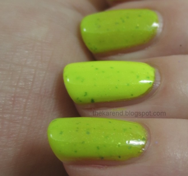
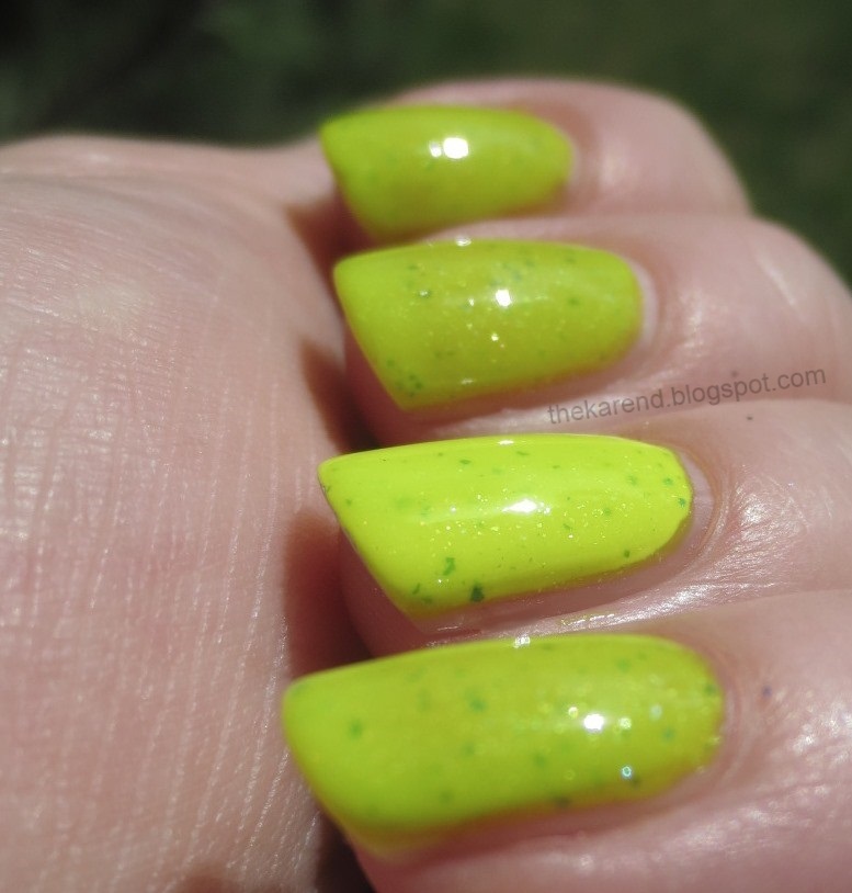
Finally today I have another 80s Girl Bands color, Supersonic, which Pam kindly gave me for review as a gift of my choice with purchase. This is a neon yellow green jelly with gold and blue shimmer and blue flecks. I chose this one because I'd picked it up and put it down multiple times while deciding what to buy; it's so bright and I don't have anything like it, yet I wondered how much I'd wear it since neon green is not a staple in my wardrobe.


If you want just a very bright look, you can wear Supersonic on its own at three coats; there might be a little visible nail line but the color is so eye catching I don't think anyone will notice. If you want a crazy eye popping bright look, layer two coats over white, as I did on my accent nail.


Supersonic shimmering in the sunshine:


All 10 colors in the 80s Girl Band collection are available for pre-order now on the Girly Bits website for $10 a bottle (I think the regular price will be $11.50 after the pre-order ends on June 6th, but I could be wrong about that). Looking at that page, I see a couple more I wish I'd brought home with me, so you may see those swatched here later this summer if I succumb to temptation as I so often do.

Monday, July 22, 2013

Nicole by OPI Neons

One of the things I shared in last week's display post was the Nicole by OPI Neons display, which has two sets of mini polishes (and full size bottles of Top Coat Plus). I was fortunate to receive both sets of minis for review.

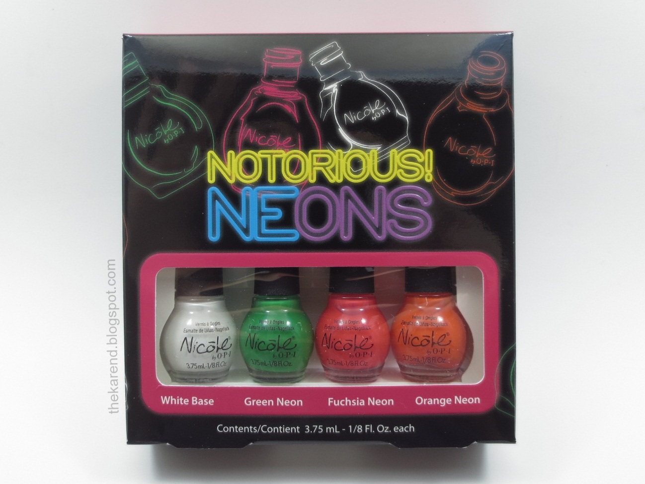
Let's start with the Notorious Neons set, which has the White Base with Green Neon, Fuchsia Neon, and Orange Neon.


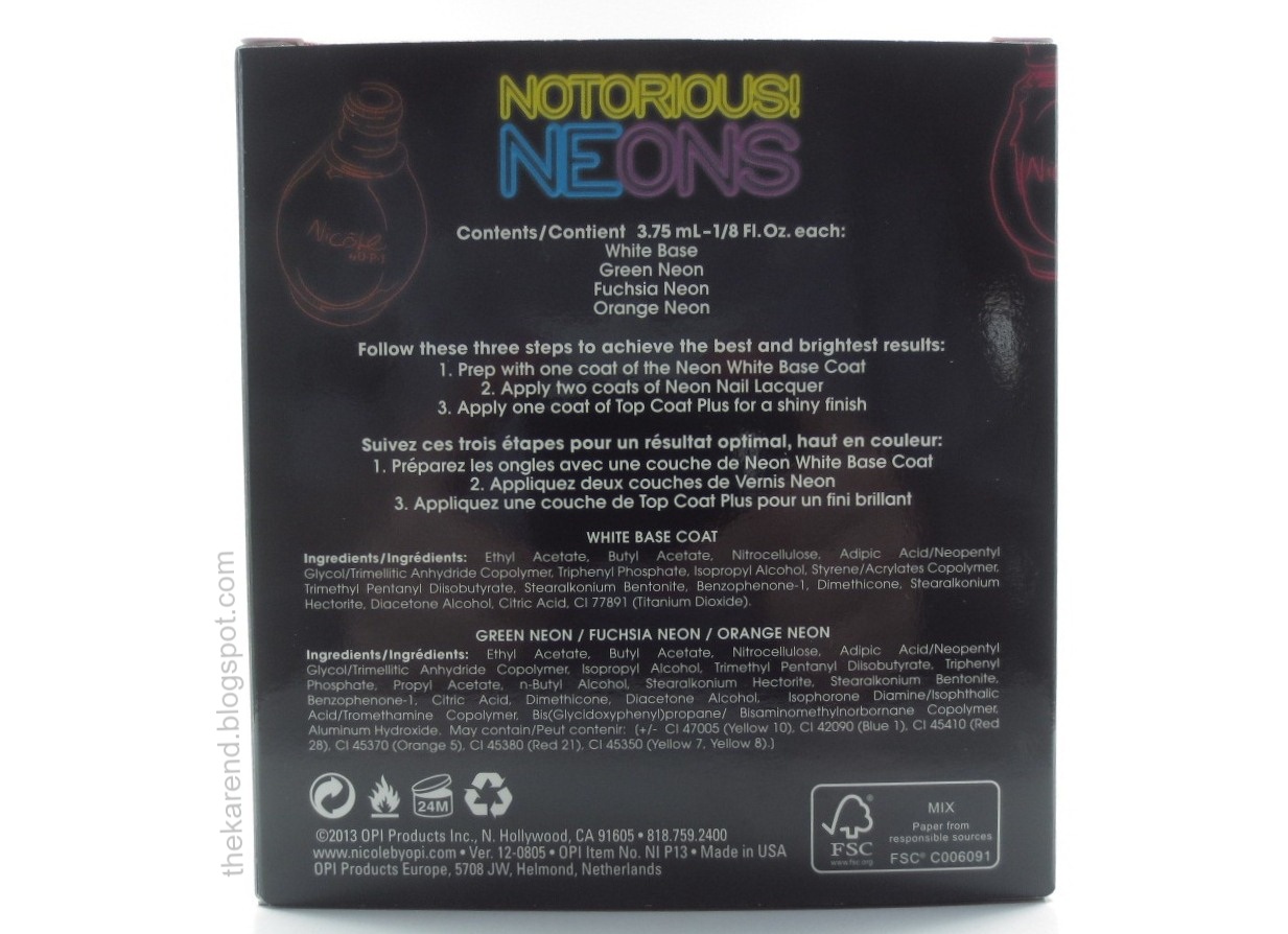
Here's the back of the box, with directions and ingredients:


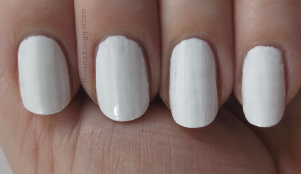
The white base wasn't as self-leveling as I would have liked, but it was fairly opaque, which I suppose is its main job. I did find two coats was necessary to get it even enough for my liking.


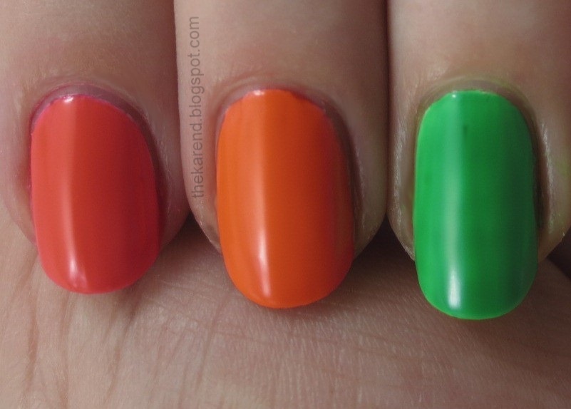
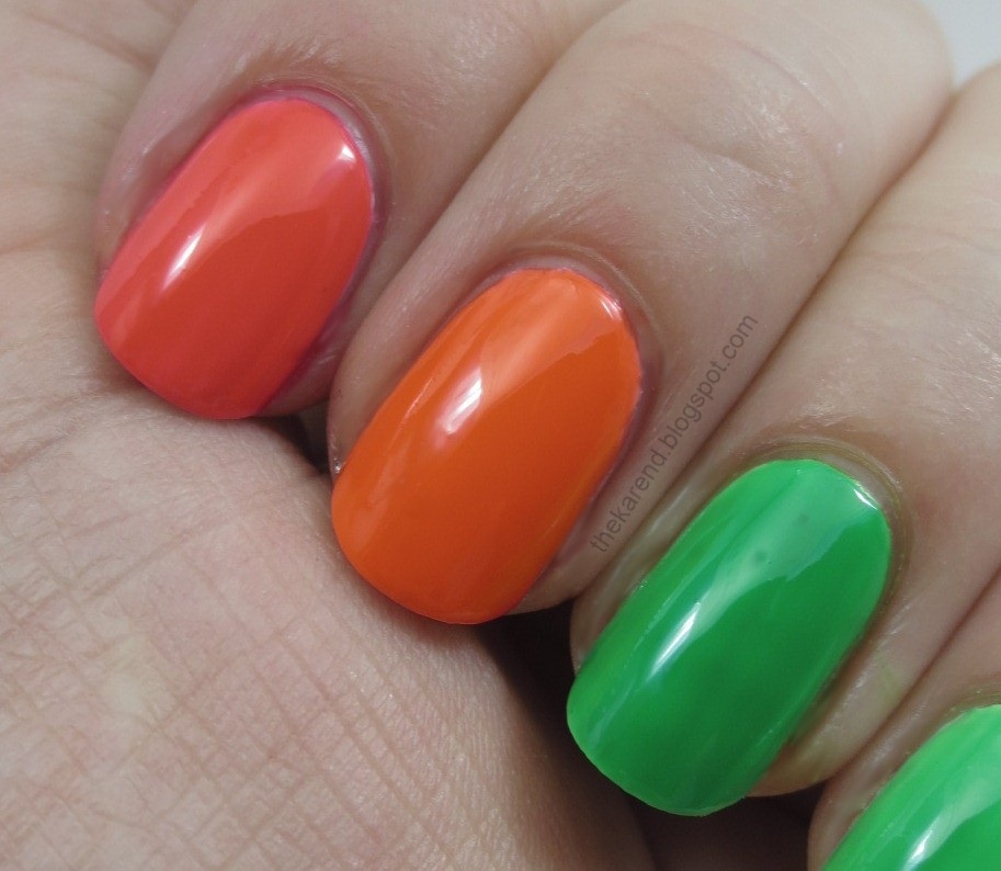
I did Skittles swatches of these because the bottles are so tiny (3.75 ml), and I didn't want to use them up too much when I wasn't going to be wearing them very long. Left to right below (all over white): Fuchsia Neon, Orange Neon, Green Neon. These are without topcoat, and you can see the typical satin finish most neons have.


The one called Fuchsia is does not resemble any idea of the color fuchsia I've ever had. It's clearly an orange red, nothing to do with purpley pink at all (well, other than it's got red in it). I would have called it Coral Neon or Tomato Neon (as they seemed to want to stick with one word colors to go with the neon part of the name). I found the green a bit streaky; I really should have added another coat to even it out. (All of the colors here are three coats over the two coats of white.)

Here they are with topcoat on them:


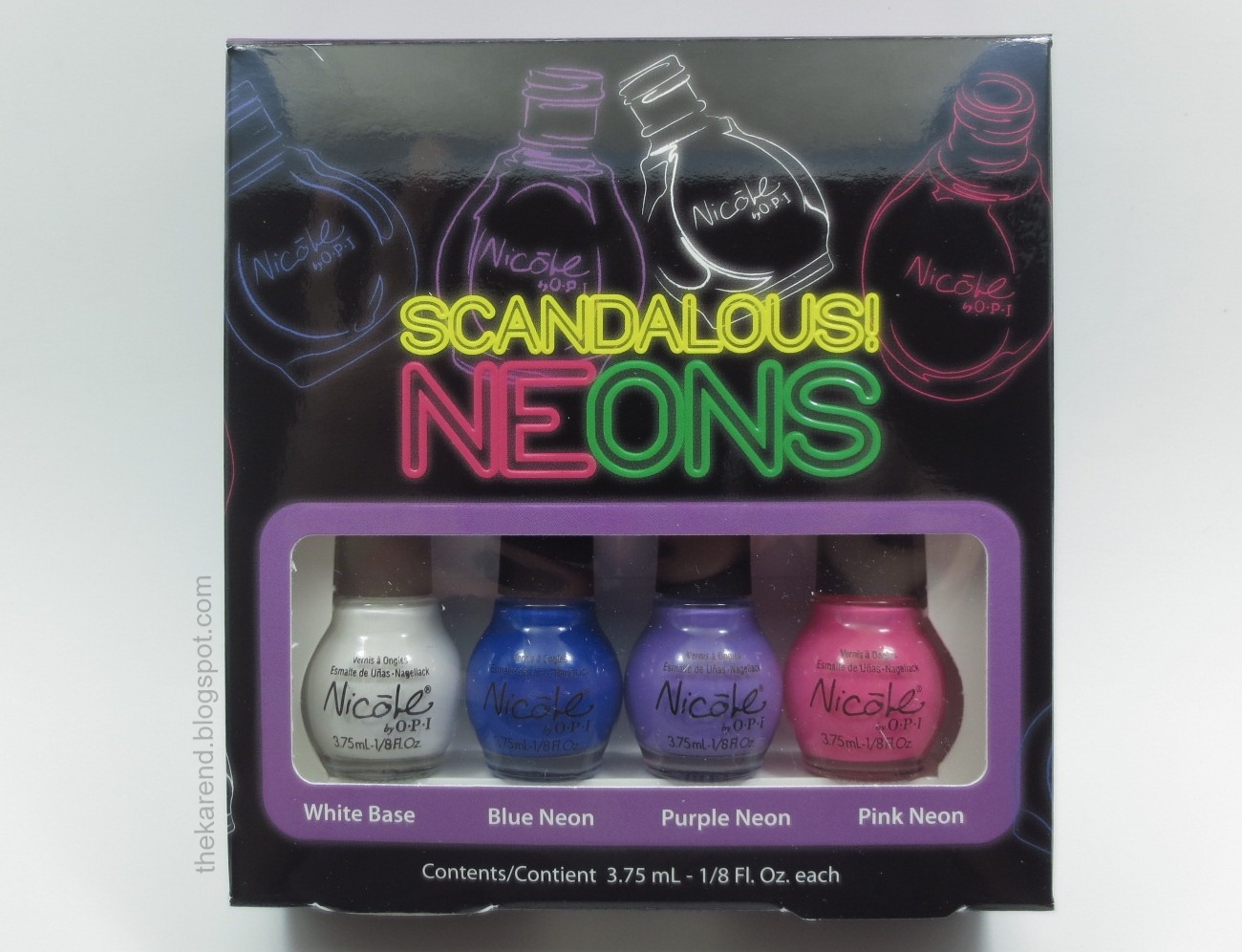
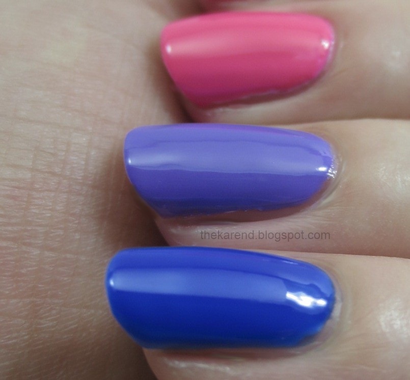
The second set is Scandalous Neons, which has the same White Base along with Blue Neon, Purple Neon, and Pink Neon.


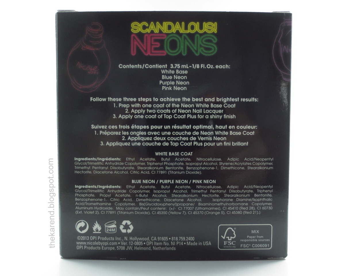
For the sake of completeness, here's the back of this box (the ingredients are slightly different than the first set due to the colorants):


Left to right below: Pink Neon (alone), Pink Neon (over white), Purple Neon (over white), Blue Neon (over white). None of these are particularly neon to my eyes, though the white base does brighten them up (and I like the Purple Neon very much just for the color). Pink and Blue are three coats of color; Purple is two.


As mentioned in my display post, I saw these at Meijer, but my understanding from the press release is they should also be showing up at CVS, Duane Reade, HEB, Kroger, and ShopKo in the U.S. ($10 per set) and Loblaw, Jean Coutu, Rexall, London Drugs, and Shoppers Drug Mart in Canada ($12.50 per set). I don't see anything about these sets on the Nicole by OPI website but they have popped up on the NOPI Facebook page.


The polishes shown in this entry were provided free for review purposes. The content of the entry was not dictated by the provider.