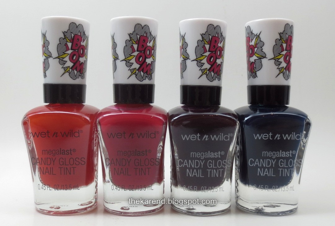
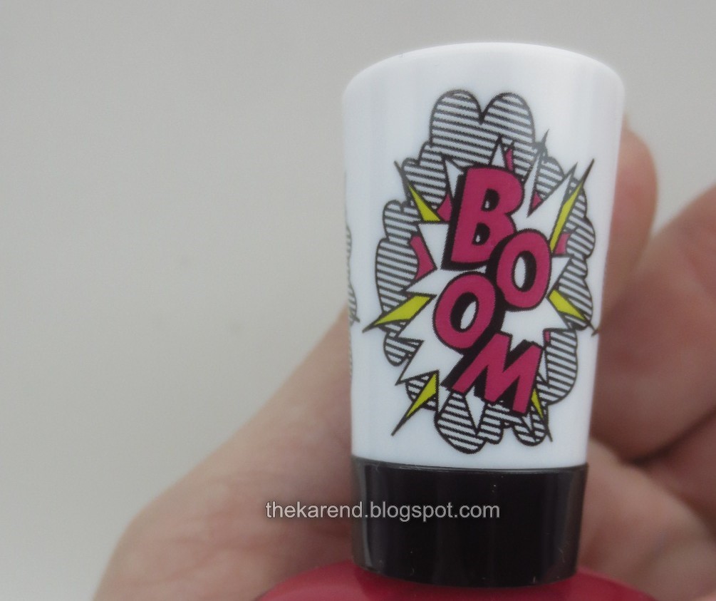
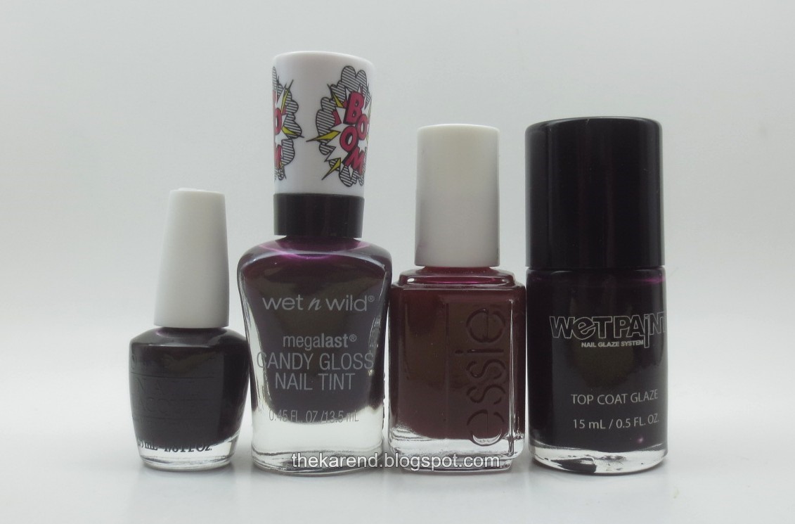
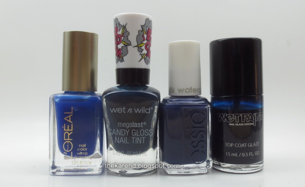
Unlike the regular black handles for the Meglast line, these have white ones with a Boom! design on them (which, if you've been listening to the Hamilton soundtrack as much as I have, will give you an earworm. Boom! Goes the cannon...)
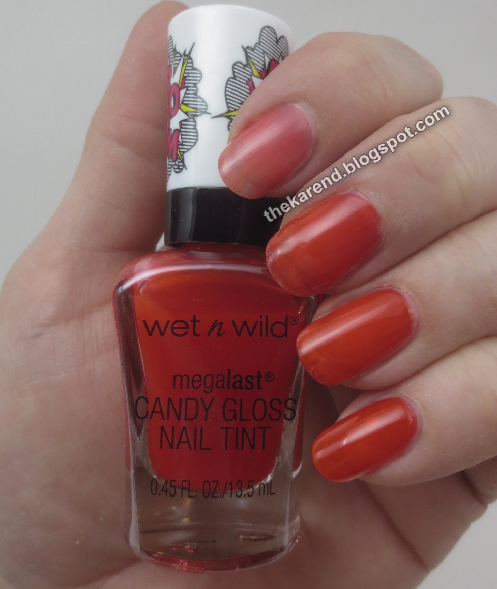
Floral Support is a red orange buildable jelly. Below, starting at top, is one thin coat, two coats, three coats, then four. There is some phantom dirt line (as always, thanks to Lizzy for that term), which didn't please me, but I did like the formula; one coat was only very slightly streaky, and it self-leveled perfectly at two coats.
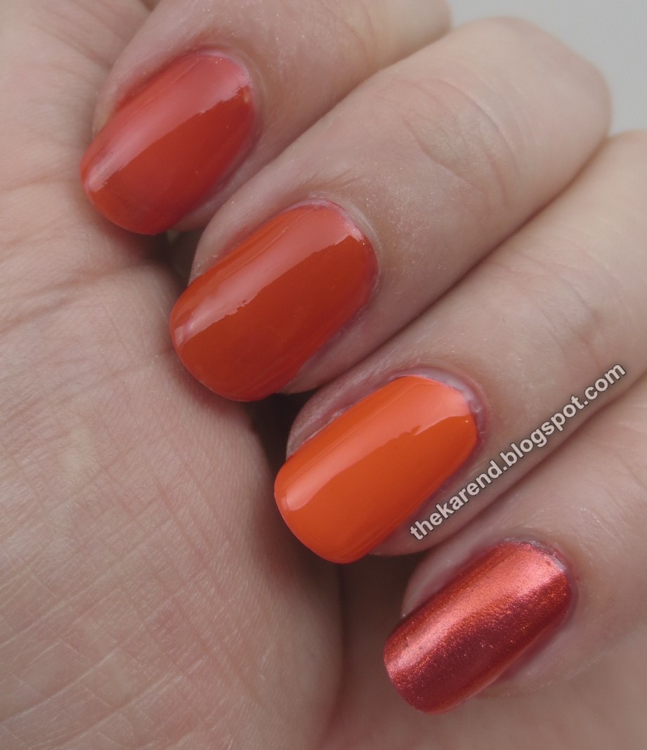
Of course I tried it over different bases. Top to bottom below: two coats of Floral Support alone, over skintone (Sally Hansen Complete Salon Manicure Cafe au Lait), over white creme, over silver metallic. I was surprised how Halloween orange it looked over white.
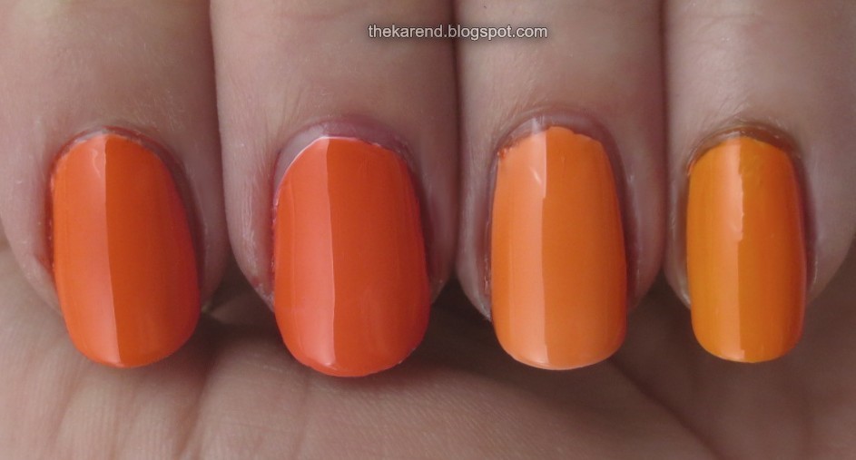
Could I resist doing comparisons? I could not. Left to right: OPI Chromatic Orange, Wet 'n' Wild Floral Support, Essie Art New-Beau, Wet Paint Orange Julia's.
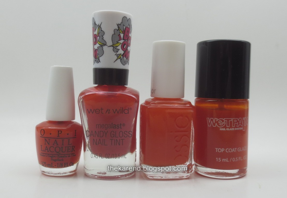
On the nail over white below, in same order as bottles above. Floral Support is a pretty good match for OPI Chromatic Orange, for a price that's 80% less. It's less yellow than either the Essie or the Wet Paint.
Edie in Pink is, unsurprisingly, a pink jelly. Below, top to bottom, two coats of it alone, over skintone, over white, and over silver. The surprise here was how it looked over silver, taking on a much more purple-toned hue.
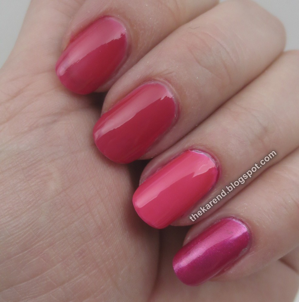
For comparison's sake: OPI Pen & Pink, Wet 'n' Wild Edie in Pink, Essie Love Sheen, L'Oreal Jolly Lolly.

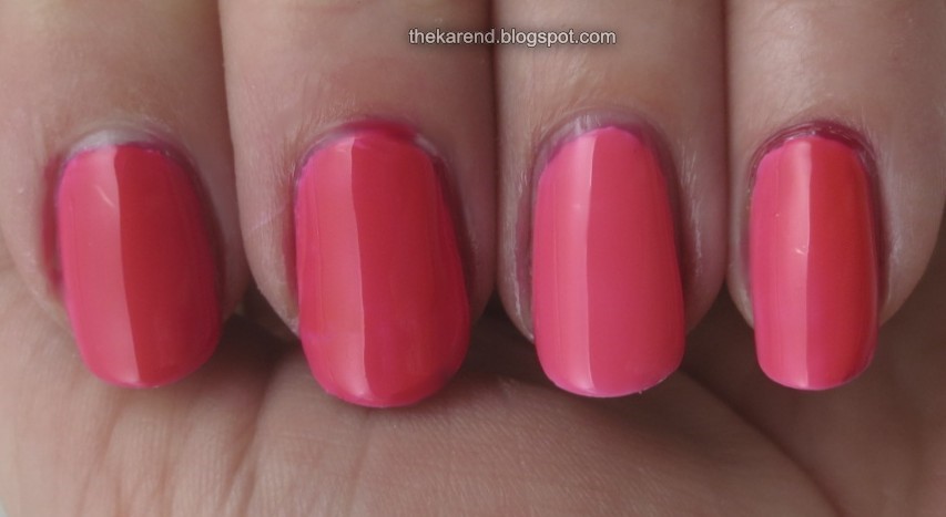
Layered these over white; below they're in the same order as the bottles above. As with the oranges, the Wet 'n' Wild is a close match for the OPI. It's not too far off the L'Oreal, just a touch darker. It's more than a touch darker than the Essie.
One Grape or Another is a purple jelly. You know the drill by now: top to bottom, two coats of it alone, over skintone, over white, and over silver. I liked it best over silver, though over white it's certainly nice and bright and cheerful.
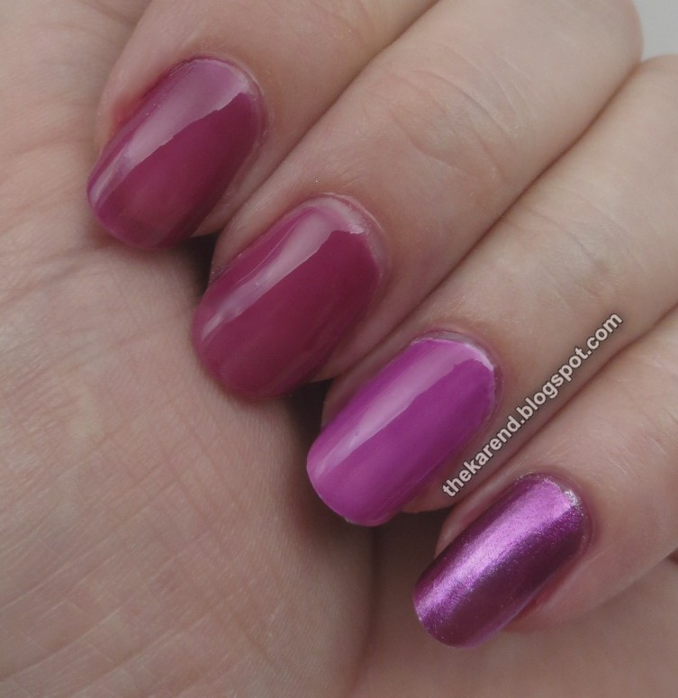
The purple comparison lineup: OPI Purple Perspective, Wet 'n' Wild One Grape or Another, Essie Highest Bidder, and Wet Paint Jazzberry Jam.
You know what's next: on the nail over white, same order as the bottles. Here, nothing is a close match for anything else. Yay, more purples!
A Case of Blue is the last in the quartet; it's a blue jelly, of course. Say it with me now: top to bottom, two coats of it alone, over skintone, over white, and over silver. I liked this one over both white and silver; alone or over skintone it looked a little muddy to me.
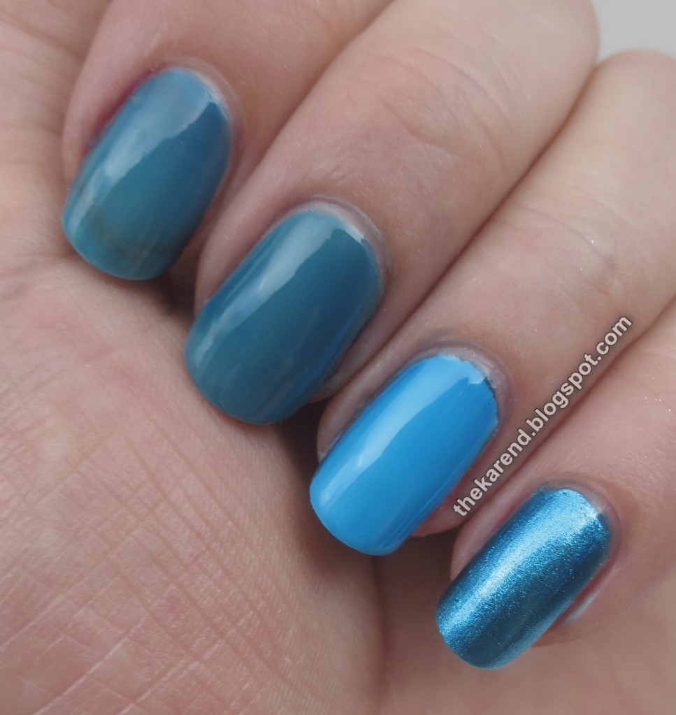
Blues for comparison purposes: L'Oreal Miss Pixie, Wet 'n' Wild A Case of Blue, Essie Point of Blue, and Wet Paint Waterfalling for You. (I didn't pull the OPI Color Paints blue, Indigo Motif, as I remembered from my jelly comparison post that it was more opaque than most jellies.)
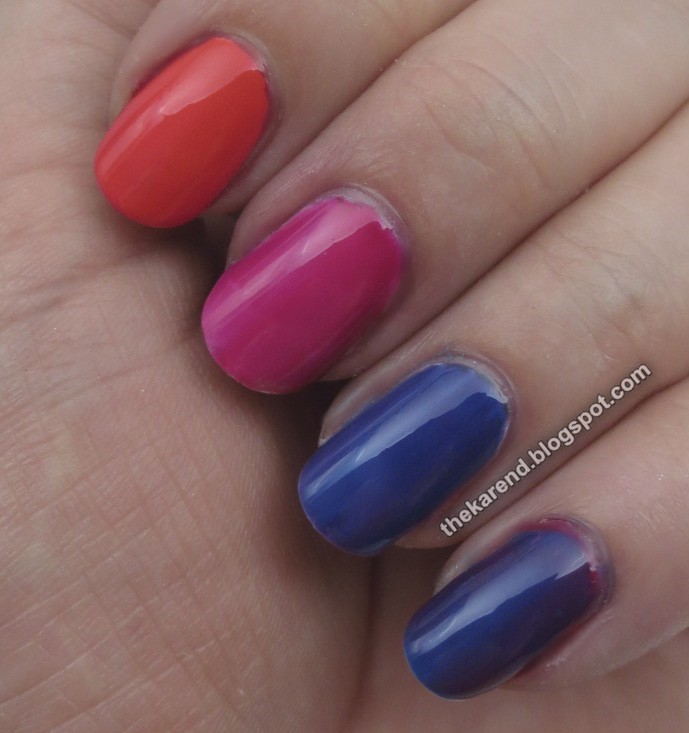
The blues above on the nail over white below. Like the purples, no matches here. The Wet 'n' Wild come closest to the Wet Paint, but it's lighter. It's more warm-toned than either of the other two.

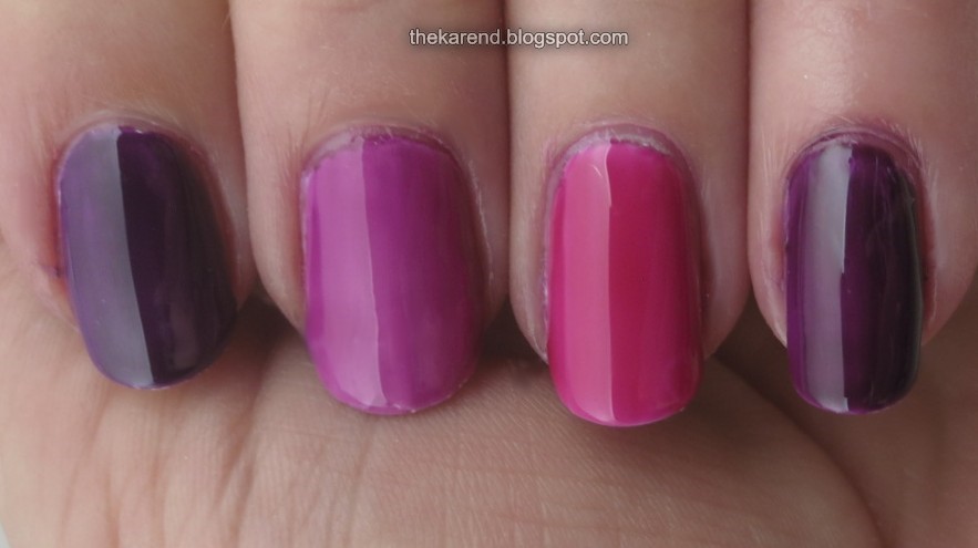
Before I put these away, I tried layering them with each other. Top to bottom, over white: Floral Support topped with Edie in Pink makes a pretty coral hue, Edie in Pink topped with One Grape or Another is not that different than One Grape alone over white, One Grape or Another topped with A Case of Blue yields a deep blurple, and A Case of Blue topped with Edie in Pink makes a slightly different blurple.
Overall, I'd say these jellies are a good buy. Inexpensive, decently behaved, and fun to play with. Sure, they're about a year behind the pricier brands, but they're not going to look dated like a crackle might (not that I let that stop me from wearing crack if I want).

Cool! Thanks for comparing them to the other brands. I hope I can find these WnW versions in my local stores—seems like most of the Walgreens, CVS, etc. near me tend to pass on a lot of these limited edition collections. 😑
ReplyDeleteIt`s hard to find a store selling this brand in Europe, but I got 1 set from my boyfriend :)
ReplyDeleteomg I haven't seen these anywhere! Now I'm going to have to go on a hunt. >_>
ReplyDeleteWelcome back! I didn't say before, but I am sorry for your loss. Thanks for a great comparison post. I guess I will skip these since I already have some minis of the OPI Color Paints, and they are so close. But the pink is tempting me....
ReplyDelete