Friday, May 31, 2013

Essie Neon Collection for Summer 2013

I'm sure those of you who are regular readers will not be surprised that I grabbed all six of the colors in this summer's neon collection from Essie. It was hard enough for me to restrain myself back in the days when the brand was only in salons and select beauty supply stores; since they moved into mass market retail outlets like Meijer and Rite Aid and CVS, I don't even have to go the slightest bit out of my way to have multiple chances each week to scoop up these pleasingly square bottles. I did manage to exercise one small bit of self control: most of the display variations for this collection have Essie Blanc in them, to use as a base. I did not buy any of that white, just the six colors: Boom Boom Room, Bottle Service, Saturday Disco Fever, DJ Play that Song, Bouncer It's Me, and Shake Your $$ Maker.


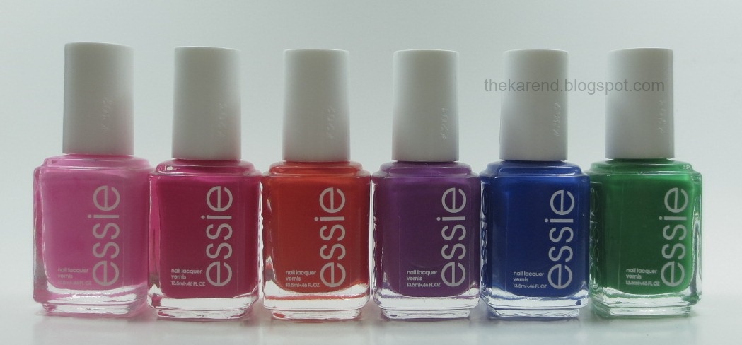
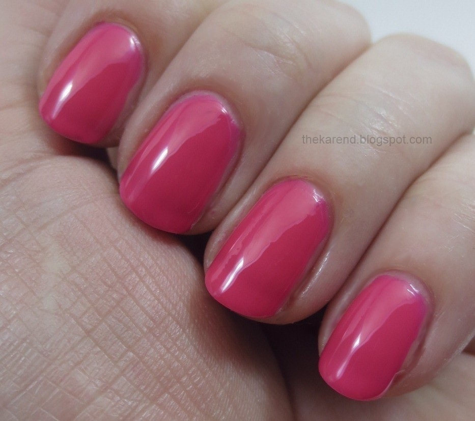
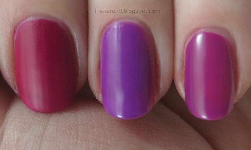
Boom Boom Room, a bright medium pink, doesn't actually seem to need a white base. Here's what it looks like on its own at three coats (I nearly stopped at two, it was so well behaved):


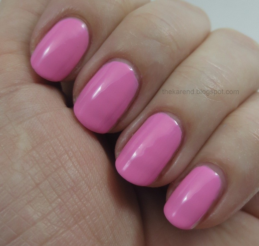
Note that Boom Boom Room doesn't have topcoat on it up there, either, and it's still pretty shiny. This makes me question whether it should be in a neon collection at all, but I can see why from a marketing perspective it would be included, since I know pinks sell. The last two collections (drugstore, not Essie) I've failed to complete are both missing pinks because those shades sold out before I could get them.

I mention the shiny-ness because you'll note coming up that Bottle Service, a hot pink, does not display the same level of gloss as Boom Boom Room. It also does not display the same level of opacity (opaqueness? are both correct? I'd go look it up but I'm so distractable today I fear I'd wander off on the internet and not come back to finish this post today). This swatch is three coats.


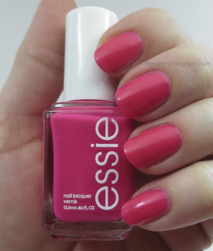
Just to show the difference, here's Bottle Service with topcoat:


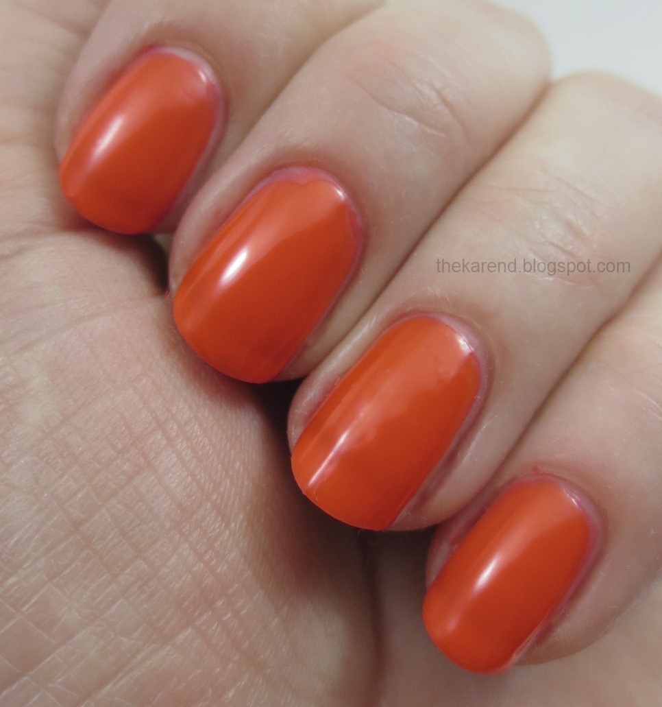
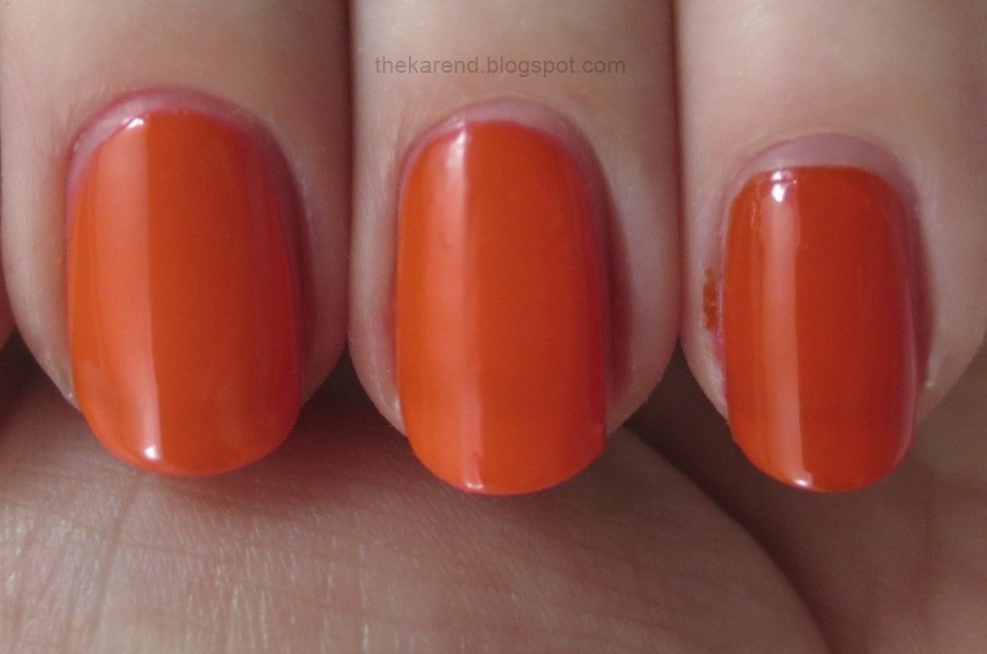
Saturday Disco Fever is a juicy orange. Here's three coats of on its own, and as with Bottle Service, you can see why one might want to wear underwear (white or otherwise):


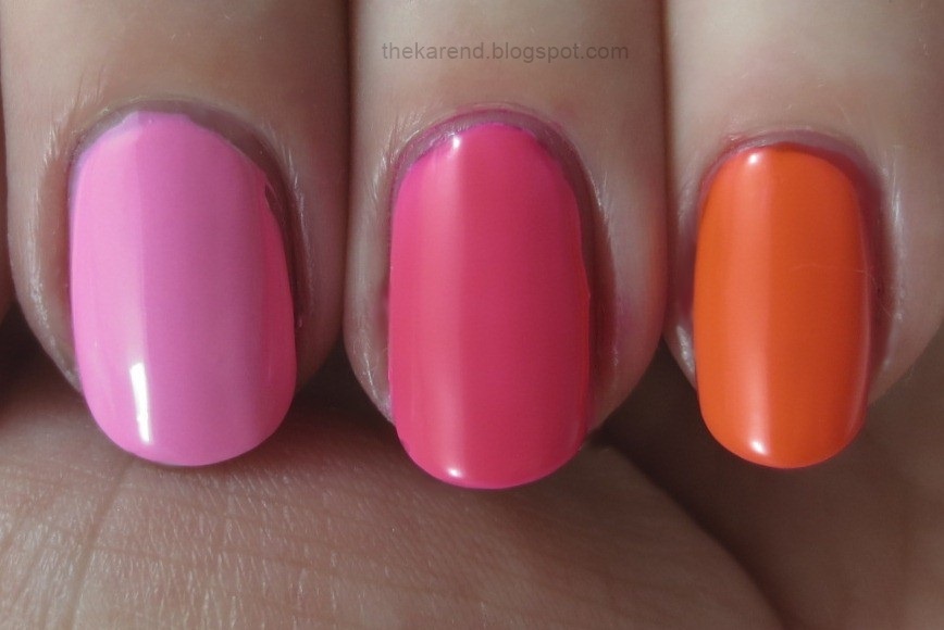
I did stop being lazy long enough to do Skittle swatches over a white creme base, starting with the three warmer hues from the collection that we've just looked at. Over the white, I used one coat of Boom Boom Room (far left) and two each of Bottle Service and Saturday Disco Fever.


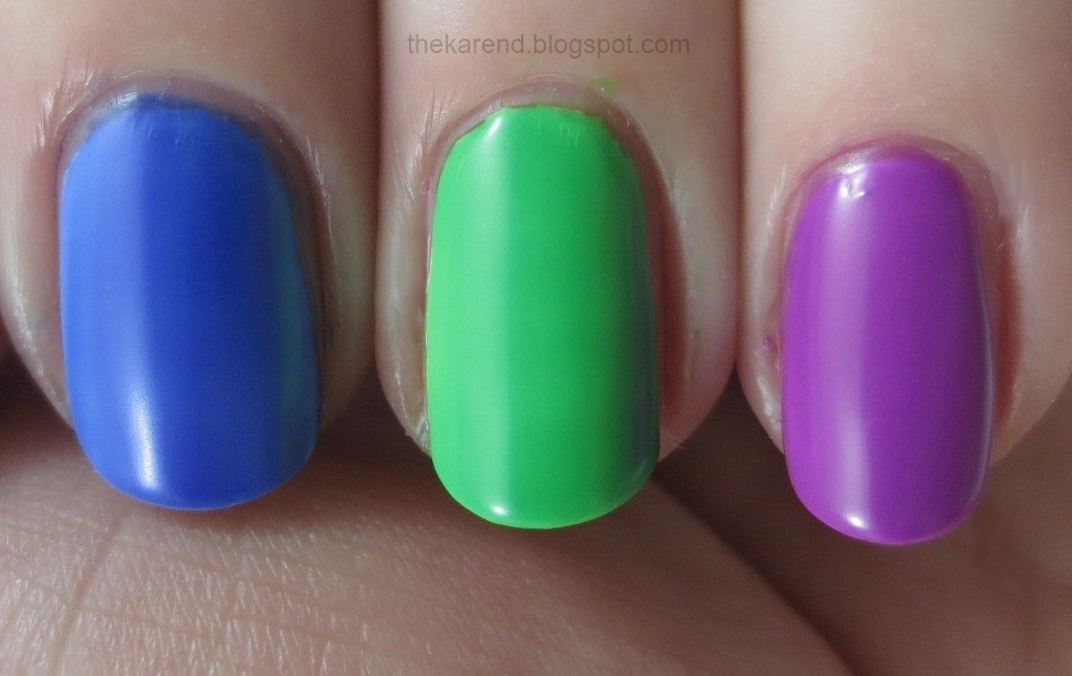
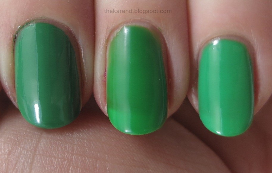
I did the cooler shades Skittles-style over white as well. Left to right below (all two coats over the white): Bouncer It's Me, Shake Your $$ Maker, DJ Play That Song.


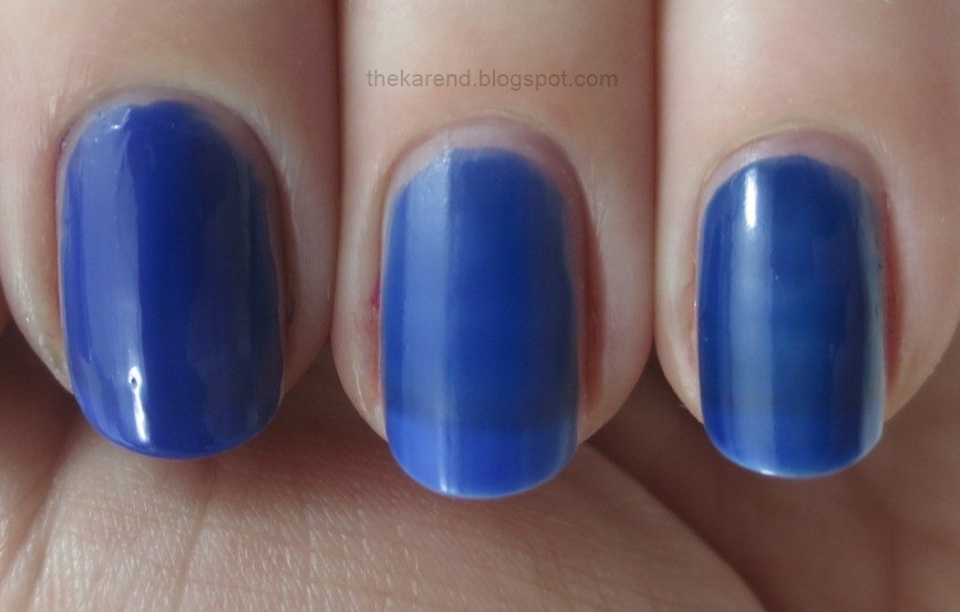
I really should have done the cooler shades full swatches over white, too, as they don't look so great on their own, especially without topcoat. To prove it, here's Bouncer It's Me at three coats—I like the color, but the visible nail line and dull finish, not so much:


Shake Your $$ Maker was slightly better than Bouncer on its own but I don't think I'd wear it this way (this is 3 coats):


I don't even have any swatches to show you of DJ Play that Song on by itself. I know, bad blogger. For proper swatches of all of these colors, go visit The PolishAholic. But wait just a bit, because I've got some comparisons to show you.

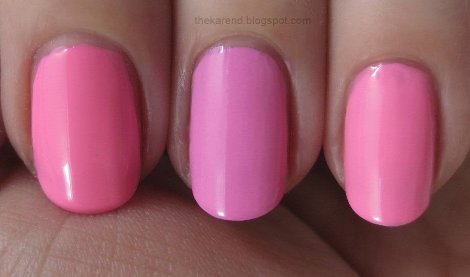
Left to right below (all 3 coats): Color Club Flamingo, Essie Boom Boom Room, Studio M Power Pink. This shows how Boom Boom Room is more purple-leaning than standard bubblegum pinks.


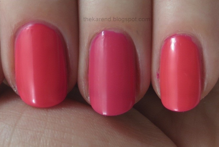
Left to right below (all 3 coats): Finger Paints Pink Perspective, Essie Bottle Service, Pop Beauty Pinkest. Bottle Service looks more rosy-toned and less orange next to typical pink neons.


Left to right below (3 coats of each): Essie Bazooka, Essie Saturday Disco Fever, Sephora Pantone Tangerine Tango Cream. Looks like not much changed between last year's orange neon from Essie and this year's. They're both a touch brighter than the color of the year for 2012.


There is a wide range of purple neons in the world. Left to right below: Essie Perky Purple (2 coats), Essie DJ Play That Song (3), Fergie Dana (3).


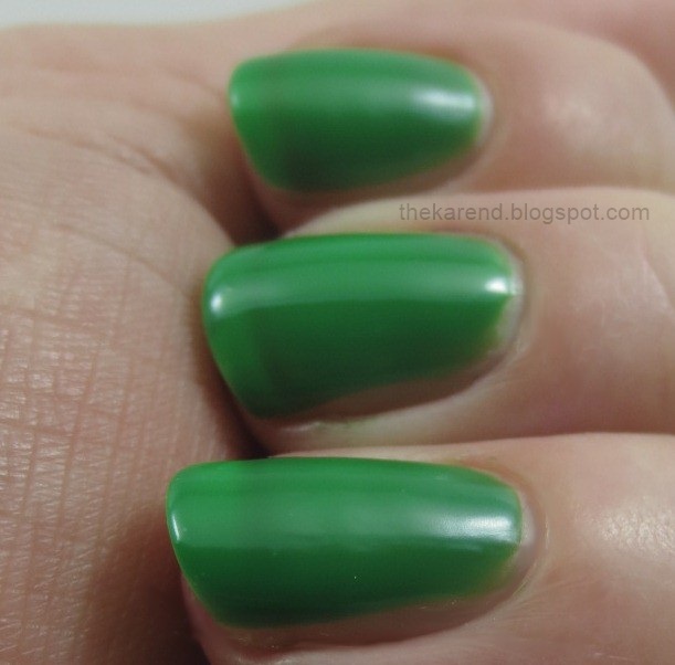
I avoided green nail polish for quite a long time, so my stash isn't as deep in that color as it is in a lot of hues, but still I was surprised I didn't have any really close matches for Shake Your $$ Maker. Left to right below: CND Green Scene (2 coats), Essie Shake Your $$ Maker (3), Barry M Spring Green (2).


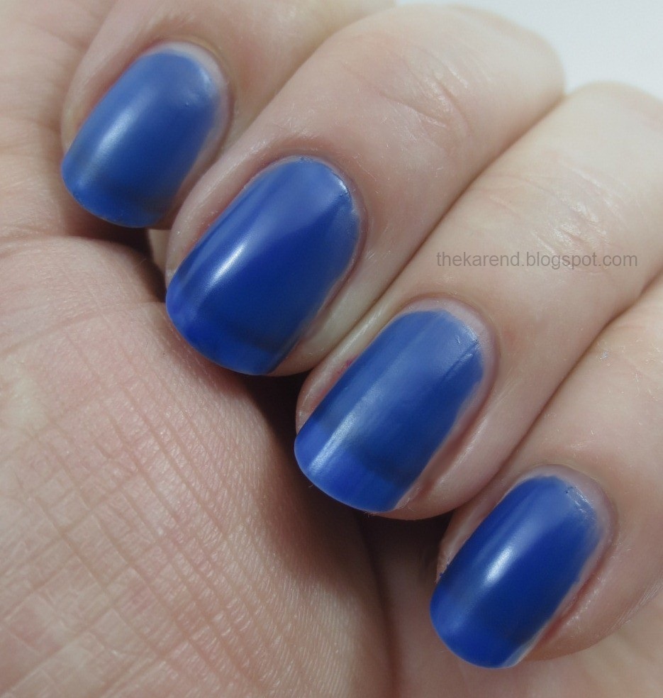
Finally, here's how Bouncer It's Me stacks up against two popular blue cremes from recent years. Left to right below: RBL IKB2012 (2 coats), Essie Bouncer It's Me (3), Revlon Top Speed Royal (2).


From a uniqueness perspective, Shake Your $$ Maker is my pick from this collection.

Just a heads up—next week is my employer's annual conference, so from Monday through Wednesday, I'll be meeting and greeting and moderating and schmoozing instead of sitting in front of my computer screen for hours on end, so I don't expect I'll be able to do any blog posts until Thursday at the earliest. Not to worry if you don't see me around cyberspace for a few days.

Thursday, May 30, 2013

Holographic Comparisons Featuring FNUG

I would have posted this entry at lunchtime today but I did something I fortunately don't do very often: lost my first draft when I failed to save it at any point between when I started typing it and when I accidently closed the document window thinking it was a different window entirely. I guess I have to do dumb stuff like that every so often to remind myself why I hate doing dumb stuff like that. At least I didn't lose the photos this time; those are not so easy to replace as the words. Ah Well, onward to the comparisons I mentioned when I posted the swatches of the FNUG holographics. All of the swatches today are two coats of color over a base coat (Aqua Base for FNUG and Layla, Instant Artificials for all others, no top coat.

Let's start with the silvers. To compare to FNUG Psychedelic, I grabbed GOSH Holographic Hero (which like the FNUGs is in my stash thanks to mrsrexy), Dance Legend T-1000, and Color Club Harp on It.


Here they are on the nail, indoors, in the same order as the bottles above:


And here they are in the sunshine:


The slightly blurrier photo below highlights the differences I saw among these. The GOSH is the least holo (this newer version does not live up to the original GOSH Holographic). The FNUG has the smoothest most complex rainbow, while the Dance Legend is a bit less refined and the Color Club a bit less than that. Still, the Color Club holds up well against its expensive cousins from overseas.


I'll finish off the silvers section with a couple different angles taken in the sun:


Moving along to the light green category, I have FNUG Fantastica, Layla Jade Groove, Urban Outfitters Green Holo, and Color Club Angel Kiss.


On the nail, the differences in the base colors shows up more than it did in the bottles. The FNUG is most yellow-leaning, and the Color Club is nearly blue. Here they are indoors (again in same order as the bottles):


In the sun, all of them have rainbows; I think the FNUG wins, though, as its rainbow seems to have more colors. The Layla takes second place.


The greens in the sun from a different persepctive:


Wrapping up with the light blues, FNUG Futuristica took on Layla Mermaid Spell, Color Club Blue Heaven, and China Glaze Sci Fly By.


On the nail, indoors, the first three show hints of rainbows while the China Glaze (from this past springs Hologram collection) just looks like a metallic-leaning shimmer.


In the sun, the disparity continues. The FNUG busts out the most beautiful rainbow, with the Layla not far behind and the Color Club not far behind that. The China Glaze does look more colorful than it did indoors, but compared to the other three, it's not at all eye catching. The OMG collection proved China Glaze can do great linear holos; they just haven't their last two tries.


The blurry shot below was as holo as I could get the China Glaze to look:


I'll finish up today with a few more shots of the blue rainbows in the sun:


I haven't done the math so I can't prove it, but I believe the Color Club ones win in the dollars per rainbow category. FNUG wins in colors per fingertip.

Wednesday, May 29, 2013

FNUG Holographics

Yep, more holos, this time from FNUG. These are in my stash thanks to mrsrexy at Canadian Nail Fanatic, who included them in a surprise package she sent me with all sorts of goodies. I admit I started in on the edible items pretty much right away, but it took me much longer to get a chance to try these polishes since sunshine and swatching time don't seem coincide very often. There are three colors: Psychedelic (silver), Fantastica (green), and Futuristica (blue). The bottles come in the nail polish version of tantalizing lingerie, sheer drawstring bags that invite one to remove them to see the beauty behind the veil.


On the recommendation of The Holo Queen, I used a holo base coat with these FNUGs (I used Nfu Oh Aqua Base) and no topcoat. All swatches today are two coats of color.

I started with Psychedelic, the silver. The least colorful I could get it to look was in the diffuse light of my lightbox, as shown below:


In regular room light, a bit more direct than the lightbox, the rainbows started to show up for real:


In lower levels of indoor light, there were still rainbows:


In the sunshine, the rainbows were ridiculous:


It was the same story with Fantastica, the green. Lightbox:


Direct indoor light:


Low indoor light:


Sunshine:


Futuristica, the blue one, performed just as well as the other two. Lightbox:


Direct indoor light:


Low indoor light:


Sunshine:


Just look at those rainbows! I am so appreciative that mrsrexy made it possible for me to have these in my stash. Thanks, lady!

I did do some comparisons of these to other holos in my stash, but since this entry is already photo heavy, I'll save those for another blog post in the near future, possibly even tomorrow depending on whether I can stay focused.

Tuesday, May 28, 2013

Skintone Cremes from Revlon and L'Oreal

Yesterday was the Memorial Day holiday here, so I took advantage of the three-day weekend to go visit family in Illinois. For those of you who have been following my Mom's struggles, I'm happy to report that she's continuing to gain strength. She's going to senior day care two days a week and though she's not a fan of all the activities they have there she has made a new friend, so that's good.

Last week when I pulled out two of the shades from Revlon's Naked Tips for the Pacific Coast collection comparisons, I was reminded that I'd never gotten around to swatching those "naked" polishes in the first place, so I gathered them all up. Top row below: Porcelain, Cool Beige, Nude Beige, and Mocha. Bottom row: Natural Pink, Sandy Nude, Natural Tan, and Rose Beige.


I lacked the patience on this particular day to do eight full hand swatches of neutral cremes, but figured that Skittle swatches would at least give a flavor of what these colors look like on a pale rosy person like myself.

Left to right below: Revlon ColorStay Porcelain (3 coats), Cool Beige (3), Nude Beige (3), and Mocha (2). Porcelain surprised me by being so sheer since all of the other polishes in this Naked Tips group are opaque; it almost gives a French mani look. I think I'd be worried about anyone who's skin matched Cool Beige, as it's very cool-toned indeed and a bit greyish. Nude Beige, which we also looked at the other day, is a tiny bit too brown to match me, though I could see wearing this if I wanted a neutral look. Mocha, like Cool Beige, looks a bit ashen to me, like someone would look if the color drained out of their face, but it's a nice taupe creme on its own merits.


The second quartet is Revlon ColorStay Natural Pink, Sandy Nude, Natural Tan, and Rose Beige. Natural Pink is way too light to match my natural pinkness. Sandy Nude we discussed the other day; it's a tad orange for me. Natural Tan has enough pink in it to coordinate nicely with my rosy-ness; perhaps this is the color I'd turn if I weren't prone to sunburn and didn't care about skin cancer. Rose Beige is the pinkest of the collection, so pink that it's about three steps away from being something I'd call mauve.


The Naked Tips are limited edition colors (not sure why since they seem like basic shades to me). I have still seen the display around recently, though, so they're not yet impossible to get.

What I haven't seen in a while is the New York Nudes collection from L'Oreal, as that came out near the end of last summer, but since they were hanging out next to the Revlon colors in my boxes I grabbed them for the Skittle swatch treatment, too. Left to right below: Park Ave Luncheon, Broadway Boogie, Till The Sun Comes Up, Hudson Sunset, Downtown Chic, Brownie Points. (I will register my objection to the use of Till instead of Til only once before moving on.)


Because my four fingers didn't go evenly into the six L'Oreal colors, the first two got two fingers each. Park Ave Luncheon is the rightmost two, with Broadway Boogie filling out the hand. Both of these are three coats each. They're more yellow-toned than any of the Revlons and therefore less compatible with my pink-toned self though I can see them looking lovely on people who are less lobstery than I.


Left to right below: Till The Sun Comes Up (3 coats), Hudson Sunset (2), Downtown Chic (2), and Brownie Points (2). The first is the shade meant for me in this collection. The others will be mannequin hands on darker complected ladies; for me, they're a great start on a brown ombre mani.


Surely it will come as no surprise that I did some comparisons. Left to right below: L'Oreal Park Ave Lunch, Revlon Porcelain, L'Oreal Broadway Boogie, Revlon Nude Beige.


Left to right below: L'Oreal Till the Sun Comes Up (3 coats), Revlon Natural Tan, L'Oreal Till the Sun Comes Up (2 coats), Revlon Rose Beige.


Based on just these two collections, it looks like I'm more squarely in Revlon's target market than L'Oreal's but I'm more inclined to want to support L'Oreal because they seem to acknowledge that people come in a wider range of nude shades.