
I started with the lightest color, which was called Lime Green on the shelf label but which I'd call acid yellow. I used three coats of this and still had visible nail line. The brushstrokes didn't settle as well as I'd like (perhaps topcoat would have helped, but perhaps not). Shame, because I like the color.


I took Lime Green outside into the sunshine to see if that would make it greener. The answer? Not really.

Copper is not copper; it's orange. This was better behaved than Lime Green as far as coverage and brushstrokes. I used three coats, at which time it was opaque. I might have been able to get by with two.
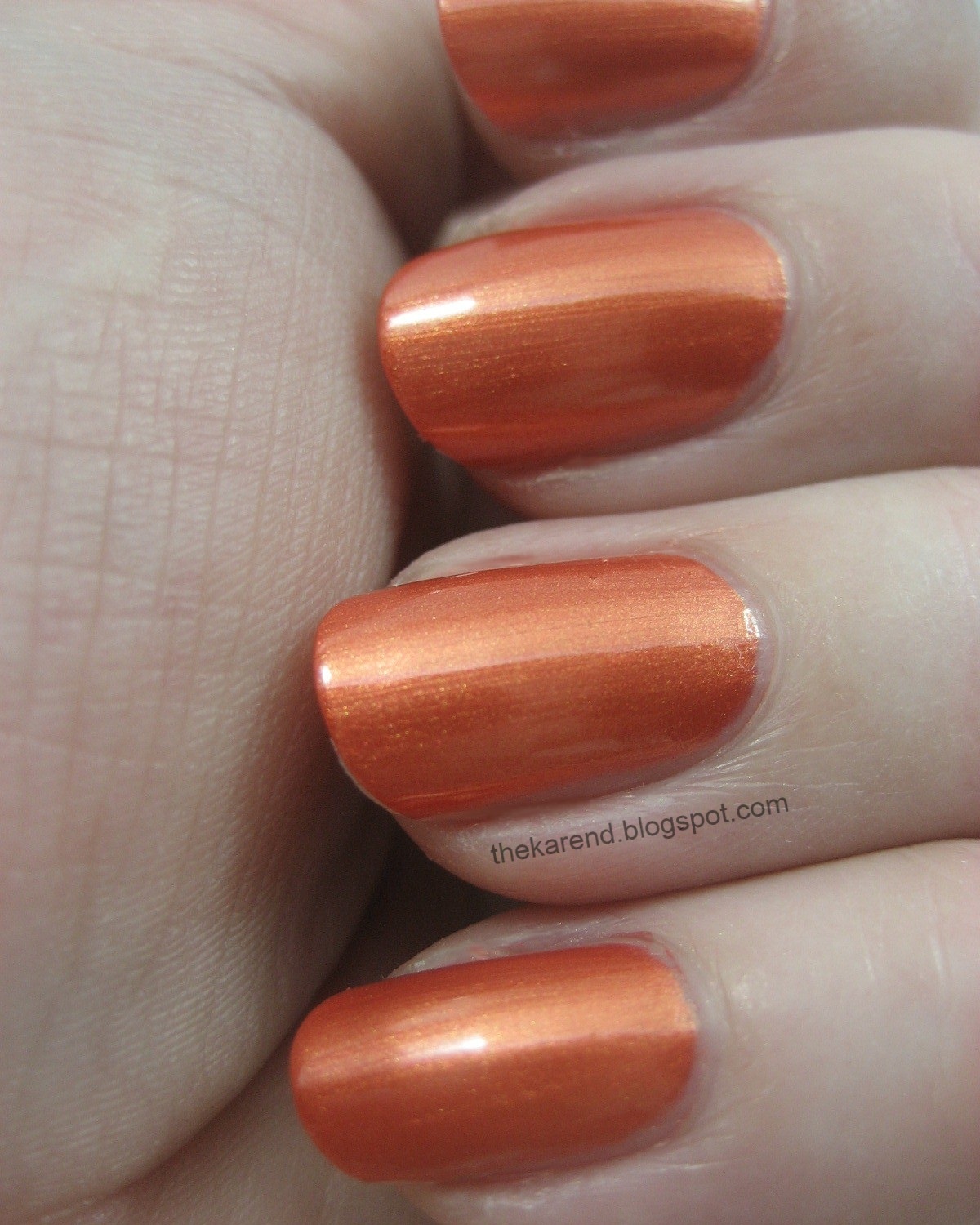
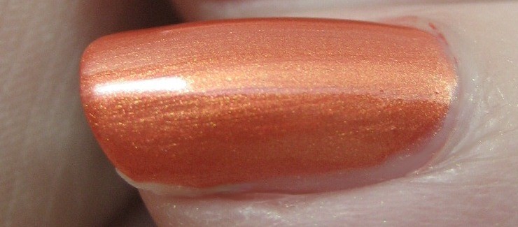
Purple is actually purple, so that was refreshing. It's a bright warm-toned purple with a touch of blue in the shimmer; if you're like me you already own this sort of this several times over. This one was on the sheer side, though not quite as sheer as Lime Green; I used three coats.


Bronze was aptly named as well (though I know from discussions back in the day on knitting boards about book Ravenclaw colors that bronze means different things to different people). This is more of a flecked shimmer rather than a frosty one, with pops of copper and gold coming through against the deep warm brown base. I used three coats though really could have stopped at two; it was just so pretty I kept painting.


Bronze is the standout in the quartet as far as I'm concerned. At $3 for .32 fl. oz., it's a good value, especially since I understand that The Cos Bar is a luxury beauty boutique which started in Aspen, Colorado, which I've seen called "The Most Expensive Town in America".


