Showing posts with label b: chi. Show all posts

Monday, November 29, 2010

A Couple of Quick Comparisons

Mr. Karen and I traveled to Illinois for the long Thanksgiving weekend, so I spent much of the past few days either in the car or spending time with family rather than updating this blog. Now I'm back to my regular routine, so there shouldn't be any big gaps between posts for the next few weeks. Goodness knows I have many things I want to post about!

A week or so ago, Tamara of Mocha Mish Mash wondered how OPI Samoan Sand compared to Sally Hansen Wet Clay, so I pulled those two out for swatching.


Samoan Sand (top), Wet Clay (bottom); two coats each.


As you can see, Samoan Sand is more peachy and sheer than Wet Clay. They both have a place in my stash.

Before I put away the Barielle and CHI polishes I swatched last week, I wanted to see how a couple of them compared to Chanel Khaki Rose, since I still haven't found a good dupe for that one.


Left to right: Barielle Cashmere or Loose Me, Chanel Khaki Rose, CHI My Cornerstone in Manhattan.


Top to bottom: Cashmere or Loose Me, Khaki Rose, My Cornerstone in Manhattan, Khaki Rose.


The Barielle has much more red in it compared to Khaki Rose (and there's the issue of the secret shimmer; the Chanel has none), but the CHI is pretty close. It's a bit too light to be a true dupe, but for about one-third the price I think it comes close enough.

Monday, November 22, 2010

CHI New York City Collection

Continuing my autumn theme, today I have some of the colors from CHI's fall 2010 New York City collection. I spotted this at Ulta a couple months ago; you may remember the display pic I posted then:


Left to right: Snow Angels in Central Park, Subway to Wall Street, Late Night Dinner in Soho, Crazy Cab Ride on Broadway, Ferry to Lady Liberty (missing), Night Lights of Times Square, Carriage Ride to Radio City, My Cornerstone in Manhattan.


When CHI were buy 2, get one free a while back I got three of them, then used part of my Ulta rewards to get a fourth just the other day.

First up is Ferry to Lady Liberty, which was missing from the display when I first saw it. As expected from the color card, it did turn out to be a grey, a very dark grey creme to be more specific.


Subway to Wall Street is a medium grey shimmer. I got an eensy weensy bit of brushstrokiness showing on just a couple nails, which I think points to operator error rather than a fault in the polish forumula.


I wasn't originally planning to get Carriage Ride to Radio City, but it was the most interesting to me of the remaining colors after I grabbed the two greys, so it came home with me. It's a brick red with a shimmer that pretty much refused to show up on the nail under almost all lighting conditions.


Above in full sun; I think I see a hint of shimmer.


Finally, I have My Cornerstone in Manhattan, which is the one I would have gotten in place of Carriage Ride if it had been in the display when the B2G1 was on. In the bottle it looked like it might be too warm-toned for me, but on the nail it turned out to be a milk chocolate creme that I quite liked. I definitely dried darker than it looks in the bottle.


All of these were two-coaters for me. As usual, these swatches are without top coat.

Monday, September 13, 2010

Mo' Displays

Time once again for another episode of "All My Displays". First up, China Glaze Vintage Vixen, which I first saw at Sally Beauty at the end of July but my Ulta just put it out last week.


As you've no doubt seen elsewhere, there are twelve colors in this collection (Bogie, Classic Camel, Emerald Fitzgerald, First Class Ticket, Foxy, Goin' My Way, Hey Doll, Ingrid, Jitterbug, Midnight Mission, Riveter Rouge, and Swing Baby). I bought a couple the first time I saw them, then a few more in a an e-tailer order, then another one because I had a coupon and was regretting not getting it, and so on. I've now got eight of the twelve and have so far managed to control my urge to complete the set.

Next, new Sally Hansen Insta-Dri limited edition colors for fall. As you can see from the price stickers plastered all over, I spotted these at Rite Aid.


Front, left to right: Metallic Momentum, Instant Coffee, Ruby Rocket, Purple Bolt. Back, left to right: Silver Sweep, Golden Flash, Cherry Blaze, Sonic Plum.


I haven't gotten any of these yet, since I'm hoping to find them on sale somewhere soon. Metallic Momentum looks the most interesting to me. I'm a bit surprised there's no green or blue in this grouping, popular as those two colors seem to be right now.

Also spotted at Rite Aid (though not price stickered as aggressively as the Sally Hansens): L'Oreal The Color of Hope collection, which includes four nail polishes. There's Delicate Dusk, Sovereign Silver, Color of Hope, and Imperial Plum. Sovereign Silver is a shimmer; the other three are cremes. I didn't buy any of these, either, and I'm not sure I will, since they seem dupe-y to things I already have (though I might decided to get them just to make sure and let you all know what I find).


Right next to Vintage Vixen at Ulta was this small Orly Halloween display. No new shades here (Liquid Vinyl, Orange Punch, and Goth), but I thought it was cute (and they didn't change the names to try and fool me into thinking these were not re-promotes).


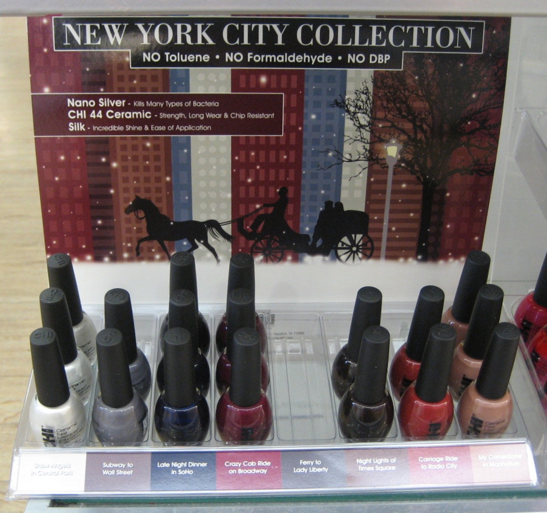
On the shelf below the Orly was a CHI display I hadn't seen before, for the New York City collection.


Left to right: Snow Angels in Central Park, Subway to Wall Street, Late Night Dinner in Soho, Crazy Cab Ride on Broadway, Ferry to Lady Liberty (missing), Night Lights of Times Square, Carriage Ride to Radio City, My Cornerstone in Manhattan.


I don't know if Ferry to Lady Liberty was so fabulous that it sold out immediately or what; I'll be looking out for that one at my other Ulta, since I do like greys and assume that's what it is based on the color below its empty space. Subway to Wall Street also looks interesting to me. My Cornerstone in Manhattan also attracted my attention; I'm pretty sure I don't have anything that color, and I'm pretty sure that's because it'd be on the ugly side of fugly with my skintone, but I might try it anyway. The others don't excite me.

Let's move on to our last stop, Meijer, where I spotted the Revlon Suede Rhapsody display. It doesn't say "holiday" anywhere on here, but all the red and green and white sure looks like Christmas to me. There are four polishes here, all matte suede finish: Fire Fox, Ruby Ribbon, Emerald City, and Powder Puff. I got the last two to try out.


Finally, tucked away on a bottom shelf near the outer wall of the Meijer, I found the Studio M fall display. Unlike last year, when the all the fall shades were labeled "Fall Promo Shade", these have names.


Left to right: Not So Subtle, Sophisticated Lad (perhaps "Lady" wouldn't fit on the label), Plum Perfection, Get the Blues, Reddy for Action, Lost in the Forrest (sic), Wicked Hot, Decidedly Devious.


Since Studio M is made by the same parent company as Color Club, it's always fun to play "spot the dupe". I don't have all that many Color Clubs, so I'm not very good at the game. Is Get the Blues the same as Gossip Column from Rebel Debutanate? No idea. I'll be swatching this collection soon and maybe you all can tell me which Color Clubs might be dupes.

See anything you like in these displays?

Thursday, July 8, 2010

Taupe or Maybe Grey is the New Purple

Though I tried to convince myself I was being prudent by waiting for swatches of Chanel's Fall 2010 polishes before I decided whether to buy, there was really no chance I wouldn't get one of them. Jade Rose, yawn—I didn't want it last spring, and I do not want it now. But Paradoxal—a mysterious purple that doesn't necessarily stay purple once it's out of the bottle? Yes, please. It arrived last week, in a gift box because if I am going to pay that much for nail polish, I want as much gold and black packaging as I can get. (Sorry, environment; I promise to re-use the box.)

Indoors, in indirect light, it looks like really dark taupe creme, or a dark grey creme, or a greyed plum creme. Definitely not purple. Definitely not a shimmer.

Chanel

Chanel

Indoors, in more direct light, a very small amount of purple shimmer peeks out.

Chanel

Outside, in direct sun, if one holds one's fingers at certain angles, pink AND purple shimmer show up.

Chanel

Chanel

Chanel

I don't have anything quite like this in my stash, but that didn't stop me from doing comparisons. I'd read Paradoxal described as Essie Demure Vixen's darker sister, so I included that in the lineup, thinking I might layer it with something, but that didn't work out.

Chanel

Left to right: Chanel Paradoxal, CHI Passionate Kiss, Zoya Ki, OPI You Don't Know Jacques, Essie Demure Vixen.


Chanel

Top to bottom: Chanel Paradoxal, CHI Passionate Kiss, Zoya Ki, OPI You Don't Know Jacques.


Passionate Kiss is a dark purple shimmer (and shows that, even indoors), but it lacks the pink highlights and murkiness of base color that Paradoxal has. Ki is more shimmery, and the duochromey-ness of it means it sometimes is closer in color to Paradoxal and sometimes farther away. YDKJ is not really anything like Paradoxal, but it might be a good place to start a franken because it does have that dark cool-toned taupe tone.

All in all, I'm happy I got Paradoxal, even though it was pricey. I can see myself wearing it a lot this fall. I might have to carry around a powerful lamp with me to show off the shimmer, though.

Thursday, June 10, 2010

Milani Intense Metal Comps

Picking up from my last entry, today I have comparisons to the three Milanis I got from the Liquid Metals Intense Colors collection.

Milani
Left to right: Milani Melt Down, Borghese Chianti Wine, Nina Ultra Pro Viva La Velvet, Sally Hansen HD Zip.


Milani
Top to bottom: Melt Down, Chianti Wine, Viva La Velvet, Zip.


I used two coats of all of these reds. The Borghese is the closest to Melt Down but it's not a dupe; the Borghese is a shimmer rather than the metallic micro glitter of the Milani. The Nina (from last winter's Crushed Velvet collection) is too light to be a dupe and tends more toward being a foil than the Milani. The Sally Hansen (which came out with Opulent Cloud) is too warm-toned to be dupe, and it's also more of a shimmer like the Borghese.

Milani
Left to right: Milani Hot Metal, Nina Ultra Pro Dragon Berry, Viva la Diva 61, NYC Nail Glossies 239.


Milani
Top to bottom: Hot Metal, Dragon Berry, 61, 239.


Hot Metal, being purple, has lots of friends in my stash. The Nina (from the Hard Candies collection) has a very similar base color but it has silvery micro glitter instead of the purpley blue flash of Hot Metal. The Viva la Diva (which I got in a swap) looked darker than Hot Metal in the bottle but is really close on the nail—it's got the same purple flash against the plummy pink; if you can't get Hot Metal but can get 61, I think they'd fill the same slot in a collection. The NYC is pretty much Hot Metal with all the glitter removed. The NYC was the only two coater in this group; the others needed three.

Milani
Left to right: Milani Molten Rock, Ulta Alter Ego, Nina Ultra Pro Velvet Seas, CHI Hot Ring Illusion Around Saturn.


Milani
Top to bottom: Molten Rock, Alter Ego, Velvet Seas, Hot Ring.


Things went a bit off the rails when I got to Molten Rock—you'll see that I have two blues and two greens here, which is not the most helpful comparison ever. The Nina I justified by wanting a Nina in all three of these, and Velvet seas was the closest I had. The CHI just does not belong; I meant to grab the blue from this collection, but it's dark like the green so they look pretty close sitting in a Helmer drawer. Why I didn't notice I had the green instead of the blue until I'd put it on, I really have no idea. Ah well, at least the Ulta was a good pick for this comp; it's just a hair lighter than Molten Rock and more shimmery than metallic but still pretty close. The Nina, besides being teal green instead of turquoise blue, is a foily shimmer, so not really much like Molten Rock at all. The CHI we've already discussed. It's a very pretty polish, but does not belong in this comp. (Molten Rock is three coats; the others are two.)

But wait, there's more ... as jbrobeck pointed out in the comments on yesterday's entry, a lot of companies are doing the glass flecked/micro glitter/metallic-y thing for summer 2010, so since I had the Sally Hansen Ultra HD polishes handy, I grabbed a couple of those to compare.

Milani
Left to right: Milani Hot Metal, Sally Hansen HD Byte, Milani Molten Rock, Sally Hansen HD Spectrum.


Milani
Top to bottom: Hot Metal, Byte, Molten Rock, Spectrum.


Byte is Hot Metal's lighter, brighter, pinker sibling; they're definitely closely related. Molten Rock and Spectrum are cousins—both turquoise blue, but Molten Rock is darker and metallic while Spectrum is lighter and more glittery. I used two coats of Hot Metal and Molten Rock, three of Byte, and four of Spectrum. (An aside: If you look closely at the hand pic above—or click to see the full size— version), you can just see the end of the scar on my palm that I've had since I was a very young girl; I got it so long ago I don't remember how it happened—I want to say I pinched my hand in a door or something like that.)

*****

A little more than a week remains to enter my Wet 'n' Wild contest. I've been very pleasantly surprised at how much interest it's generated; I'm now over 200 followers, so will turn this into a 100 and 200 followers contest by giving away two sets of the polishes. If I can find the last one I'm missing for the second set, both sets will be new from the store. If not, the second set will be 11 new and one I've swatched on one nail.

Tuesday, June 1, 2010

Hip Huggers and Friends

The Maybelline denims have been showing up again at Dollar Trees around here; I thought they were all gone months ago, but evidently more turned up in a warehouse somewhere or something, because the store that's on my Claire's-Meijer-Ulta-Sally's route near work just got a bunch more. I sure wish the same would happen with the Sally Hansen glitters, which I never saw in the first place. Ah well, if I'm meant to have them, they will come to me. The reappearance of the denims inspired me to pull out one of my favorites, Hip Huggers, a beautiful blue violet creme. A couple months ago, I did a comparison post on MUA with it and a CHI that had recently come out; since then I've also picked up a Petites Color Fever that someone mentioned was a dupe for the CHI, so today I have a three-polish comparison post.

Periwinkle polish

Left to right: Petites Color Fever Periwinkle, Maybelline Express Finish Hip Huggers, CHI In Between the Sheets.


Here they are on the nail in the glare of my lightbox:

Periwinkle polish

Top to bottom: Hip Huggers, Periwinkle, Hip Huggers, In Between the Sheets.


I used three coats of all of these, over a base of Nail Tek Foundation II (which doesn't seem to work well for me in my regular manis, so I'm using it up swatching). The person who said the Petites was a dupe for In Between the Sheets was right; I had to keep checking my notes when I was putting them on because I could not tell which was which. They're both a bit lighter than Hip Huggers and tend a tiny bit more toward the blue in blue violet, but are as close to Hip Huggers as anything I've found so far. In regular room light, the differences are even less noticeable than in the lightbox:

Periwinkle polish

I think either the CHI or the Petites would make a great substitute if you're wanting Hip Huggers and haven't been able to find it. I think the CHI is a limited edition, though I have seen a few at Ulta recently.