Showing posts with label b: joe fresh. Show all posts

Friday, December 14, 2012

OPI Skyfall Comparisons, Part 2

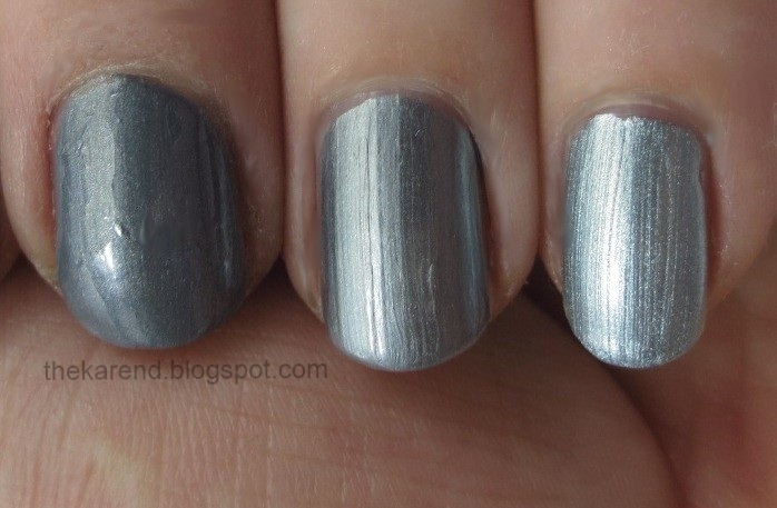
And I'm back with the cool-toned shimmers from OPI Skyfall. Let's get Moonraker, my least favorite of the collection, out of the way first. I didn't have anything really close to this, but pulled Essie Fair Game and Love Me 1203 (one of the ones I got in the swap I shared earlier this week).


I almost don't want to share these one my nails because I could not get the polishes to cooperate, but what the heck. Left to right: Essie, OPI, Love Me. All two coats plus topcoat. They're all blue toned greys, but that's where the similarities end. Fair Game is darker and the best behaved as far as formula goes (I did a crap job with it, but that's not the polish's fault). The Love Me is brighter and more sparkly.


For Tomorrow Never Dies, I chose Joe Fresh Grape and Jesse's Girl Blue Moon as my comparison subjects.


On the nail, left to right: Joe Fresh, OPI, Jesse's Girl. Grape is a similar finish but the color is slightly lighter. Blue Moon is a good color match but the finish is more satin. The Jesse's Girl is my favorite of this trio. All were two coats, no topcoat.


I pulled NYC Molten Metal and Rimmel Play Fast Cat Fight to show their stuff next to The World Is Not Enough.
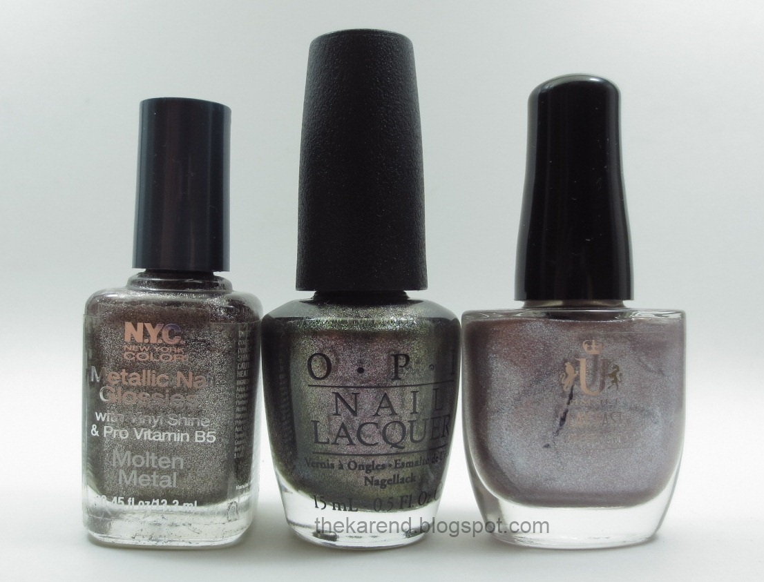


Left to right below: NYC (2 coats), OPI (3), Rimmel (4). The NYC has more silver and lacks the rose flecks of the OPI, but from a distance it gives the same look. The Rimmel is much lighter, but does have some pink in it—I could see doing an ombre with this as the lightest and the OPI as the darkest, mixing them to get the steps in between.


On Her Majesty's Secret Service got matched up with Sinful Winter Wonder (from this year's holiday collection) and Zoya Fei Fei (from fall 2012).
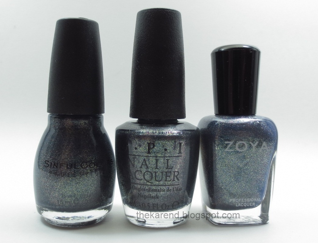


Now here we're definitely into don't need them all territory. Left to right: Sinful, OPI, Zoya. The Sinful and OPI are the closest; the OPI's shimmer looks like it has just slightly smaller shimmer particles. Fei Fei is more blue than the other two. The differences are slight enough that having just one of these should be sufficient for non-hoarders.


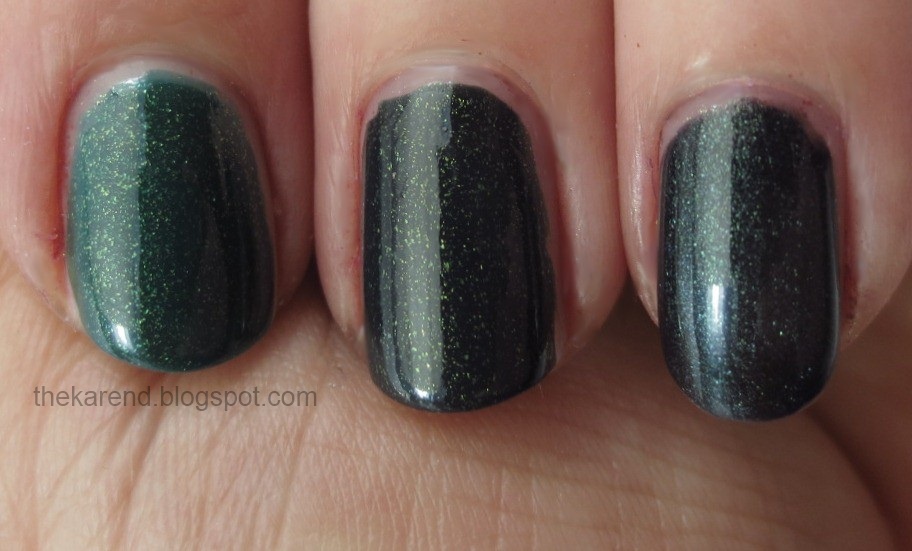
Because Live and Let Die is a green with gold-leaning shimmer, I had to pull out Sally Hansen Salon Project Runway for comparison. I also grabbed Wet 'n' Wild Morbid, which I know a lot of you green lovers have in your stashes.


Left to right: Sally Hansen, OPI, Wet 'n' Wild. Project Runway is way lighter than the OPI. Morbid is closer, but its base is a touch too blue-leaning and its shimmer is cool rather than warm. I gotta keep all three.


If there are other Skyfall comparisons you'd like to see (yesterday Hannah mentioned Zoya Ziv versus OPI Goldeneye), tell me in the comments and I will try to get them done if I have the colors in question.


Thursday, December 13, 2012

OPI Skyfall Comparisons, Part 1

Here, finally, are some comparisons of OPI Skyfall polishes—just the warm Seductive Shades today; I'll have the cool-toned hues tomorrow. Many of the polishes I chose to compare are no longer in stores, but I figured they may be in your stash, as they are in mine.

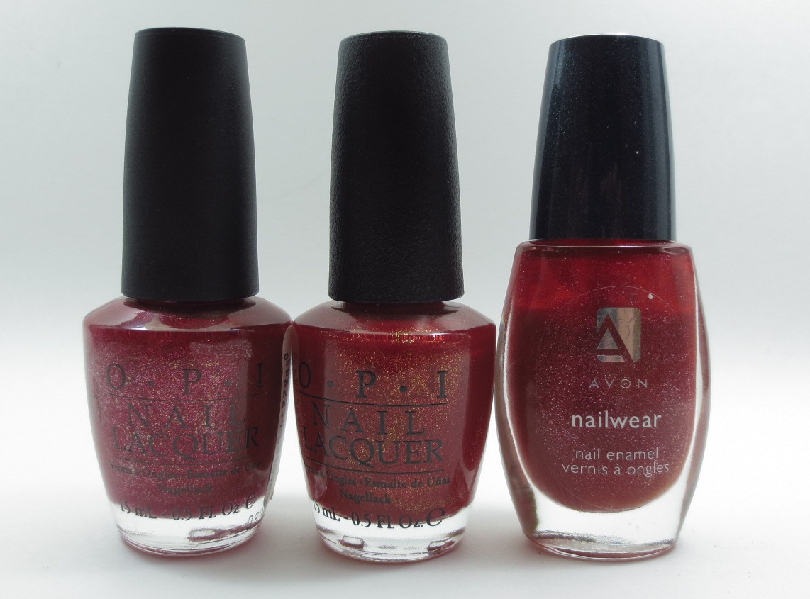
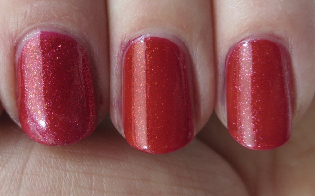
First up, The Spy Who Loved Me versus OPI Crimson Carol and Avon Nailwear Ruby Slippers.


I used two coats of all three of these red shimmers, no topcoat. Left to right: Crimson Carol, The Spy Who Loved Me, Ruby Slippers. No dupes here. The base of Crimson Carol is a cooler red than The Spy, and its shimmer has more colors. Ruby Slippers is closer as far as base color, but its shimmer is silvery pink rather than the warm golden orange of The Spy.


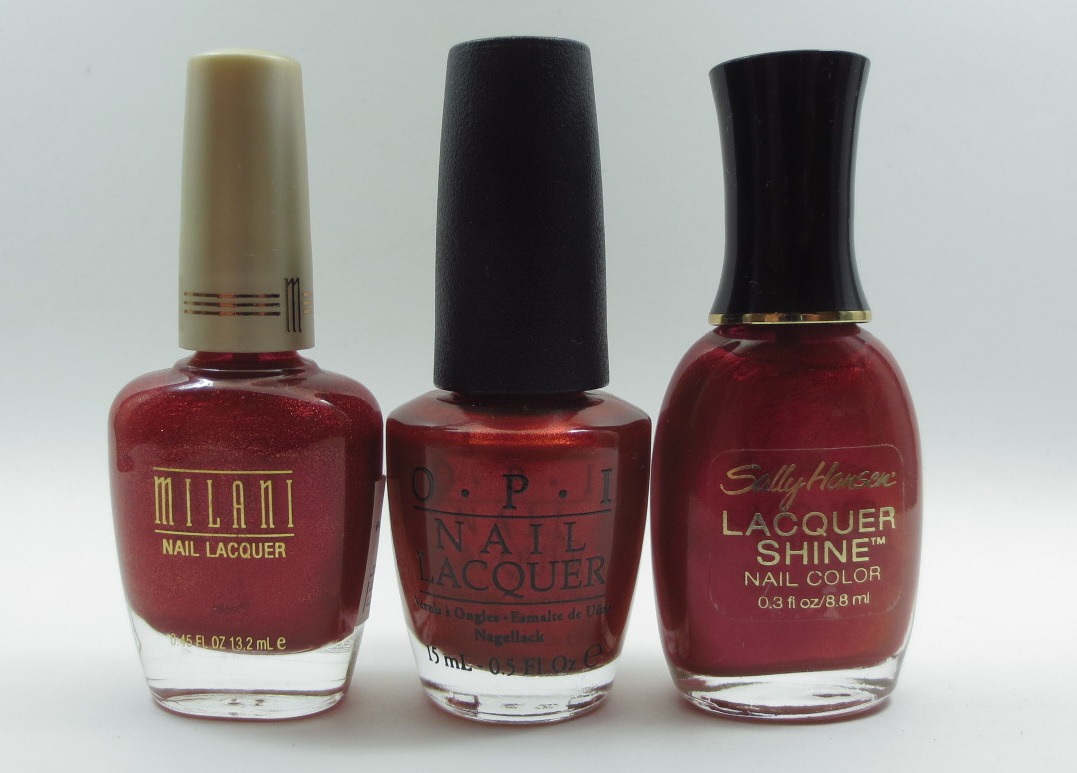
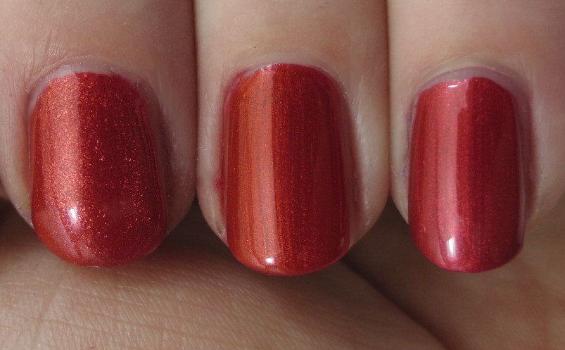
To compare with Die Another Day, I pulled Milani Melt With U and Sally Hansen Lacquer Shine Luminous.


Like the reds above, all of these are two coats, no topcoat. Also like the trio above, there are no dupes. Left to right: Melt With U, Die Another Day, Luminous. Both the Milani and the Sally Hansen are more red-toned than the OPI. The Sally Hansen's shimmer is quite similar to the OPI, while the Milani is more flecked.


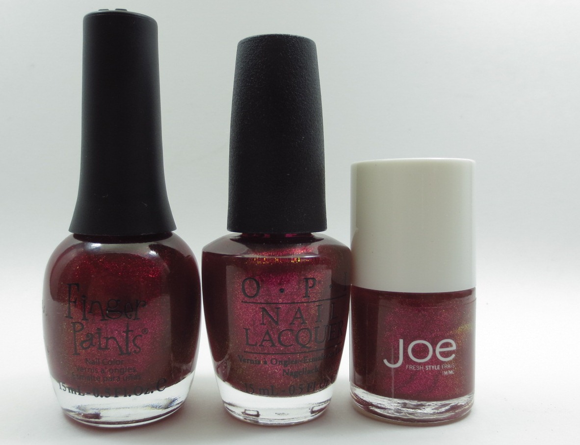
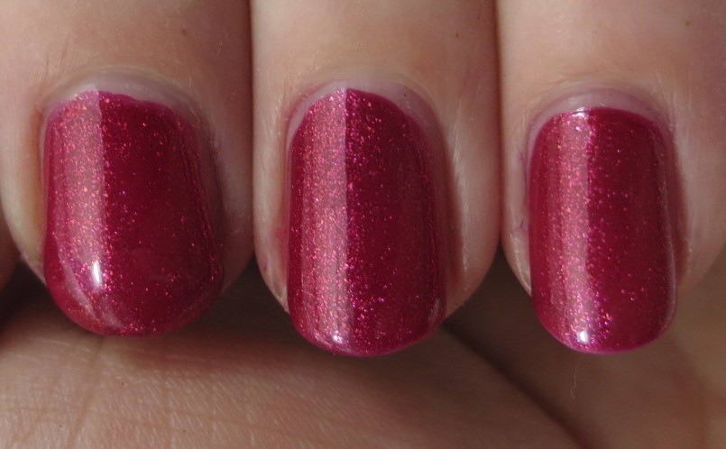
Finger Paints Magenta Mood and Joe Fresh Sweet Tart Bon Bons looked to be the two closest matches for You Only Live Twice when I flipped through my nail wheels.


Now we're into dupe territory; with two coats of each of these, I had a hard time telling them apart. Left to right: Magenta Mood, You Only Live Twice, Sweet Tart Bon Bons.


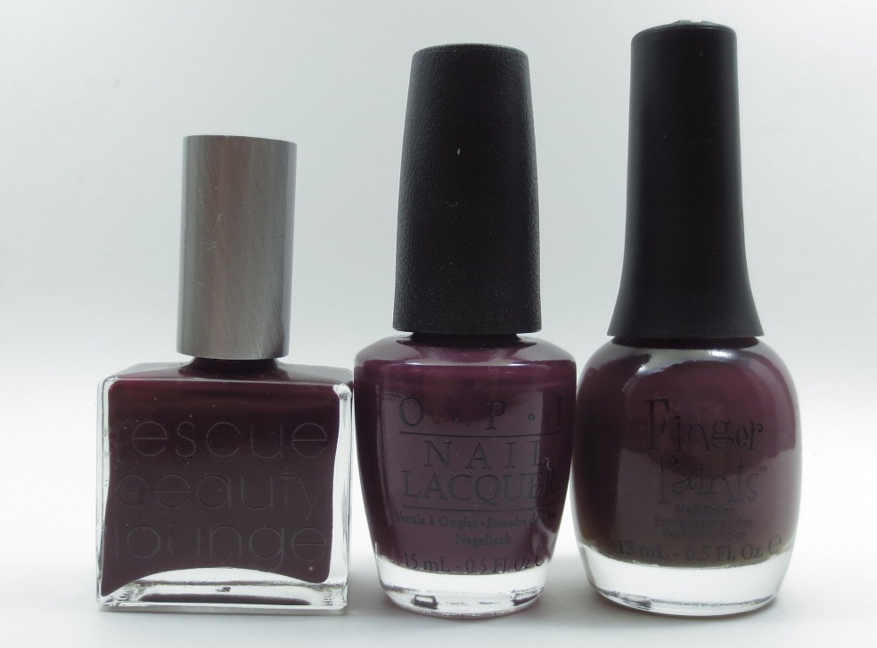
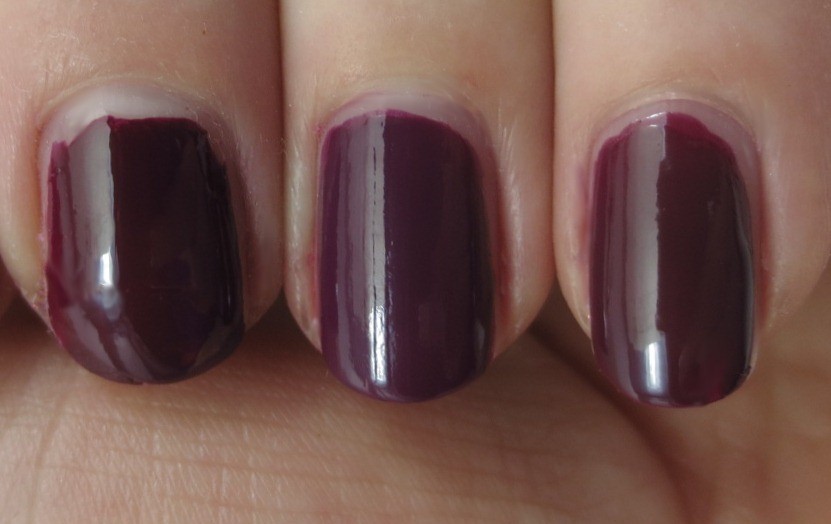
In the bottles, Rescue Beauty Lounge Drifter and Finger Paints Shades of Fall seemed like good matches for Casino Royale.


On the nail, the OPI looked more purple than the other two. Left to right: Drifter (1 coat), Casino Royale (2), Shades of Fall (2).


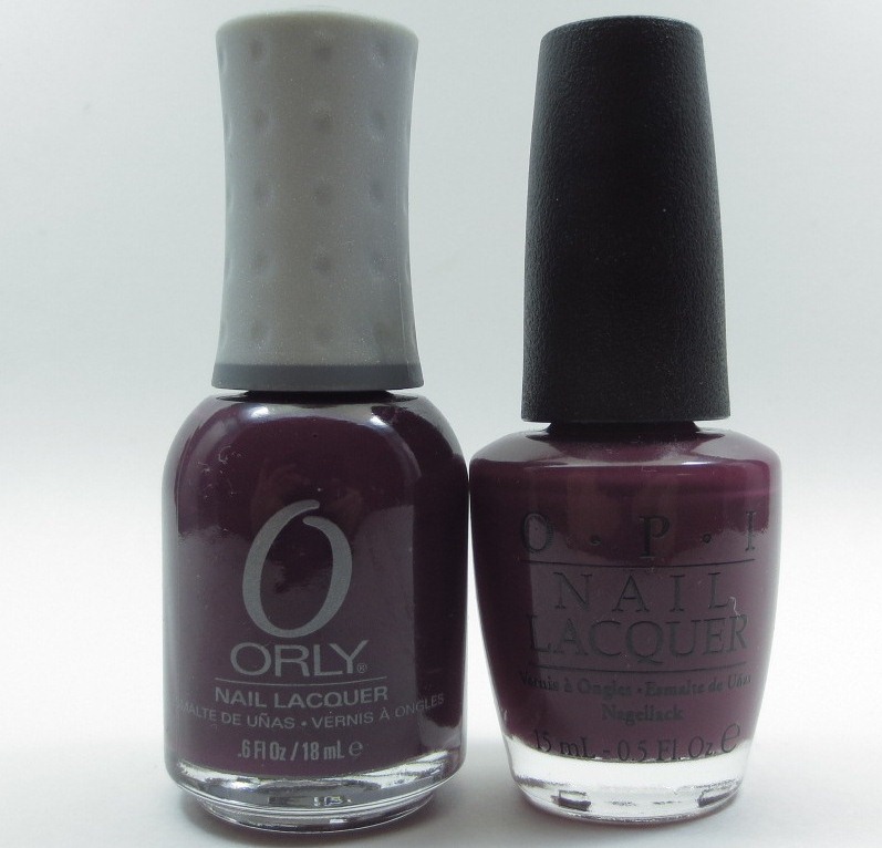
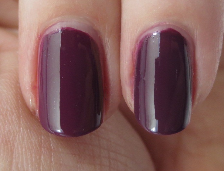
I knew I had to have a better match, what with my love for purple, so back into the stash I went and came up with Orly Plum Noir.


I'd noticed that Casino Royale looked like it could use some smoothing out (no doubt I'd rushed through the second coat of color); instead of putting on another coat of color, I grabbed a bottle of clear that was handy. Too late, I realized it had been contaminated with a smattering of silver sparkles at some point. (No doubt I'd previously used it to topcoat something blingy that wasn't quite dry.) So here you see a slightly sparkly Casino Royale on the left and Plum Noir (2 coats, no topcoat) on the right. These are so close in color I'm comfortable saying you don't need both.


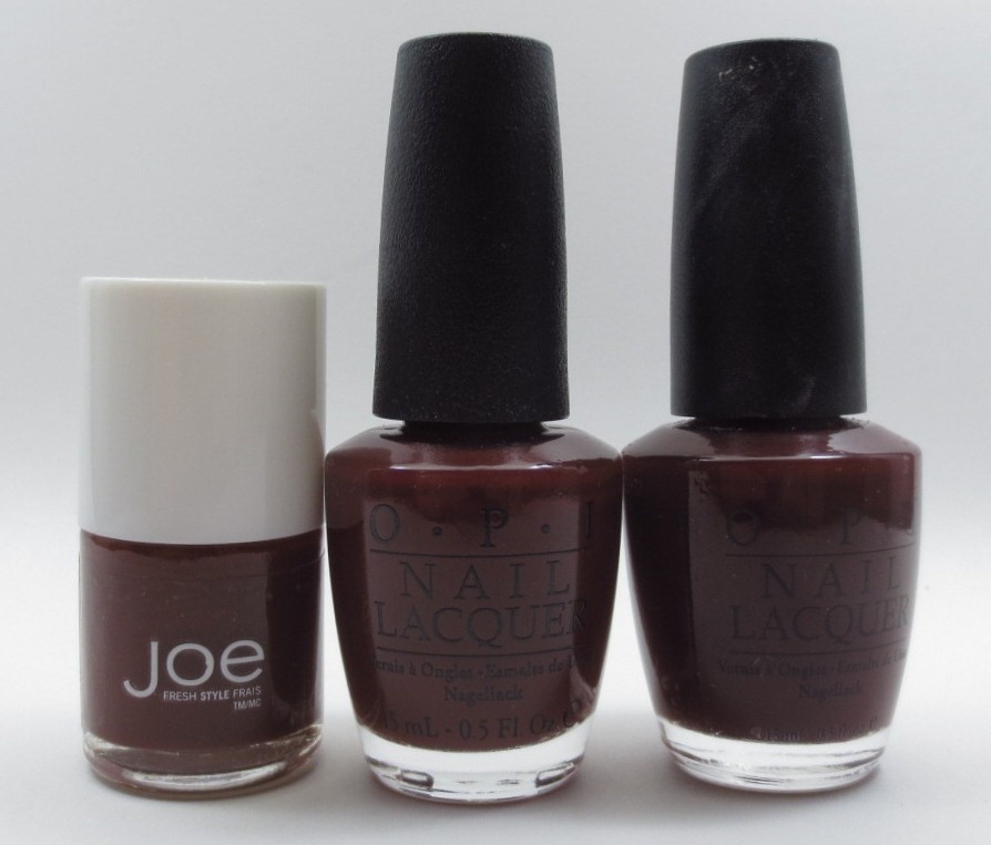
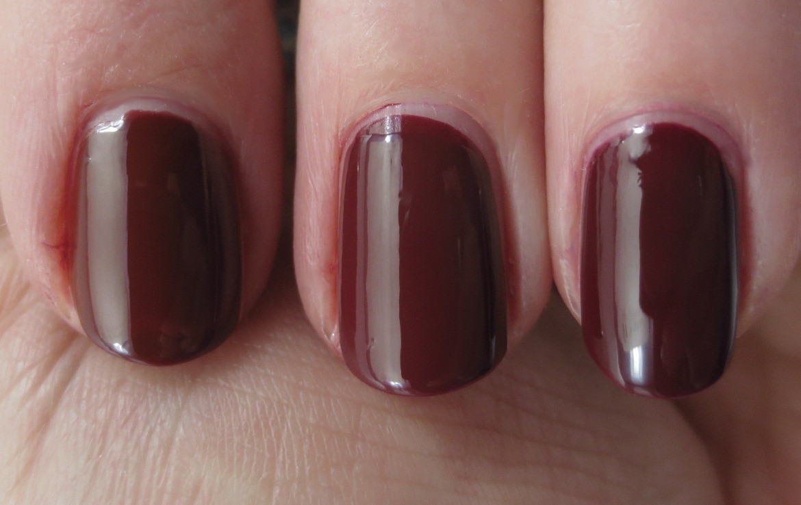
For the other creme in the collection, Skyfall, I chose Joe Fresh Brick and OPI Vampire State Building for comparison purposes.


All of these deep rust cremes were two coats, no topcoat. Left to right: Brick, Skyfall, Vampire State Building. The Joe Fresh is a touch darker and oranger than Skyfall. Vampire State Bulding looks like it has the same base color as Skyfall, but is a tiny bit deeper. I bet a few drops of black in Skyfall would make a good dupe for the long discontinued and now hard to find Vampire State Building.


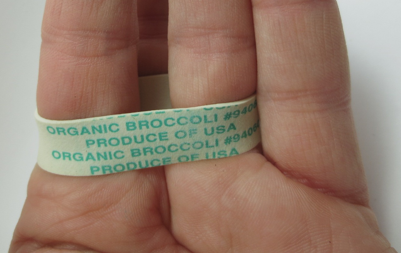
You may have noticed that the three nails in the above shot aren't the same three that were in the earlier photos. At this point in the swatching session, the patch I had on my middle nail was starting to show a lot of wear and tear; rather than stop and redo it, I just took it out of the picture and used my index finger instead. To make it easier to hold my index finger close to my ring finger, I looped a sturdy rubber band between them. I felt rather ingenious, if I do say so myself.


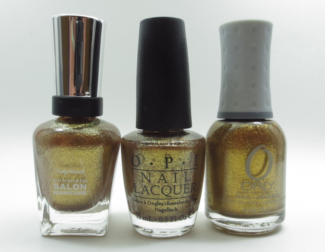
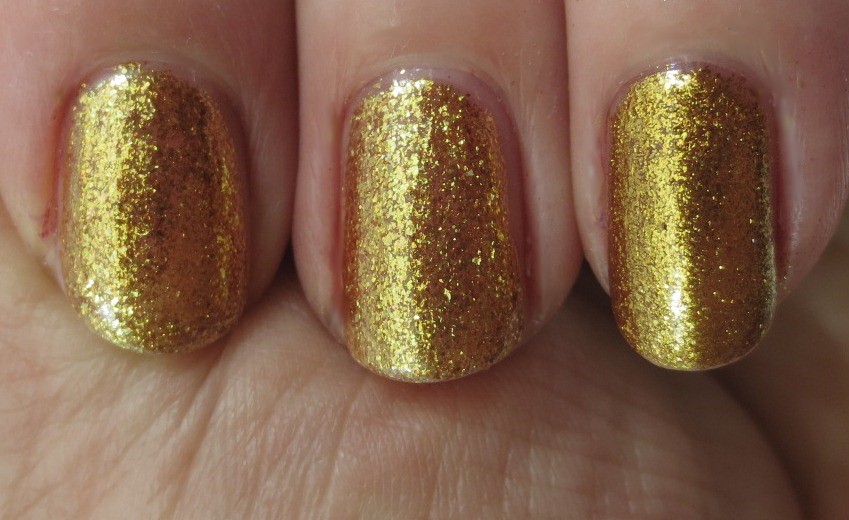
Finally, we have Goldeneye. Even though I am not a gold lover, I found two polishes in my stash that looked like possible matches: Sally Hansen Complete Salon Manicure Gilded Lily and Orly Glitz & Glamour.


Left to right: Gilded Lily (3 coats), Goldeneye (3), Glitz & Glamour (2). I couldn't really tell any difference between the Sally Hansen and the OPI. The Orly is denser and its shimmer particles are smaller, but it's very similar in color and blinginess.


I hope these comparisons help with your buying decisions, but wonder if I should try to use more core/currently available polishes for comparisons to make them more useful for more people. Let me know your thoughts in the comments if you're so inclined.

The OPI Skyfall collection polishes shown in this entry were provided free for review purposes. The content of the entry was not dictated by the provider.

Monday, February 13, 2012

Christian Dior Forget Me Not

Forget Me Not is the other polish in Christian Dior's Spring 2012 collection, sibling to Waterlily. It's a warm purple creme which covered quite nicely in two coats. Unlike when I put on Waterlily, I noticed the rose scent in this one, and not because I remembered to sniff it, either—it just wafted up to my nose when I was moving my hands around. It wasn't overpowering or unpleasant, just unexpected (yes, even though I should have recalled it was scented).


As you see, my nails are shorties right now. I think I mentioned the unfortunate incident when I snapped off the tip of my right pinky, and I just don't have the patience to deal with a fake nail or tip so shortened the rest of my nails to blend in with the nubbin.


I was sure I would find a dupe to this in my stash, given that purple is my favorite color so of course I have even more excess in that hue than most. (Now seems as good a time as any to say that in my head, Forget Me Not should be a blue color, like the flower.) When I held my polished fingers up to various of my purple creme nail wheels, though, I couldn't find an exact match. The ones that looked closest were Joe Fresh Fig, OPI Parlez Vous OPI, and Butter London Scoundrel.


On the nail, they weren't that close. Forget Me Not is considerably less dusty than Fig and Parlez Vous, darker than Scoundrel, and redder than all of them.


Top to bottom: Fig, Parlez Vous OPI, Forget Me Not, Scoundrel (all two coats).


When none of these three matched, I took a quick look at the redder purple cremes on my wheels, but those all seemed to be much warmer than Forget Me Not. I still can't believe I don't have a dupe—maybe it's lurking in my untrieds.

*****

On another topic, you may have noticed that my photos have a watermark for the first time. I decided it was time to start doing this earlier today when I found a couple of eBay listings (from two different sellers) using my photos without permission. I understand eBay is more likely to pull the listing if there's a watermark, so watermarks it is. I hate that it's come to this, since doing that takes away time from doing other things, but I want to be well armed when I go into battle against the ignorant (if I'm feeling charitable) and unethical (if I'm not). You'll probably see several changes to the look of the watermark over the coming weeks as I learn more about how to manipulate the image to add them.

Thursday, October 6, 2011

Les Jeans de Chanel

Today I've got all three limited edition blue polishes that Chanel released this past September. As often happens when I buy Chanel polishes, I ordered them, got them, then ignored them for weeks. It's the "oh man, I spent all that money, what if I find out they're not that special" effect. I debated hard with myself about whether to get them at all, but in the end I decided to do it, since I do like blue and I didn't think I'd have trouble swapping these away if it came to that. (When I ordered them, I saw Mimosa was still available, and wavered for a moment—I'd been holding strong against it, but there it was, taunting me. Was it still being there a sign I should get it? I managed to complete my order Mimosa-free, but it was dicey there for a bit.) There are three colors in this collection: Coco Blue, a sky blue shimmer, Blue Boy, a medium slightly dusty blue creme, and Blue Rebel, a dark dusty blue creme.


I started with Coco Blue, which started out a little streaky but was okay by the time the third coat went on.


I did say this was a shimmer, though a glance at the photo above might not show that. See, here's the bottle—shimmery:


To see the shimmer on the nail, you need direct sun (or a camera flash or some such).


Because of the subtleness of the shimmer in Coco Blue, I felt completely comfortable comparing it to a creme, OPI What's With the Cattitude, when that base color was the closest match I found when going through my nail wheels.


Top to bottom: What's With the Cattitude, Coco Blue.


The OPI is a tiny bit darker and of course has no shimmer, but if you want sky blue nails it's a fine alternative. It was also three coats, like the Chanel.

Blue Boy was almost a two-coater but I did three. This is my favorite of the collection.


The closest I could find in my stash to Blue Boy was Joe Fresh Persian Blue.


Top to bottom: Blue Boy, Persian Blue.


These are pretty similar; Persian Blue has maybe a hint more teal and a touch less grey. I used two coats of Persian Blue and that was plenty.

Blue Rebel took two coats, and pleasantly enough did not look black in normal room light as dark blues sometimes do.


Speaking of blues that tend to look black, the nearest match I could find to Blue Rebel was Finger Paints Cobalt Cardigan, and it wasn't that near.


Top to bottom: Blue Rebel, Cobalt Cardigan.


Despite it being darker than Blue Rebel, Cobalt Cardigan demanded three coats. I was surprised I didn't have anything closer to Blue Rebel; maybe I do and it's just not made it onto a nail wheel yet.

I believe these are now sold out, at least online at retail prices, though some Chanel counters might have a few left, I suppose. I don't think these are colors that one needs to be too sad about missing, though. They're nice, but there are equally nice blues out there for less money.

Tuesday, April 19, 2011

Catrice Floralista

Continuing my completist leanings from yesterday, today I have the three colors from Catrice Floralista that I neglected to swatch earlier this month.

Coral's Enchanted Garden took three coats to cover to my satisfaction. Orange-y colors often don't look that great on me, but I liked this one quite a lot.


I don't have an overabundance of coral and orange in my stash like I do for other colors, so the closest match I could find turned out to be not all that close: Essence Colour & Go What Do U Think? (I got mine at Ulta).


Catrice (top), Essence (bottom).


The Essence is noticeably pinker, as you can see. The Catrice is definitely not a true orange, though; it also has some pink in it, just not as much as the Essence. Yay, I can keep them both.

Pink Spring is one of those names that make one wrinkle one's brow in confusion, as it is certainly not pink. It's purple. A warm, reddish purple, sure, but nowhere near reddish enough to qualify it as pink.


Finding things to compare to this one wasn't a problem since I'm a purple person. I pulled Joe Fresh Fig out even though it didn't look super close to Pink Spring in the bottle because a) you never know and b) Fig has been waiting a while to be swatched. I also grabbed American Apparel Dynasty.


Top to bottom: Joe Fresh, Catrice, American Apparel, Catrice.


Fig is the odd one out in this trio; it's darker, bluer, and dustier than the other two. Dynasty is not far off from Pink Spring, just a bit more cool-toned.

Walk in the Woods is a light tan creme that might look better on someone less pink-complected than I.


I couldn't put my hands on any close matches to this in the bottle (perhaps because I haven't yet gotten to sorting my neutrals in the great stash reorg of 2011), but I didn't let that stop me and got out Models Own Nude Beige and Revlon Grey Suede to compare.


Top to bottom: Revlon, Catrice, Models Own, Catrice.


Yeah, neither the Revlon nor the Models Own is close; they're both too pink. They are close to each other, though, despite the Revlon having a slight shimmer. I tried to get my index and ring fingers next to each other to illustrate that, but this is as close as I could manage:


Overall, I think this collection is a great set of colors for spring. Nothing crazy or new going on here, but the aplication is good and the bottles are pretty.