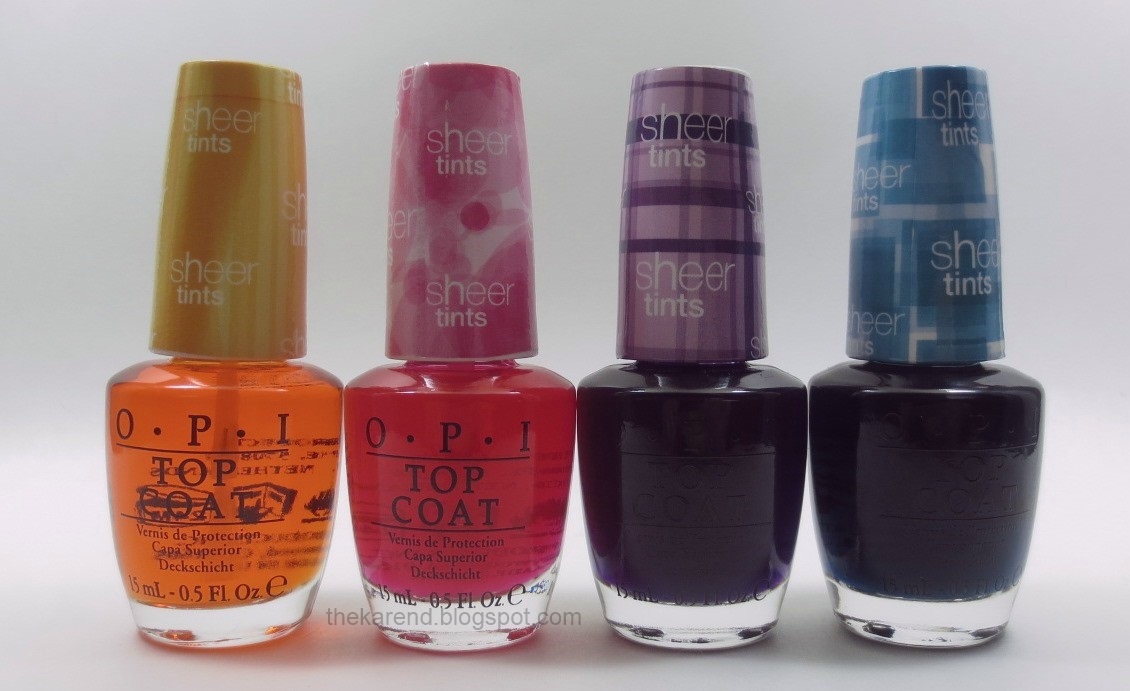
I've never seen an OPI bottle with a white cap like these; with the colored overwrap on them, it's a very pretty and bright effect, very fitting for spring.
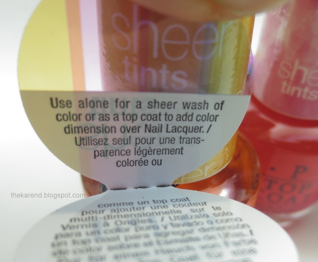
The hang tag says these can be used by themselves "for a sheer wash of color" or over another polish "to add color dimension".

Looking at these, I was reminded of the old Maybelline "water" polishes (in the Express Finish bottles with the gold caps). I didn't tend to wear those on their own because they were very sheer and tended to look more like my nails were stained rather than intentionally painted (results varied by color, of course). Despite that experience, I decided to start with these OPI Sheer Tints by swatching each by itself. The hang tag suggested that as an option, after all, and having only the four colors to do meant it was possible to accomplish that in my limited swatching time.
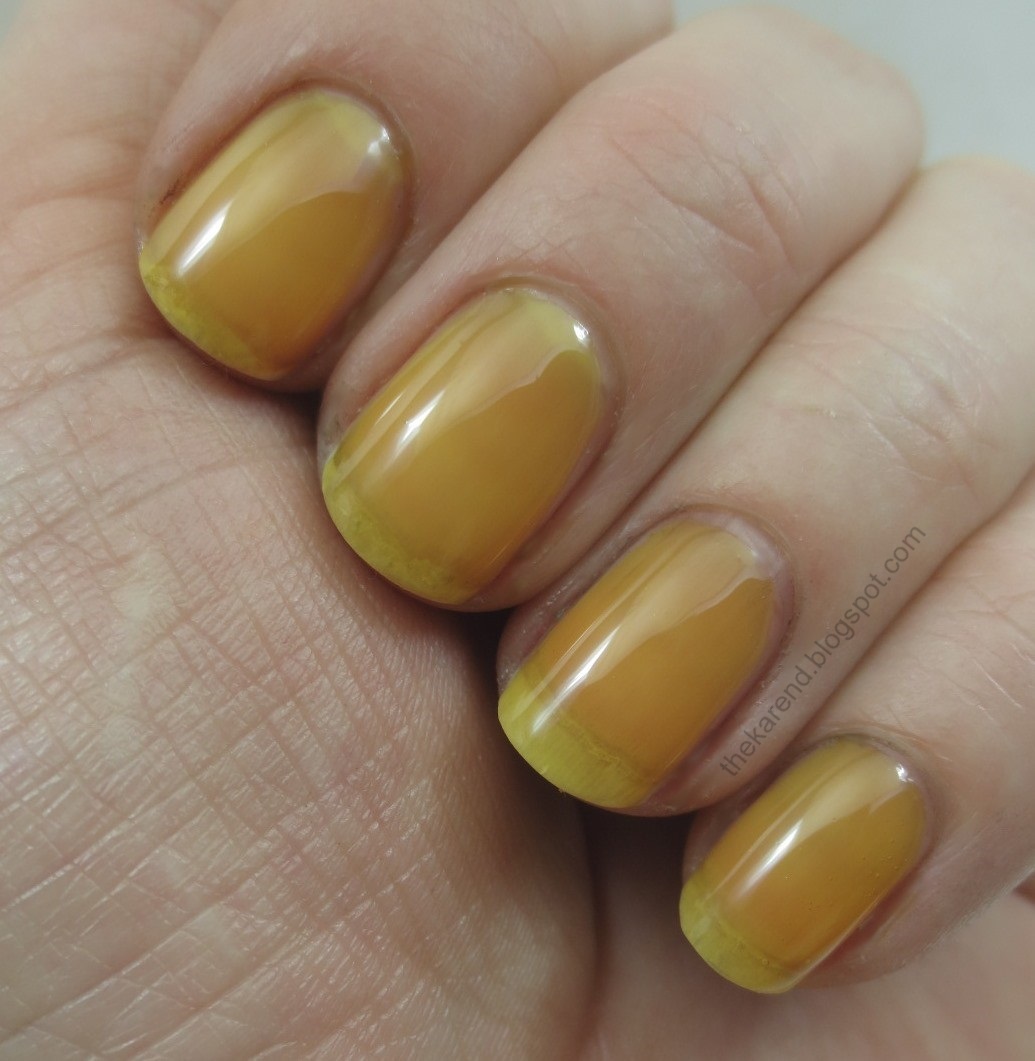
I started with the yellow orange, I'm Never Amberrassed. I used two coats for my swatch and abandoned my plan to swatch these on their own right then, as this looked awful on me. If I'd used a semi opaque base underneath, like some ridge fillers are, that might have helped, but I wanted the polish to stand on its own. If I'd added another coat of color, that might have helped, too, especially if it brought out more of the orange tones that showed in the bottle, but the formula was so thick that I feared a third coat would just be gunky and cause bubbling. So there I was, with nails that looked like the color of the walls in a heavy smoker's house. Yuck. Usually I can look at a polish that doesn't work for me and imagine someone it would look nice on, but I'm not sure who this would work for, not worn this way.
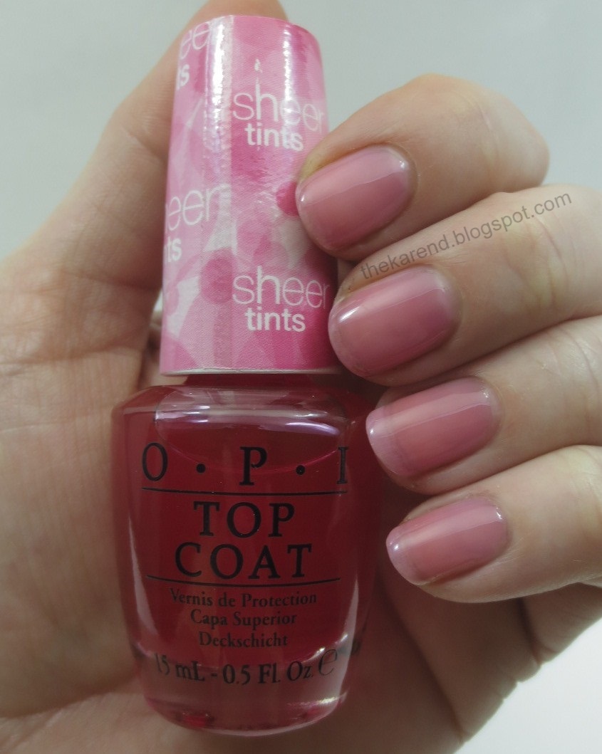
But I pushed on and tried Be Magentale With Me, which is a rosy pink. Again I did two coats, as this had the same thick formula (really thick, like thicker than a heavy duty glitter filler topcoat thick). This looked much better than the yellow, since it looked more like I'd been eating raspberries than smoking like a chimney. Still, I wouldn't wear this like this, as it gives a "dirty nail line" impression even though my nails are clean (thanks to Lizzy for introducing me to the term).
I Can Teal You Like Me is as green as the name implies; it's pretty much blue with ever so slightly green-leaning tendencies. Same thick formula, same two coat swatch as the other colors.
I saved what I was sure would be my favorite for last, the purple, Don't Violet Me Down. I certainly liked the color, but I wouldn't wear this one on its own either, at least not at the two coats I swatched it at. Sheer color is just not my look.

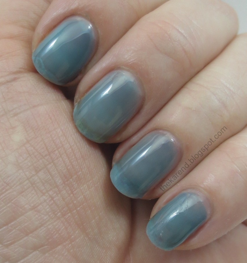
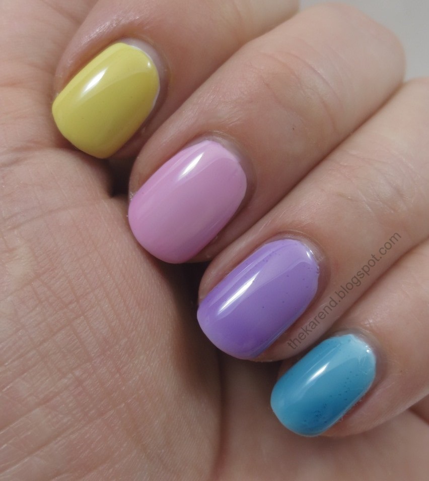
Okay, so at this point, it was clear that option one, wearing alone for a sheer wash of color, was not for me. So let's try option B, layering to add color dimension. To let the tints show their true colors to start, I laid down a base of OPI My Boyfriend Scales Walls, which is very nearly white (I couldn't find my bottle of Alpine Snow), then added two coats of the tints, starting with Amberrassed on my index finger. Now this look I'd wear—it made me think of spring and Easter candy.
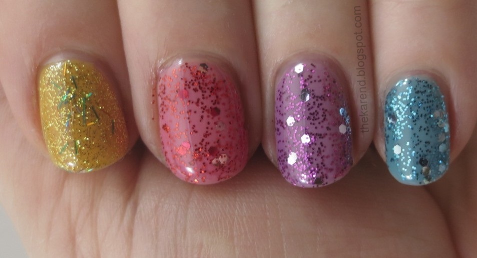
For my next layering experiment, I put down a base of OPI Samoan Sand, which is nearly mannequin hands on me (do people still talk about mannequin hands? or am I dating myself? maybe "Band Aid but better" has come back into vogue?). Then I put donw a coat of the Sheer Tints, added glitter polish, then topped with more Sheer Tint. Left to right below: Amberrassed sandwiching OPI Save Me, Magentale with OPI Gettin' Miss Piggy With It, Violet with OPI Divine Swine, and Teal with OPI Gone Gonzo. The skintone base tones down the colors of the Sheer Tints, makes them less Easter candy-esque.

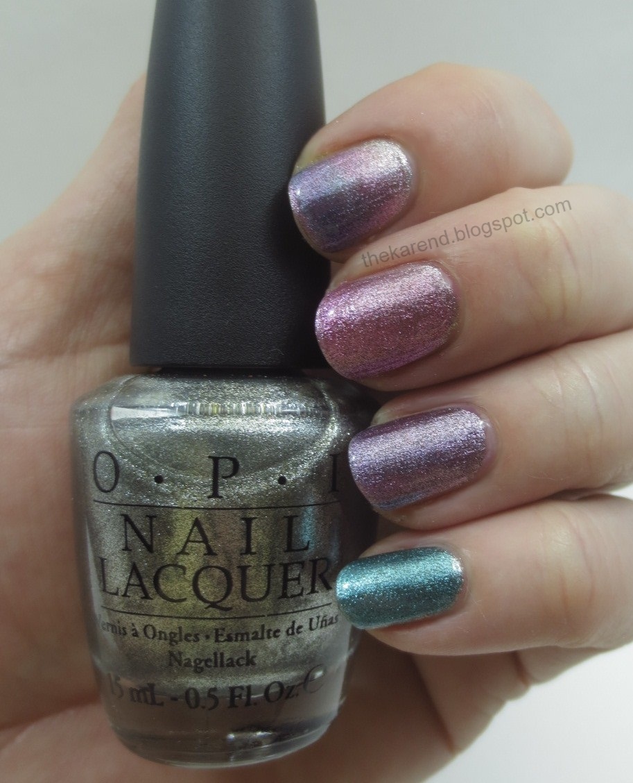
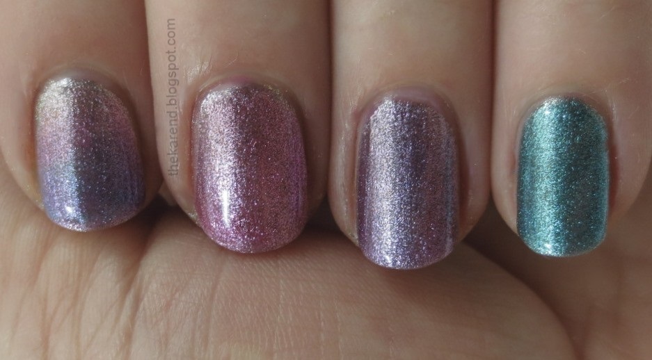
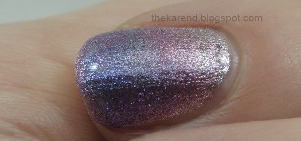
For my last trick, I tried some of the Sheer Tints over a metallic silver, namely OPI Your Royal Shine-ness. On my index finger, I tried a gradient with Magentale, Violet, and Teal. The other fingers got single colors; I used three coats of Magentale and two of Violet and Teal. This base did bring out more of the green tones in Teal.
Unfortunately that was all the playing I had time for in this swatching session, but I can think of other things I'd like to try: other gradient combinations, other base colors, layering the Sheer Tints over each other in various pairings, different sorts of nail art (splatter mani, watercolor mani, etc.) My only hesitation is the thick formula, which makes building up lots of coats tricky and prone to bubbles, as you may have spotted in some of the shots above (see the Violet and Teal nails over white, for instance). I'm not sure why these are so thick; the Maybelline water ones were not. Perhaps it was meant to better suspend the pigment and make them less prone to streaks? I guess using thinner is an option, but I think I'd have to use a whole lot of it before these got to a consistency more like normal topcoat.
I have yet to see these in any store, but they are on the Ulta website for $9 a bottle (noted as online only), and I've also found that some other websites have a set of minis with one of each color.
The polishes shown in this entry were provided free for review purposes. The content of the entry was not dictated by the provider.

Watercolors seem to be "in" this year, so I guess maybe that's the driver in releasing these. (First time in a number of years I remember seeing this much watercolor stuff, really.) I agree with you, I never could get sheers to behave well. But they look cute with a base color, I might have to try a couple!
ReplyDeleteI definitely prefer these layered over a base and not alone. I especially like the effect it has over silver polishes. I also saw some swatches of these used to make gradients, which turned out to be super pretty.
ReplyDeleteI really liked them over the silver here! I bought them for some ponding or layering mani's but would never wear them on their own.
ReplyDeleteIt's super pretty on layers ones. Definitely look alot better on layers than wear the base alone!
ReplyDelete*bows* You're welcome. ^_^ And thanks for the shoutout! I haven't been a fan of these from the word 'go'; now knowing how thick they are? I don't see these coming home with (to?) me. I do like the glitter layering possibilities, but... eh. With luck once they're released in stores I'll find them on clearance. lol
ReplyDeleteLove all the ideas you had for these, especially layering over silver! I want these, they seem fun. Strange that they are so thick though!
ReplyDeleteI like how they look over silver, but sheers are not for me :)
ReplyDeleteIt's interesting that this kind of tints or glosses were made by Chanel many, many years ago, I have 5-10 of them - and now the idea pops up again :)
ReplyDeleteThanks for showing us how one can play with these tints. On their own they're really ugly, but I really liked the sandwich with nude and glitters and the gradient. It's quite strange they are thick...Italian brand MiNy made similar polishes last year and I think they were quite watery. I have the same feeling...maybe thickness will prevent from visible patches or streaks?
ReplyDeleteLove the purple!
ReplyDeleteI love how these look over the metallic silver :D
ReplyDeleteThey look interesting. I'd probably add some thinner and use the polishes for glittter sandwiches :)
ReplyDelete