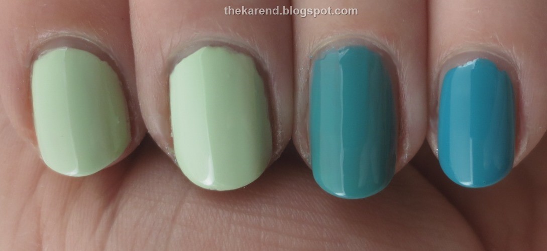
I started with pale greens and teals: OPI That's Hula-rious (from Hawaii collection), Zoya Tiana (from Delight, which I did swatch because I was a press sample, and I do make those a priority), China Glaze My Way or the Highway (from Road Trip), and Essie Garden Variety (from Flowerista).

Below you can see them on the nail in the same order as the bottles above, two coats of each (I might have been able to stop at one coat for the Essie). I know I said this wasn't a dupe hunt, but as it turned out the OPI and Zoya were so very close I'm comfortable saying I don't need both, and I pretty much need all the things. The Zoya is ever so slightly more yellow-leaning, but still reads as cool and minty against my rosy skintone. The China Glaze and Essie are not dupes; the China Glaze is what I'd call a teal green, while the Essie is a teal blue or deep turquoise.
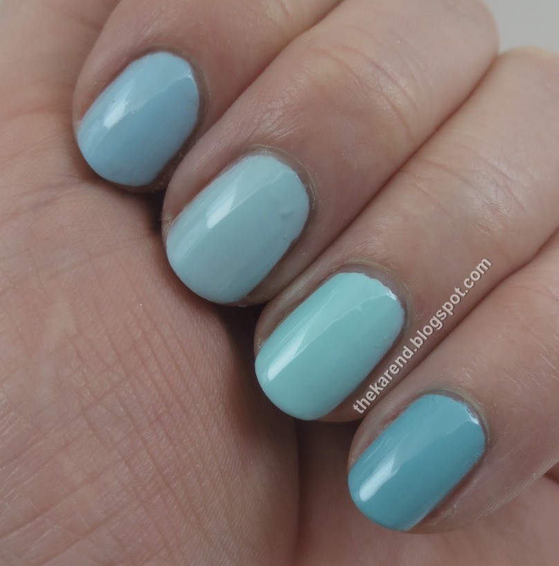
Continuing with the cool hues, I moved on to light blues and blue greens: L'Oreal Wispy Clouds (from Haute Florals), Zoya Lillian (from Delight, as previously noted), Essie Blossom Dandy (Flowerista), and Sally Hansen Xtreme Wear Big Teal (new core shade released earlier this year).

On the nail below, starting with the L'Oreal on top; two coats of each (though the Sally Hansen was nearly a one coater). There are no dupes here. The L'Oreal is a straight up light blue. The Zoya is a lighter blue, with just a hint of dustiness. The Essie is definitely green-leaning by comparison to the first two; I'd call it a light turquoise. The Sally Hansen is slightly darker turquoise, a teal blue rather than the teal green one might expect from its name.
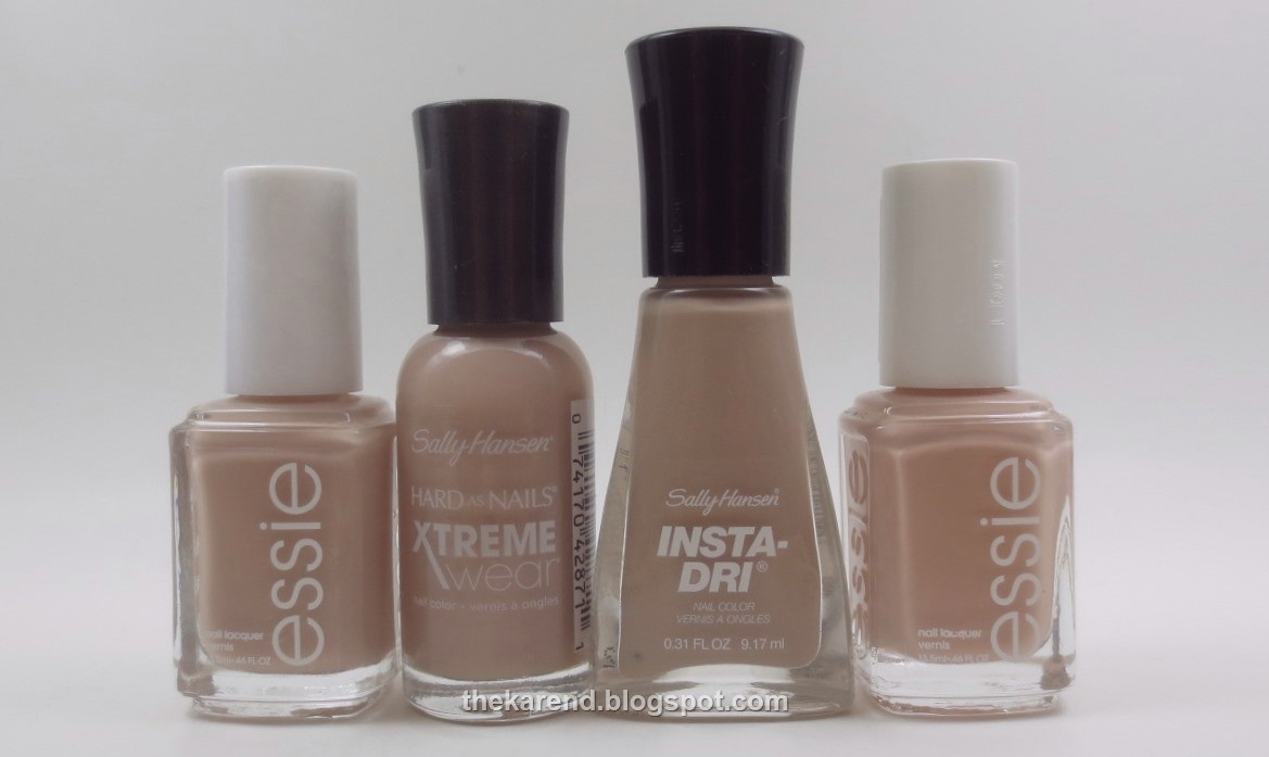
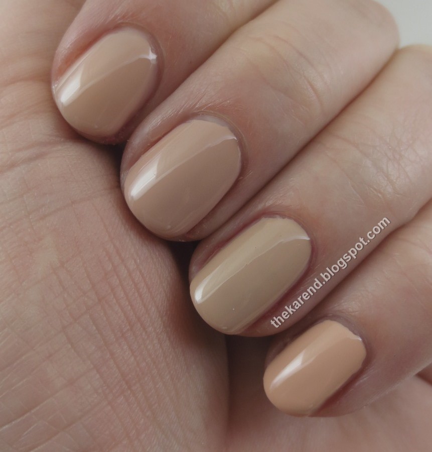
My next handful had two cool hues and two neutrals: China Glaze Boho Blues (from Road Trip), L'Oreal Spring Showers (Haute Florals), Sally Hansen Insta Dri Express Way (latest limited edition display), and Essie Picked Perfect (Flowerista).

I put them on my nails in the same order as the bottles. The Essie was one coat, the others two. The blues are close but not dupes; the China Glaze is brighter, what I'd call cornflower, as compared to the more dusty L'Oreal, what I'd call periwinkle. The two tans are even more distinct from each other, though they're definitely in the same milky tea color family; the Sally Hansen just has more milk in it.

Next up, a full hand of pale neutrals: Essie Brides to Be (from Bridal 2015, Hubby for Dessert), Sally Hansen Xtreme Wear Bare It All (new core for 2015), Sally Hansen Express Way (same as above), and Essie Perennial Chic (Flowerista).
Remember when "mannequin hands" was a thing? This handful reminded of that, when I was swatching so many skintone colors to find my match. The first two here, Brides to Be and Bare It All, are a touch too peachy to match my rosiness, but theye are close enough to each other that I could easily let one go. Express Way is more yellow-toned than the first two, and Perennial Chic looks practically orange by comparison, very peachy. All of these were two coats, though Bare It All might have been okay at one.
This next set has some legitimate oranges—well, orange reds, anyway: L'Oreal Sweet Nectar (from Haute Florals), China Glaze I Brake for Colour (Road Trip), OPI Aloha from OPI (Hawaii), and Essie Happy Wife Happy Life (Bridal 2015).
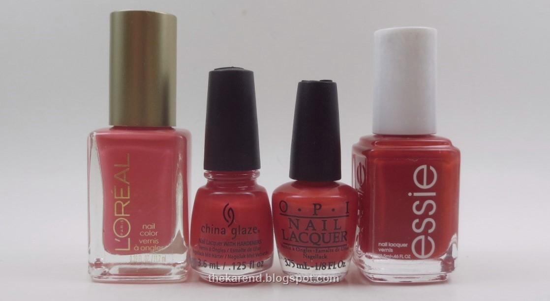
These were two coats each, except for the Essie which was one. The L'Oreal is the odd polish out in this bunch; it's a touch lighter and definitely more pink; I'd call it coral. The other three are closer. The China Glaze is a classic orange red, while the OPI is brighter and a bit more orange than that and the Essie is darker.

Staying with warm hues, peachy pinks are up next: China Glaze Pinking Out the Window (from Road Trip), Sally Hansen Insta Dri Cruisin' (latest LEs), Sally Hansen Xtreme Wear Giant Peach (new core), and L'Oreal Sweet Nectar (same as above set).
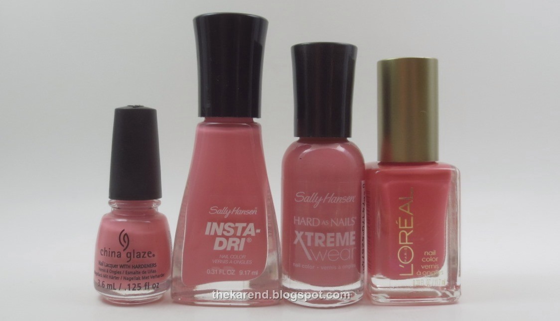
On the nail below, two coats of each. I don't think it's necessary to have both the China Glaze and the Insta Dri; the former is a touch lighter, but not so much that the difference would be noticeable in most lighting situations. The Xtreme Wear is slightly more orange-leaning than the Insta Dri; choosing between them, I'd go with whichever is more flattering and skip the other. Poor L'Oreal, it's the odd one out in this set, too, being darker and even more orange than the others.

Finally, I have pinks—it's spring, there must be pinks, even more so than other seasons. Left to right: Essie Tying the Knottie (Bridal 2015), Sally Hansen Xtreme Wear Tickled Pink (new core), Sally Hansen Xtreme Wear All Bright (new core), and Essie Brides No Grooms (Bridal 2015).
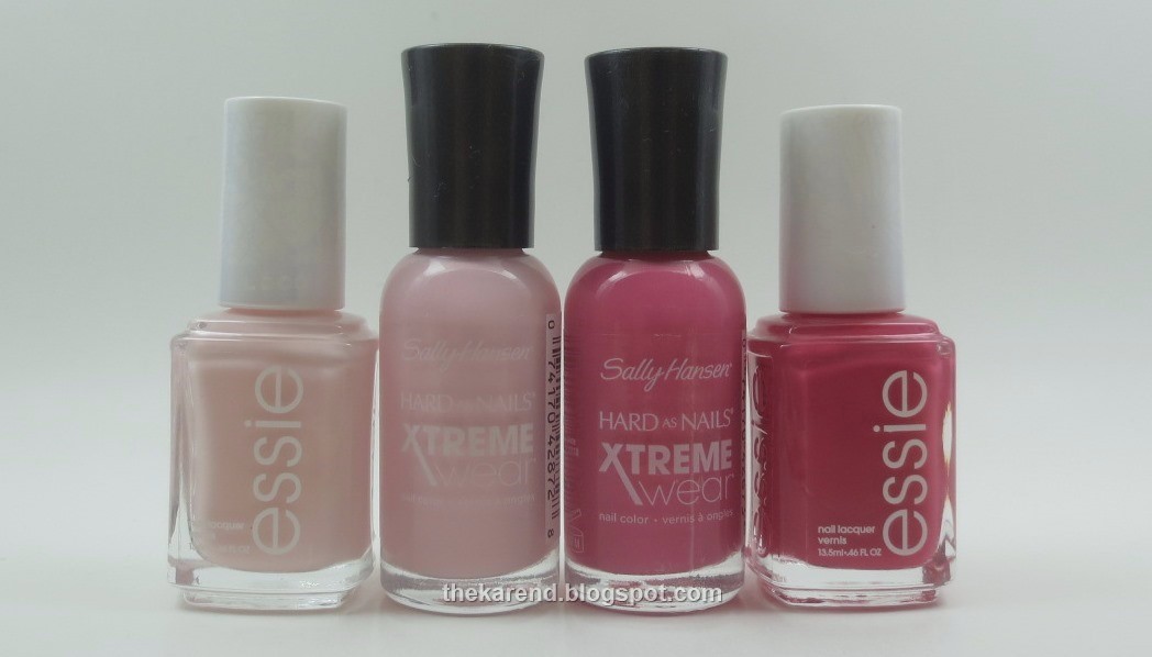
I used two coats of all of the pinks; Tickled Pink probably could have used a third, and Brides No Grooms proabably could have been one if I'd laid it on a little thicker. The light pinks are no dupes; the Essie is more peach-leaning and a touch dusty while the Sally Hansen is a clear white-based hue. The darker are not a match for each other, either, though they'd be happy in an ombre mani together.

That's all I've got for today, though looking at these photos, I'm itching to do more comparisons. Unfortunately, it will be a while before I can indulge that impulse; with limited time for swatching, it's more efficient (though still fun) to focus on a collection or two at a time, so that's what I'm planning for the next little while (not that I always follow through on my swatching plans—distraction is a constant danger).

LOVE the comparisons!! This just added quite a few polishes to my list. You kill my wallet lol
ReplyDeleteturtle, I think I am doing this wrong, then--comparisons are supposed to help you not buy stuff that's too similar to stuff you already bought. :)
DeleteThank you for these comparisons! Now I feel that I can skip a few of these shades since they were so similar, which makes my wallet happy ;)
ReplyDeleteThese comparison videos are so helpful, and in this case, timely. I almost ordered Tiana this morning. Now I'm glad I switched to Lillian because I already picked up Hula-rious and it looks so close to Tiana. This will save me money in the long run. Thanks so much!
ReplyDeleteThese look so beautiful ! my favourite one has to be the pink essie form the last collection! :)
ReplyDeletehttp://sleepy-heaven.blogspot.co.uk/
I see many pretty blues in here!
ReplyDeletelol I still haven't found my perfect mannequin hands shade. The search continues!
ReplyDeleteWould you recommend Zoya Tiana or OPI That's Hula-rious? Does one have a better formula?
ReplyDeletewhen someone has as big collection as yours is, it's no wonder that you'd stumble upon something similar ;)
ReplyDeleteI'm really liking the light blues :-)
ReplyDeleteThis was a great and extensive post, thank you for sharing! I need all things too and I still kinda want that OPI even though I have Tiana already.
ReplyDelete