
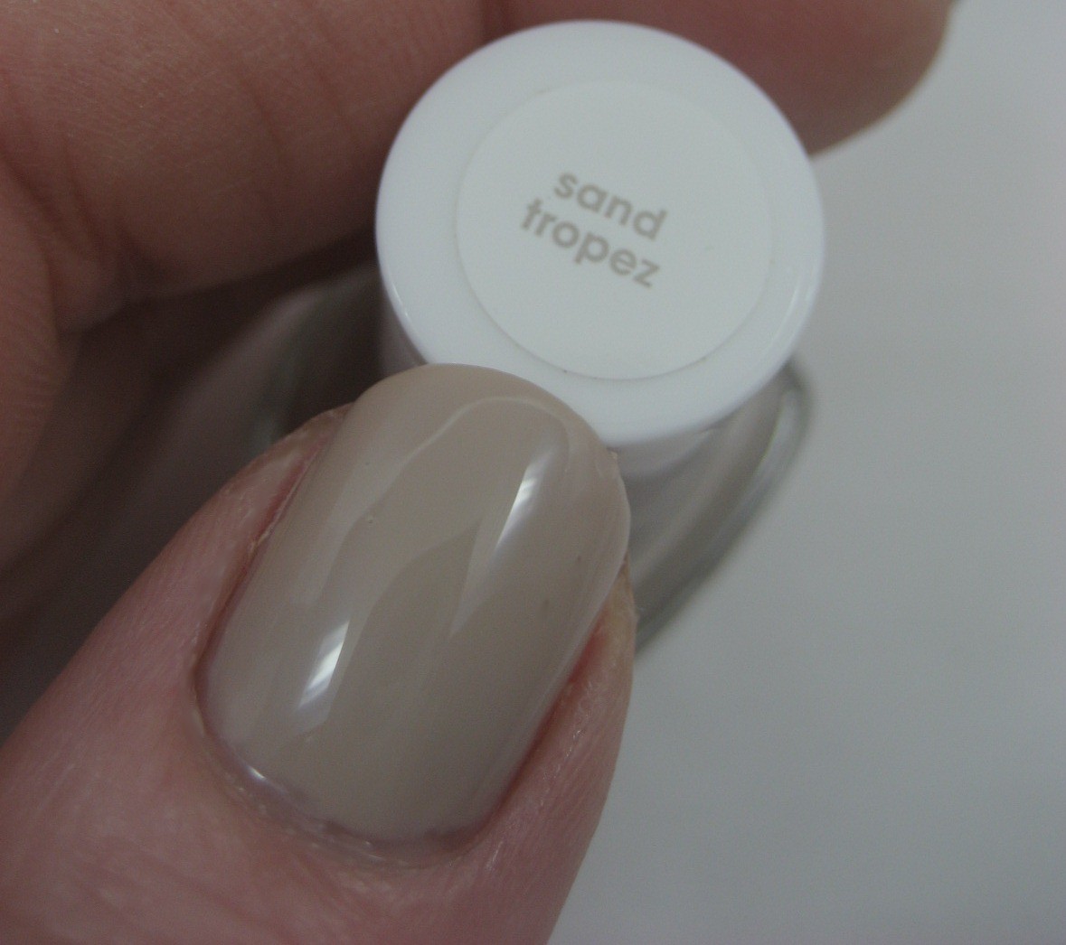

A lot of you no doubt noticed this bottle is one of the new "retail" ones, from Essie's expansion into mass market distribution. These new bottles lack the "e" on the cap, and have stickers on one side of the bottle (but still have the molded name in the glass on the other). I got this particular bottle at my local CVS; I've also seen Essie at Rite Aid, Walgreens, and Meijer. Here are some of the different displays I've seen:


Almost as soon as I put this on, I decided taking a break from color (and glitter) was a bad idea. It's somewhat interesting to see that when my hands are cold this shade is almost mannequin hands on me, but mostly it just makes me yawn to see it. It's held up very well, though; I'm on day five and have not had even one chip yet.
In what turned out to be an ill-advised attempt to add a little spark to this color, last night I stamped over it with Nicole by OPI It Starts With Me, a bronzey peachy color from the Liquid Metals collection, and the houndstooth design from Konad plate m63. I was going for a subtle tone-on-tone look; I ended up with a bit of mess. At least it's a subtle mess, so I didn't have to take it off and come to work bare-nailed today. The Nicole didn't play nicely for stamping; it was hard to get enough to stay in the plate to give good coverage. It turned out the best on one of my thumbs (if you ignore the fact I didn't get the design placed correctly).


I think I'll wait 'til summer to try this one again; when it's too hot and sticky out, a cool and calm neutral like this might be just the thing.

we are nail twins today - i too decided to get out my untried sand tropez. and also like you it was in an effort to calm myself, after wearing opi black shatter over white this past week. this color is an epic fail on me, but alas, i dont want to remove it...lazy & all that.
ReplyDeleteIt looks a bit like a coat of Hidden Treasure or something. I love it.
ReplyDeleteHonestly, there you go again with your seasonal displays. You are way beyond lucky to have so many options. Grrrrr! I envy you so much. You and your impeccable nails. Grrrr.
nice colour of essie! You know, i always loving the pictures you put up on my blog! makes me excited to having more nail polishes lol
ReplyDeleteon ur blog* sorry lol
ReplyDeleteSand Tropez reminds me a lot of Essie's Playa del Platinum but Sand Tropez might be a tad darker...?
ReplyDeleteI don't think the stamping looks bad!
ReplyDeleteAlso, I hate the essie retail bottles. I only have one, but it annoys me with the name on the top.
-____-
i don't think its a fail. it almost looks like a textured polish!
ReplyDeleteenamel girl is right...it looks interesting! :) i like it
ReplyDeleteSand Tropez looks perfect on you...very classy!
ReplyDeleteI really like it, the stamped polish adds a lovely sparkle :) x
ReplyDeleteActually thats an interesting stamping combo. I like some of the real subtle ones like this.
ReplyDeleteI think the stamping looks really cute. very understated and chic.
ReplyDelete:)
That colour looks very good on you. As for the stamping I think even though it wasn't the result you had in mind, from afar it looks like marble and I like the effect :)
ReplyDeletei like this shade! it looks good on you!
ReplyDeleteThe colour remainds me of gosh groovy grey but i am not really sure. It looks really good on your nail
ReplyDelete